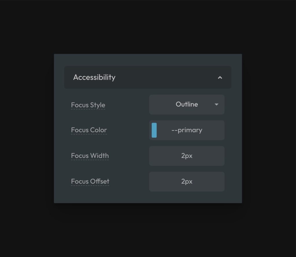
Focus styling is the styling of the visual indication of focused elements like links and buttons. Automatic.css provides unprecedented control over focus styling both globally and locally.
Default/Global Focus Styling
Navigate to Additional Styling > Accessibility.

Your options for controlling global/default focus styling are:
- Focus Style: Choose between outline or box-shadow.
- Focus Color: Set the color of the focus indication using a color token.
- Focus Width: Set the thickness of the focus indication
- Focus Offset: Set the offset (gap) between the indicator and the element (only applicable when “outline” style is chosen).
The choice between outline and box-shadow is a personal one. Each options has different pros and cons, though outline is generally used which is why it’s the default option.
Changing Focus Color on the Fly
The default focus color is not always appropriate. For example, if your focus color and background color are the same, focus can’t be seen. This creates an accessibility problem.
You can change the focus color of elements in any box (and all children) using focus classes. They use the syntax .focus--[color] with all active colors and shades as options.
Additionally, since all focus styling uses the local variable --focus-color, you can simply assign a new value to --focus-color anywhere to change the color on the fly.
Focus Parent
When using the clickable-parent technique, you can also optionally set focus on the parent using the .focus-parent utility class. As the name describes, this moves focus from the child link element to the parent element for better visual effect and accessibility accuracy.
You can learn more about this feature by reading the Focus Parent documentation.