One of the most common accessibility mistakes in web design involves clickable cards and content groups.
When you wrap a card or group of content with a link, you physically contain multiple pieces of content within the link. This is inadvisable for two reasons:
- Nesting block content (images, headings, etc.) within inline elements (a link) is bad practice.
- Grouping more than one piece of announced content within a link creates poor accessibility.
When users with assistive technology focus on your link, the assistive technology will do one of two things: It’ll try to announce all announceable items, or it’ll simply read out the hyperlink with no additional context. Both outcomes are confusing and annoying to users. Additionally, your link will have no technical or semantic meaning because it contains too many different items.
Here’s a video that covers this topic in detail:
An Example (Right vs Wrong)
Here’s a card that is wrapped in a link. Use a screen reader or Apple Voiceover to interact with it. You’ll see that the accessibility is poor.

Clickable Card
This is a sample card with text. Everything is wrapped in a link, which causes screen readers to try and announce everything. It’s super annoying and technically wrong.
Below is a card that uses the “clickable parent” technique. Focus on it and hear how it’s announced. The assistive technology will announce it as “clickable card.”
Clickable Card
This is a sample card with text. It uses clickable parent, so only the heading is announced. It’s much better.
Imagine this was a service card in a grid of services, with the card heading being the name of each service. When using Clickable Parent, assistive technology will properly read out each service name, making it very clear to the user what they’re interacting with and where each link will navigate to.
Additionally, for contextual purposes, SEO, and general page indexing, the link’s anchor text is 100% clear and exactly matches the destination. This is how links are supposed to be structured.
The Approach
You can’t wrap a group of content in a link, but you still need the entire group of content to be clickable, right? To accomplish this, we need to add a link to the heading of the content group and then extend its clickable area to fill the entire card.
This is done using an absolutely positioned pseudo-element.
You don’t need to know all the technical details of how to implement this. You just need to know that ACSS provides two utilities for easily doing this. We also provide an additional utility that will change the focus behavior of your clickable content group if desired.
The two utilities are:
.clickable-parent@clickable-parent
The Clickable Parent utility class
To use the .clickable-parent utility class, create a card or group of content and then add the destination link to the heading within that content (typically an h3 or h2). Next, add the .clickable-parent class to the heading.
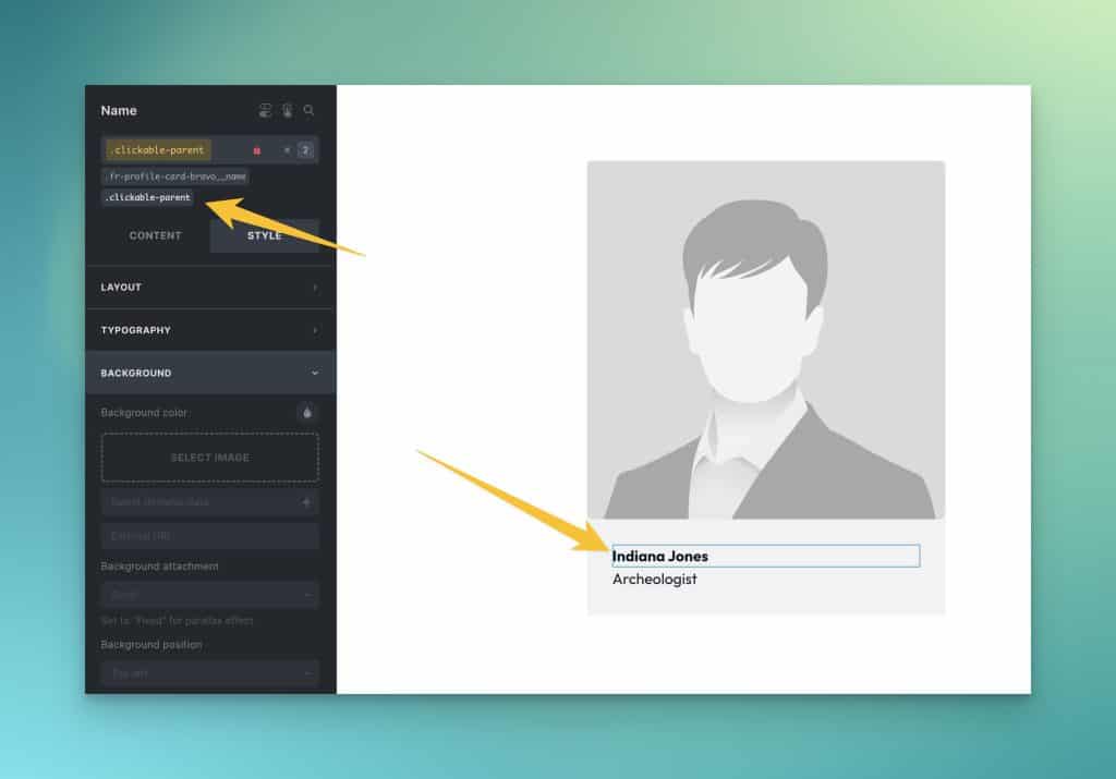
Since we’re using an absolutely positioned pseudo-element, the final step is to change the position of the parent container (the container which contains all the children of the group – the thing you want people to click) to position relative.
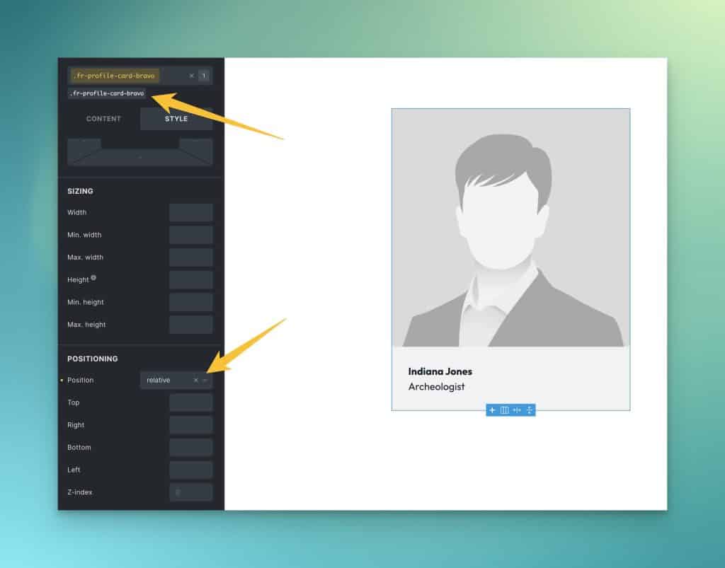
If you don’t change the parent to position relative, the clickable area of the link will extend beyond the bounds of the content group and affect other elements on your page. This is undesirable, so don’t forget to set the parent to position relative.
Congrats! Now you have a clickable content group (a clickable parent element) with the correct link structure and accessibility.
Note: Sometimes builders set certain elements to position relative. Anything that is position-relative is automatically elevated above the clickable area. This will break the clickable nature of your content group. It’s essential to ensure that all elements within your clickable content group are set to position static (this is the default position so it’s typically not necessary to do this manually).
The Clickable Parent mixin
The downside to using the clickable parent class is that you have to apply it multiple times if you have multiple clickable groups (like cards in a grid). This isn’t very scalable or maintainable.
If you have multiple clickable content groups and are using BEM classes, you may want to opt for using our Clickable Parent mixin.
Note: This mixin must be added to a SCSS stylesheet. It will not work in a vanilla CSS stylesheet. If you’re not using SCSS and aren’t familiar with SCSS, then stick with the utility class method above.
Here’s an example of the Clickable Parent mixin in use:
.clickable-card {
   position: relative;
}
.clickable-card__heading a {
   @include clickable-parent;
}
Code language: PHP (php)
Note: The mixin should be used on the actual a or button element.
That’s it!
Clickable Parent in Bricks Builder With BEM Classes
Not using SCSS, but still want to use clickable-parent with custom classes? In Bricks, you can easily do this with the new %root% selector in the CSS input of any element.
Just assign this CSS (we recommend adding it to the parent element, especially if you’re going to be using the Focus Parent technique:
/* Clickable Parent */

%root% {
  position: relative;
}

%root%__[clickable-child]::after {
  content: '';
  position: absolute;
  inset: 0;
  display: flex;
  z-index: 1;
}
Code language: CSS (css)
Let’s assume you have a card with a clickable heading (typical use case). Here’s what it would look like (assuming you’re using BEM and gave your heading the class structure of .[parent]__heading:
/* Clickable Parent */

%root% {
  position: relative;
}

%root%__heading a::after {
  content: '';
  position: absolute;
  inset: 0;
  display: flex;
  z-index: 1;
}
Code language: CSS (css)
Notice that I have selected the actual clickable element, which, in this case, is the a element that’s inside the heading. If your clickable element is a button, you would simply select the button.
Focus Parent
It’s common to want to combine the clickable-parent technique with another technique called focus-parent.
Where clickable parent extends the clickable area of a link to cover an entire parent element, focus-parent alters the focus behavior of that parent element and its children.
In other words, the focus-parent technique also allows your entire clickable element to be focusable. This extends the same click and hover effects that clickable-parent provides to keyboard users.
Wrap-Up
95% of web designers fail to implement clickable content groups correctly. The result is poor link structure, semantic structure, and accessibility.
With ACSS, you can structure things properly in seconds with minimal effort. This is yet another example of how ACSS promotes best practices, helps enhance accessibility, and helps you build better websites with less effort.