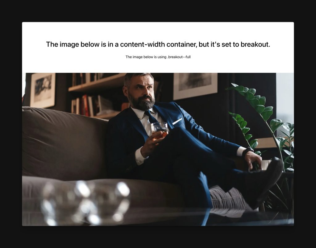
Breakout classes allow you to break an element outside the width confines of its parent. They’re very helpful for making elements wider than their container.
For example, here’s an image in a content-width container, but it’s breaking out to the edges of the viewport because .breakout--full has been used.

Your options for breakout are:
.breakout--s– Equates to 60vw coverage.breakout--m– Equates to 70vw coverage.breakout--l– Equates to 80vw coverage.breakout--xl– Equates to 90vw coverage.breakout--full– Equates to 100vw coverage
Note: Breakout classes other than “full” will not cause content to breakout on devices below 1280px. Rather, they’ll maintain 100% width because there’s no longer anything to break out of. “Full” will always extend edge to edge, though, even on mobile.
Note: “Full” breakouts can cause a horizontal scrollbar to appear in certain browsers. This is due to the browser misinterpreting the need for a scrollbar on 100vw width elements (because the element goes behind the scrollbar area of the browser, the browser believes it needs to add a horizontal scrollbar. This is most common on Windows devices. If avoiding this issue is important to you, use Content Grid to manage content breakouts instead.