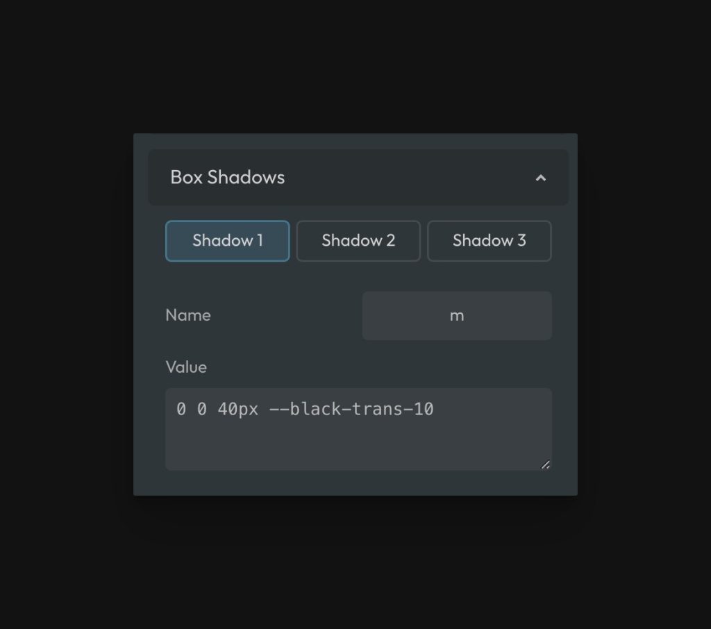
Users can set three custom box-shadows in Automatic.css via the Box Shadows panel in “Additional Styling.” These box shadows can be applied with utility classes as well as variables.
Defining Box Shadows
All three box shadows have default styles, but you can customize them by Going to Additional Styling > Box Shadows.

By default, the utilities for Box Shadow are:
.box-shadow--m.box-shadow--l.box-shadow--xlvar(--box-shadow-m)var(--box-shadow-l)var(--box-shadow-xl)
Box Shadows don’t necessarily have to be customized based on size. They can be customized based on anything (like color or even contextual use). In these cases, you may want to rename them using the “name” field.
Using a custom name will rename all the classes and variables to the name of your Box Shadow, but the box-shadow-- prefix will be retained.
For example, if you name your shadow, “primary,” your utilities for that shadow will be:
.box-shadow--primaryvar(--box-shadow-primary)
For the value field, you can use any valid box-shadow value including compound box shadows. Make sure you omit the semi-colon.
It may be helpful to use a box shadow generator if you don’t know how to write the values yourself.