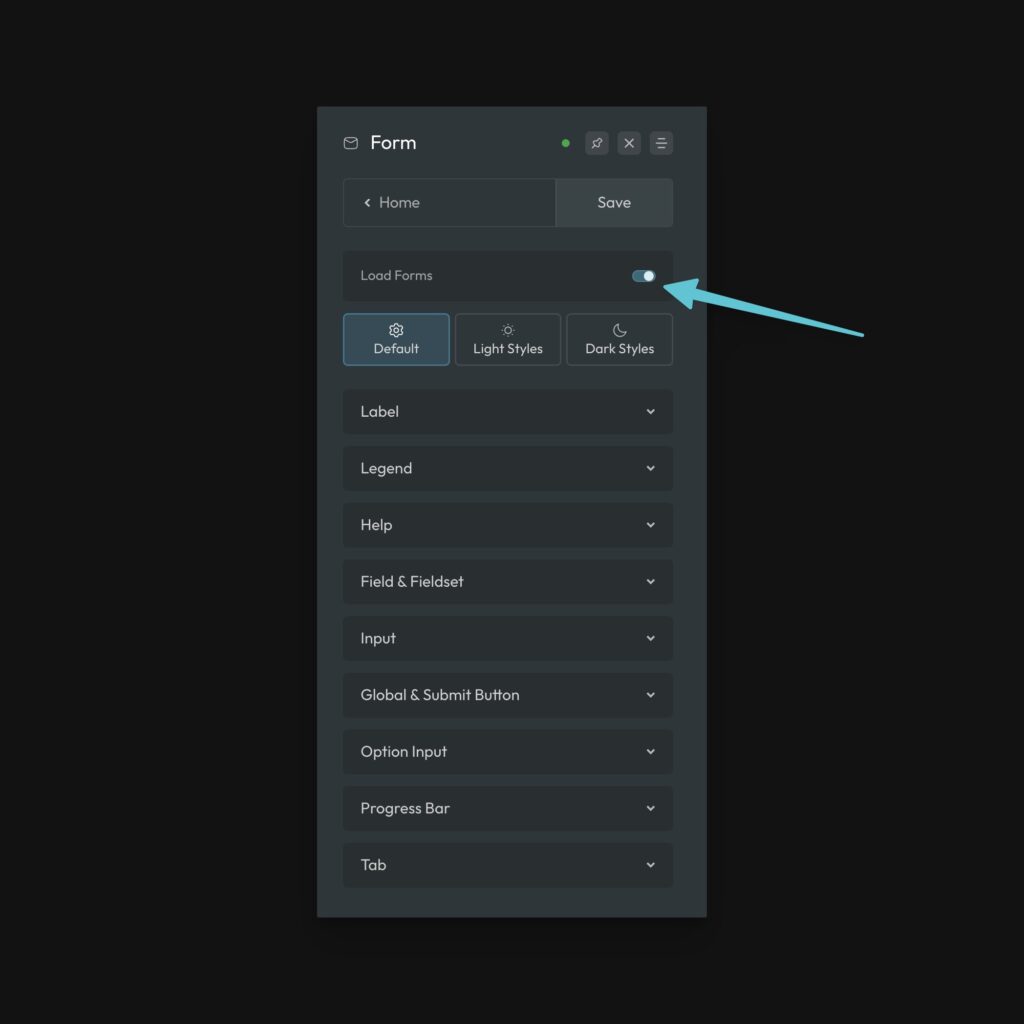
ACSS provides automatic form styling for select form systems. To get started, make sure Load Forms is turned on in the Forms screen of the ACSS dashboard:

Once activated, you’ll see three tabs and multiple settings panels.
Form Styling is divided into three areas:
- Default – All global form styles that are shared between both color styles. This covers things like spacing, font size, gaps, and more.
- Light Styles – All styles associated with a “light” form.
- Dark Styles – All styles associated with a “dark” form.
If you don’t care to use either the dark or light style set, you can simply ignore that particular tab.
The Premise of Form Styling
Most projects don’t have multiple different form styles. As with most things, consistency is the goal. Therefore, all the forms on your site should share certain structural and spacing values. In ACSS, this is done in the Default tab.
Beyond that, you want to be able to customize the colors and look and feel of your forms. The only time form styles need to differ a lot is when you need a dark form versus a light form. Thus, we have a style set for each.
Keep in mind that this is not related to color scheme. The light and dark form styles can be deployed on your website regardless of color scheme settings.
Styling Forms (Form Utility Classes)
ACSS will not style your form unless one of the .form-- utility classes is present. Your options are .form--light and .form--dark.
Once you’ve placed the utility class directly on the form element in the builder, you’ll see the styles change to ACSS’ defaults. You can then configure your styles very easily using live preview.
Supported Forms
The ACSS Light and dark form classes are currently compatible with the following form plugins
- WS Form
- Fluent Forms
- Bricks
Additional form plugins will also be supported in the near future.
Important Note about WS Form
With version 1.10.x, WS Form introduced the new Styler system, offering greater control over WordPress form design.
However, this update has impacted the functionality of our form utility classes. Therefore, we currently recommend disabling the Styler until we have fully refactored our form framework.
When the Styler is disabled, our form utility classes work without any issues.
Disabling the Styler
To disable the Styler and revert to the legacy Customize method, add the following PHP code to your theme’s functions.php file (preferably in a child theme) or as a code snippet:
add_filter('wsf_styler_enabled', function() { return false; });After making this change, navigate to WS Form > Settings and click Save to regenerate the legacy CSS files.