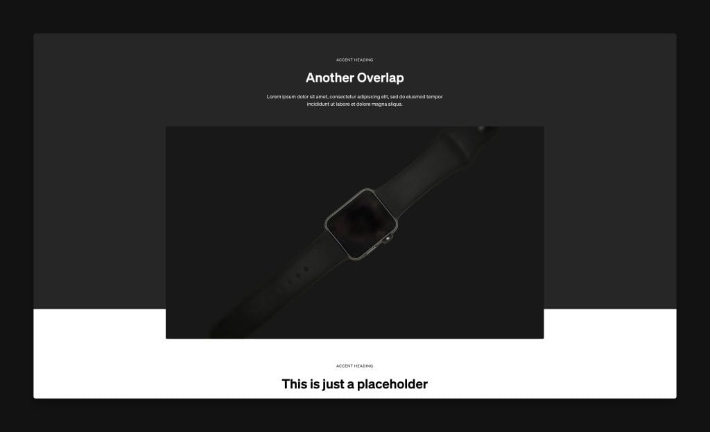
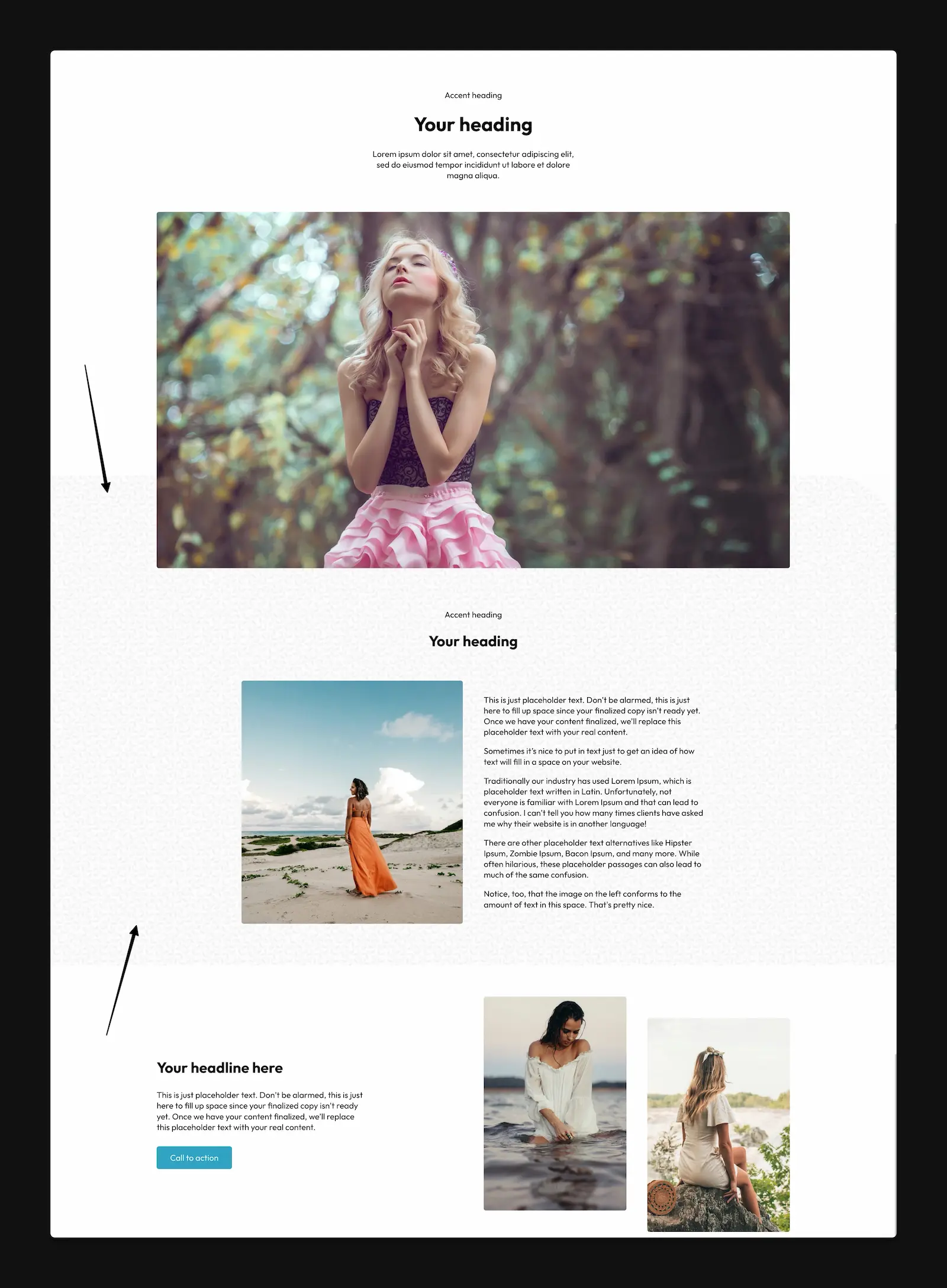
Overlap recipes allow you to quickly create two different types of overlap effects in your design.
Benefits & Compatibilities
Traditional overlap techniques all have various pros and cons. The technique deployed with the @overlap recipe has far more upsides than any other technique and a smaller list of cons.
- Can be applied to classes or IDs.
- Can be manipulated per-instance separately from the class application.
- Supports background color, background image, and background patterns.
- Supports all background attachments, sizes, repeats, etc. including fixed backgrounds.
- Supports an overlay color including gradient overlays.
- Supports masks, clip paths, and custom border radii.
- Supports background styles on the same container.
@overlap;

@overlap is a simple recipe for adding an overlap effect to any box with some unique benefits. The overlap is effectively a background-type style that extends from the top of the box to a stopping point prior to the bottom of the box. The stopping point is user-editable.
@overlap-alt;

@overlap-alt deploys a background to the adjacent sibling box with the overlap extending up into the target box.
Native Properties for Customization
The following variables / custom properties are available for immediate customization when using the recipe:
- –background: Sets the background using any valid shorthand background value.
- –foreground: Sets the foreground color of the adjacent content group (headings and paragraphs by default).
- –overlap-amount: Sets the amount of overlap.
- –overlay: Sets the overlay color or gradient.
Background Images and Patterns
Any valid shorthand background property value will work with the --background variable. This means you can use images and patterns as your overlap effect. You can also declare an overlay for your background using the --overlay property.
--background: url(/wp-content/uploads/geometric-leaves.webp) top / 200px repeat;
Code language: JavaScript (javascript)
Customizing the Overlay
By default, the overlay is set to transparent. To create a uniform overlay, replace both instances of “transparent” with the same transparent color:
--overlay: linear-gradient(var(--black-trans-10), var(--black-trans-10));
Code language: JavaScript (javascript)
To create a gradient overlay, set two different values:
--overlay: linear-gradient(var(--primary-trans-30), var(--secondary-trans-30));
Code language: JavaScript (javascript)
You can use any valid linear gradient, but maintaining the linear-gradient value is required for the overlay to work.
Border Radius
You can use border radius on your overlap effect by adding border-radius to the pseudo element.
%root% + *::before {
  border-radius: 0 150px 0 0;
}
Code language: CSS (css)
Masks & Clip Paths
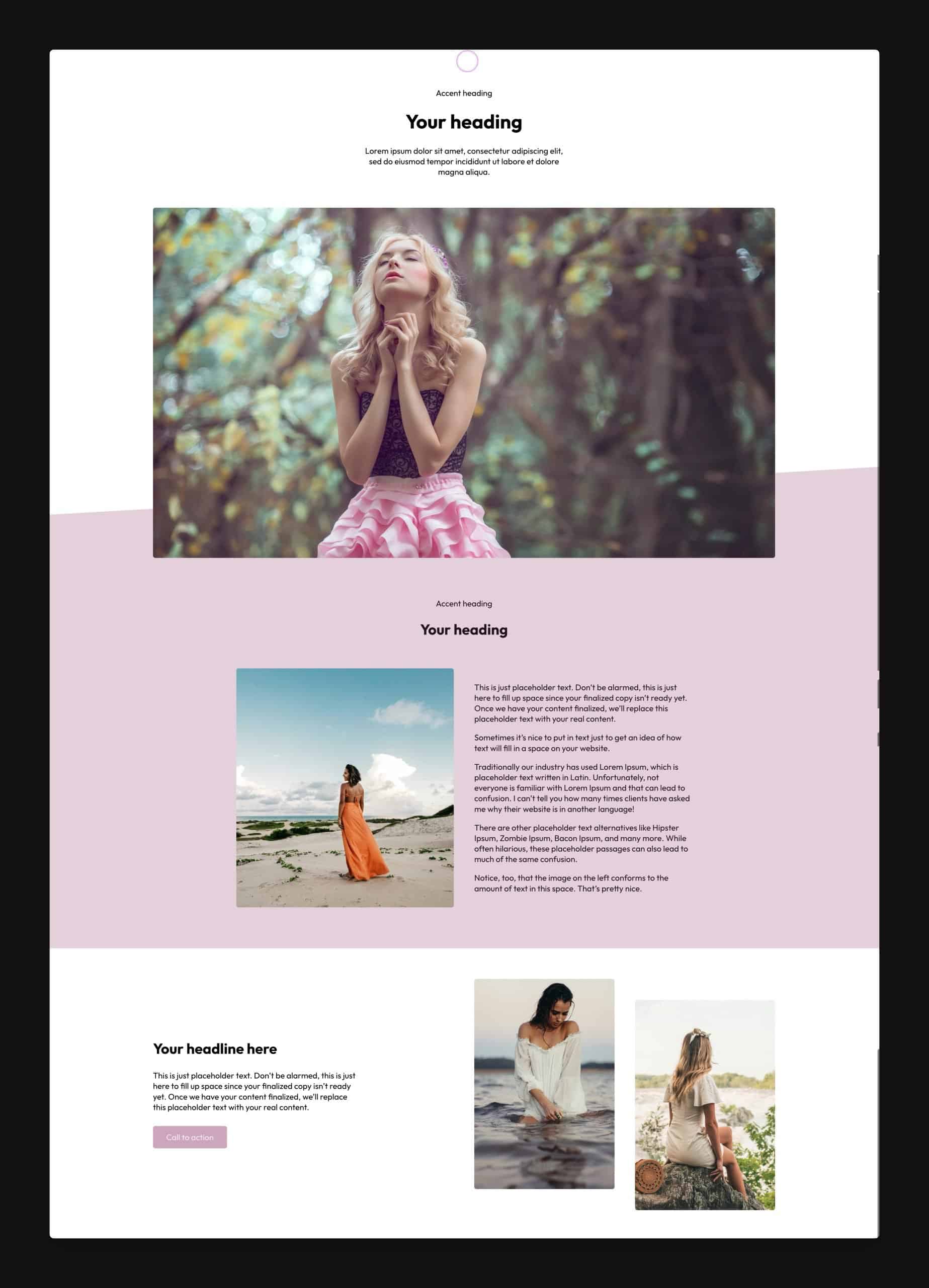
You can create fancier overlap/divider techniques with the use of masks and clip paths.

In the above example, we’re using a clip path to create an angled divider overlap effect. You can apply masks and clip paths to the pseudo element:
%root% + *::before {
  clip-path: polygon(0 10%, 100% 0, 100% 100%, 0% 100%);
}
Code language: CSS (css)
Many other possibilities are available depending on your level of skill, so feel free to play and experiment with this recipe!