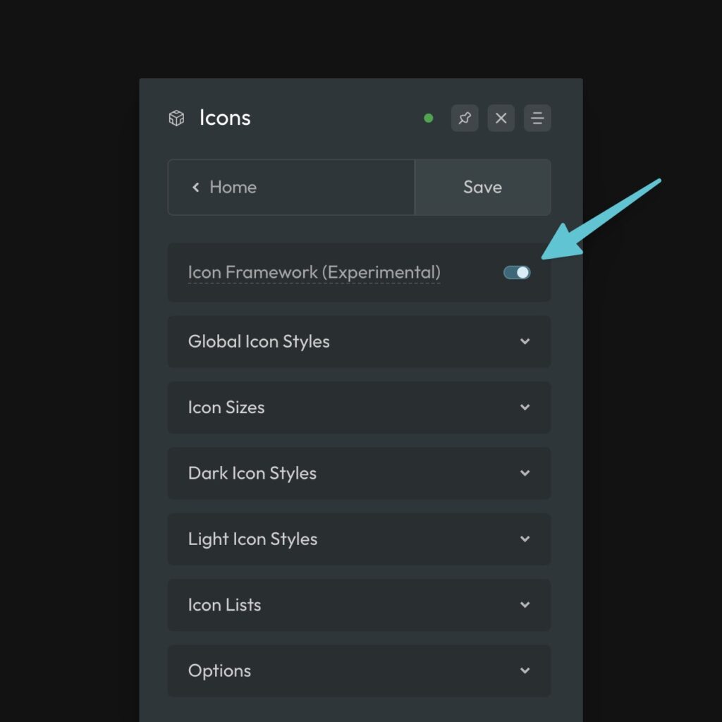
The ACSS Icon Framework makes icon styling a breeze. It’s turned on by default on all new installs, but you can double check that it’s enabled by going to Dashboard > Icons.
Styling Icons
Add an icon to your site using the SVG, Icon, or Code elements.
To apply Icon Framework styling to your icon, you need to add the data attribute data-icon. Here’s an example of how to do this in Bricks:
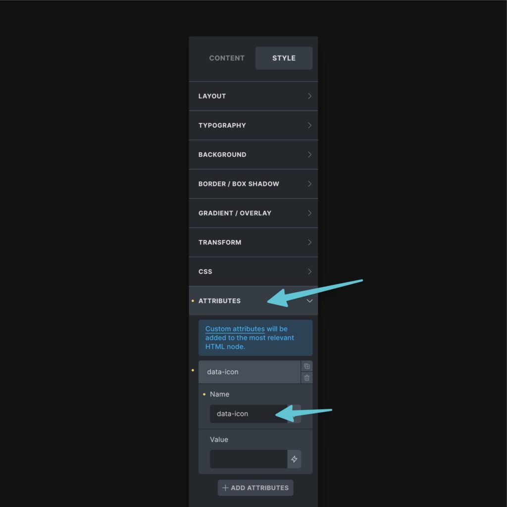
The presence of data-icon does all the work. Once that attribute is present, ACSS is controlling all relevant icon styles by default and the entire Icon Framework is available to you for tweaking.
Note: If using a code element, make sure the code is rendered without a wrapper and that data-icon is added directly to the <svg> element, like this:
<svg data-icon xmlns="http://www.w3.org/2000/svg" ... />
Code language: HTML, XML (xml)
Icon Style: Boxed vs Naked
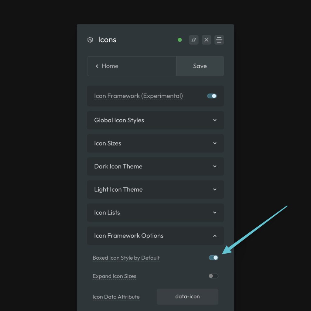
Boxed icons have padding, a background color, border color, etc. You can choose between boxed or naked icons at any time on an icon-by-icon basis, but you can also set the default style for your site in Icon Options.
Benefits of Boxed Icons
- Easier to achieve perfect alignment of icons
- More styling options and more hover options
- Typically looks more consistent
- Easier to cover up imperfections in icon sizes/sets.
If the majority of the icons in your design are boxed, set the default to boxed. If the majority are naked, set the default to naked.
Navigate to Icons > Icon Framework Options and toggle Boxed Icons on/off:
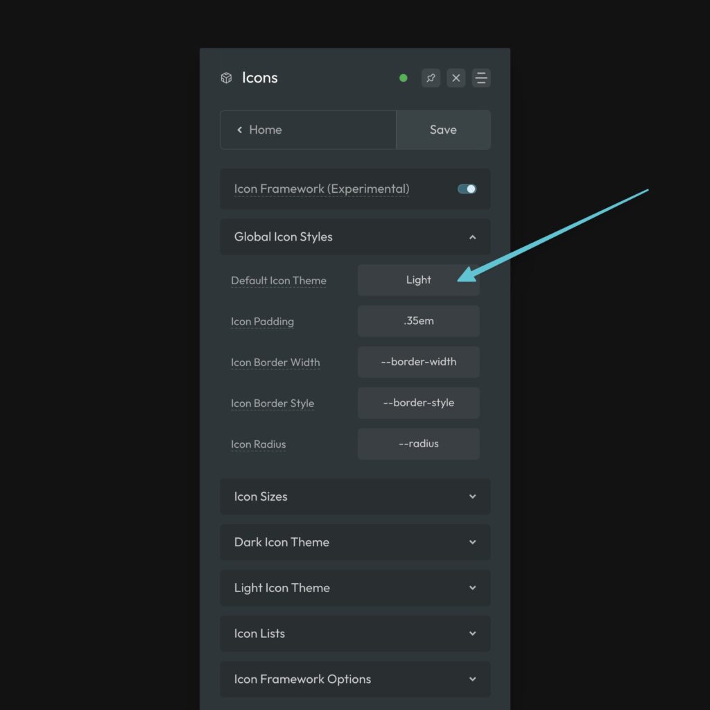
Default Icon Theme & Styling
To get started, set your Global Icon Theme as well as your Default Icon Style.
There are two icon themes to choose from: Light and Dark.
For maximum flexibility in how you use icons across a website, it’s important for the theme name to match the actual icon color, NOT the boxed styling.
For the Dark Theme, you should set a dark icon color.
For the Light Theme, you should set a light icon color.
The styles are not based on the boxed icon styling. The reason for this is simple. If you want to convert an individual icon from boxed to naked, or vice versa, the icon color should not change. If you base the theme styles on the box styling, your icon color may change when you convert an individual icon to naked.
Global Styles are styles that affect all icons regardless of whether they’re Light or Dark.
- Default Icon Style – The color style an icon will inherit by default.
- Icon Padding (Boxed Only) – The padding around your icon (creates the box).
- Icon Border Width (Boxed Only) – The thickness of the border on the icon box.
- Icon Border Style (Boxed Only) – The style of the border on the icon box.
- Icon Radius (Boxed Only) – The radius of the border on the icon box.
Configuring the Light and Dark Theme Styles
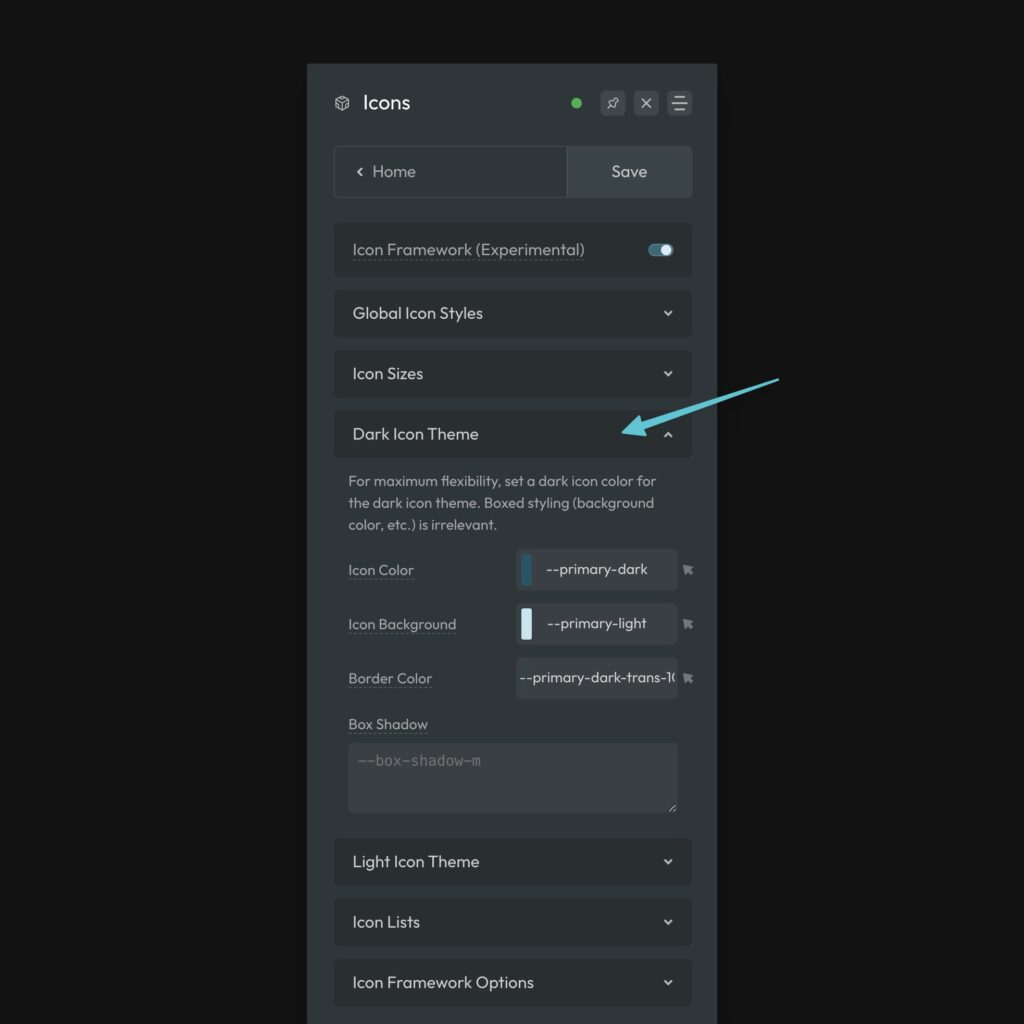
Once you’ve set your default styles, you can set the following styles related to the Dark or Light icon set.
- Icon Color – The color of the icon.
- Icon Background (Boxed Only) – The background color of the icon box.
- Border Color (Boxed Only) – The color of the border on the icon box.
- Box Shadow (Boxed Only) – The shadow around the icon box.
Each of these, except box-shadow, have hover variants you can set by clicking the cursor icon next to the input field.
Icon Sizes
By default, you have three icon sizes to choose from with the default being “M” or Medium.
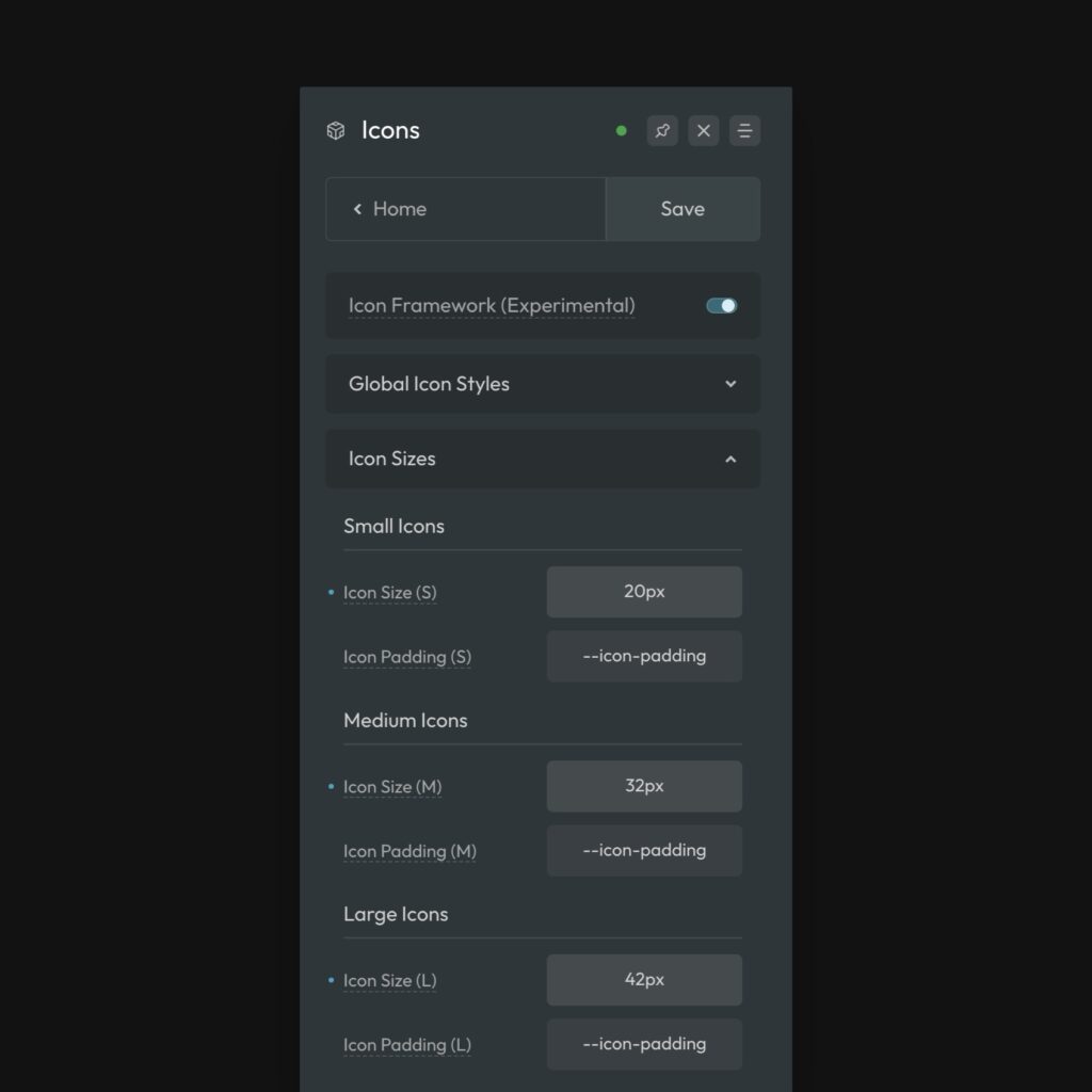
Three options should be enough for most projects, but if you need more you can navigate to Icons > Options and turn on Expand Icon Sizes.
To change the size of an icon, use .icon--{size}. This can be placed on an individual icon or on a group of icons. For example, .icon--l will make an icon(s) adopt the large values.
You control the size of these options from the Icon Sizes accordion. When Boxed Icons is turned on, you can also control the padding values for each size. By default they reference your general icon padding value, which is relative to the size.
Tip: If you feel you need to adjust icon padding, try adjusting the default icon padding value first rather than adjusting the padding of each individual size. This is more likely to maintain padding consistency.
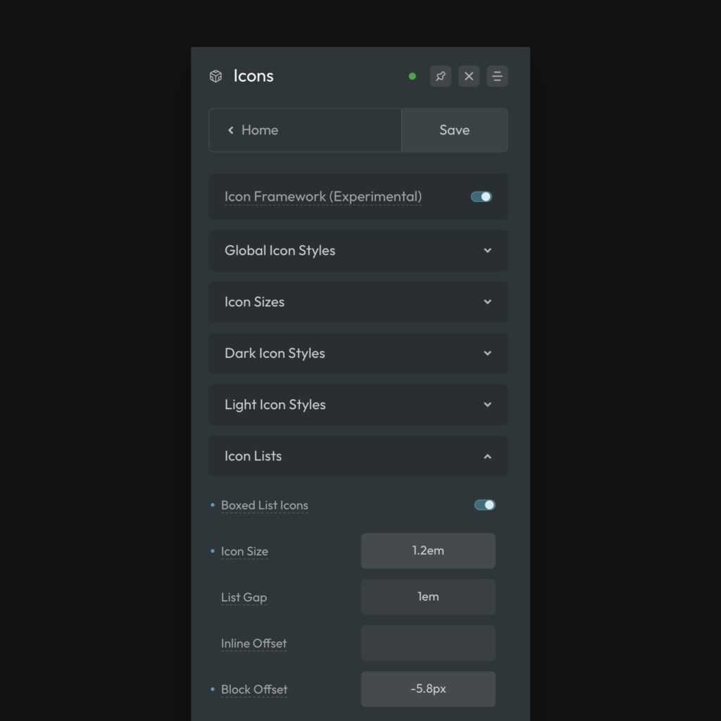
Icon Lists
The Icon Framework has support for icon lists, which also have separate styling options.
You can turn a list into an icon list by applying either the [data-icon-list] attribute to the list element (<ul> or <ol>) or by using the utility class .icon-list.
Either will work:
<ul class="icon-list"></ul>
<ul data-icon-list class="whatever"></ul>
Code language: HTML, XML (xml)
This assumes your icons in the list are still placed with icon elements, SVGs, or Code elements. The framework does not support pseudo element icons out of the box due to CSS limitations.
Once you have an icon list, you can adjust styles accordingly:
- Boxed List Icons – You can turn off the box styling for list icons if needed.
- Icon Size – The default size of an icon in a list.
- List Gap – The space between list items in your list.
- Inline Offset – If the spacing seems off, you can nudge your icons left or right.
- Block Offset – If the spacing seems off, you can nudge your icons up or down.
Overriding the Icon Theme Manually
There are two ways to change the icon theme manually, a utility class and a data attribute. Both methods work on individual icons as well as groups of icons (if applied to the parent).
Class Method:
You can use .icon--light or .icon--dark to change the theme.
Attribute Method:
You can use data-icon-theme="light" or data-icon-theme="dark" to change the theme.
Overriding the Icon Style Manually
There are two ways to change the icon style manually, a utility class and a data attribute. Both methods work on individual icons as well as groups of icons (if applied to the parent).
Class Method:
You can use .icon--boxed or .icon--naked to change the style.
Attribute Method:
You can use data-icon-style="boxed" or data-icon-style="naked" to change the style.
Overriding the Icon Size Manually
There are two ways to change the icon size manually, a utility class and a data attribute. Both methods work on individual icons as well as groups of icons (if applied to the parent).
Class Method:
You can use .icon--{size} to change the size.
Attribute Method:
You can use data-icon-size="{size}" to change the size.
The accepted values are t-shirt sizes: s, m, l, etc.
Overriding Icon Styles with Custom CSS
Every property in the Icon Framework is represented as a variable, making it easy to reference or override any style at any time. You can also deploy icon styling to any icon using the icon() mixin.
Notice for Bricks Users: Bricks uses inappropriate specificity for their default icon styling. In order to override this, we have to use additional specificity. This means that if you write custom CSS to style icons, the styles may not apply. You can use a double root selector %root%%root% {} for your custom CSS to resolve this.