With Automatic.css, you can quickly turn any link (<a>), navigation button (<a>), or literal <button> into a styled button with utility classes.
Every color set in the ACSS dashboard has a corresponding button style with both solid and outline variants and each button style can be customized.
Note: Abbreviated Naming Convention
Only a few classes in ACSS use abbreviations for the name. Buttons are one of them. Instead of writing .button, the naming convention for all button classes is .btn--.
Solid Button Classes
To add a solid button, add a link or button element to the page and then add the class .btn--primary. The link or button is now styled according to the settings you’ve chosen for your website’s primary button.
You can do the same with any of the other colors (secondary, tertiary, accent, base, neutral). For most buttons, we recommend using the primary family as this should map to your website’s primary color.
Light and Dark Button Variants
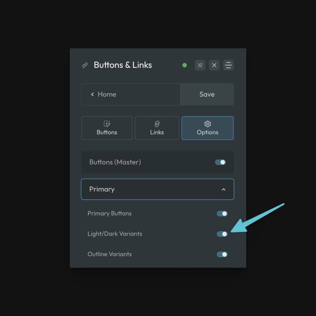
Every button style also has light and dark variants. These are useful for when your button color is clashing with the background of the container. Light and dark variants can be activated/deactivated from the button options in ACSS:

These are applied with classes using the syntax .btn--{color}-{variant}.
For example, .btn--primary-light would give you light variant of the primary button style. You do not and should not combine these classes with the main button style class. Use them independently.
Outline Button Classes

A popular alternative to solid buttons are outline buttons. An outline button has a transparent background and colored border.
Creating outline buttons with ACSS is easy. First, add the button class for the desired color to your link or button (e.g. .btn--primary). Now, add a second class .btn--outline.
The existence of the .btn--outline class swaps the style of your button to the outline variant of the chosen color.
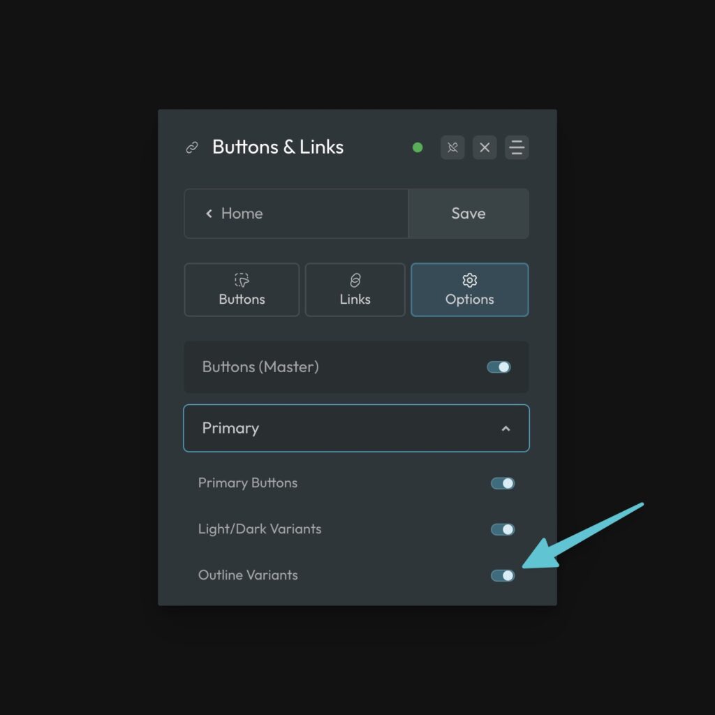
You can customize the styling of your outline buttons in the ACSS dashboard. And yes, .btn--outline is compatible with the light and dark variants as well.
Button Size Classes
Sometimes you want smaller or larger buttons depending on the placement of the button on the page. This is easy to achieve with ACSS using button size classes.
As with most things in ACSS, button classes use “t-shirt sizes” (xs, s, m, l, xl, xxl), so they’re easy to remember.
If you want a large button, add the class .btn--l to your link or button. Add .btn--s if you want a small button, and so on.
Wrap-Up
By mixing and matching various button classes, you can achieve exactly what you want in seconds. For example, if I want a small outline button that uses my site’s action color, it would look like this:
.btn--primary .btn--outline .btn--s
Remember, the order the classes are applied to an element doesn’t matter.