Automatic.css is managed from a Real-Time Dashboard – available in the builder or on the front-end – that features Instant Preview and Hot Reload and various other enhancements.
Opening the Dashboard
The dashboard is available in the builder or on the front-end via both a clickable element as well as a keyboard shortcut. You can also quick-open to specific areas of the dashboard with additional keyboard shortcuts.
Keyboard Shortcuts
The most convenient way to open the dashboard is with one of many keyboard shortcuts. You can manage these shortcuts in Options > User Shortcuts.
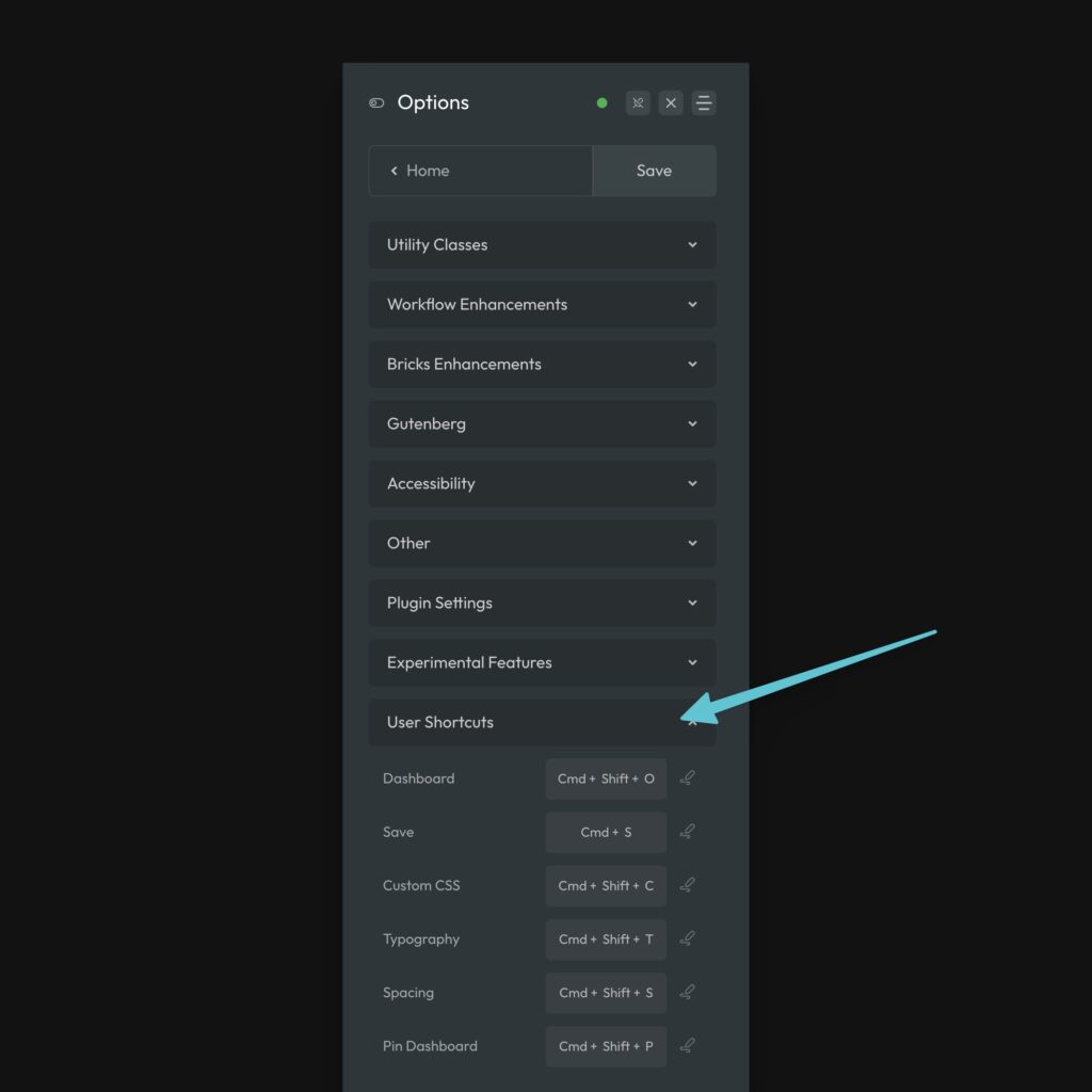
The default shortcut for opening the dashboard is CMD + O. Alternative you can quick open to these areas:
- Custom SCSS:
CMD + SHIFT + C - Typography:
CMD + SHIFT + T - Spacing:
CMD + SHIFT + S
You can save changes with CMD + S, force save changes with SHIFT + CMD + S, and pin the dashboard with CMD + SHIFT + P.
To record your own keyboard shortcut for any of these, simply click the pencil icon to the right of the input and then press and hold the desired key combination.
Click to Open
To ensure the highest degree of accessibility, there’s at least one click trigger to open the dashboard at all times. The existence of the admin bar on any given page will determine which trigger you see.
WP-Admin Bar Trigger
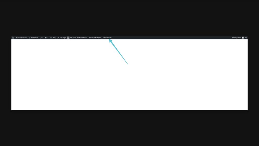
When the wp-admin bar is available on the page, the click trigger for the ACSS dashboard is the Automatic.css link in the admin bar. Click this link and dashboard will open. Clicking again will close it.
Floating Canvas Trigger
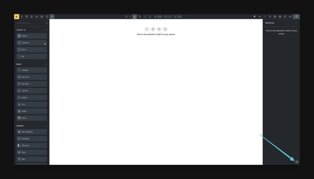
When the wp-admin bar is not active on the page, you will see a floating icon on the canvas. This icon will open and close the dashboard when clicked.
Dashboard Organization & Instant Search
The dashboard is organized into specific areas of the framework, but also features instant search which will expose all features and settings related to your search phrase.
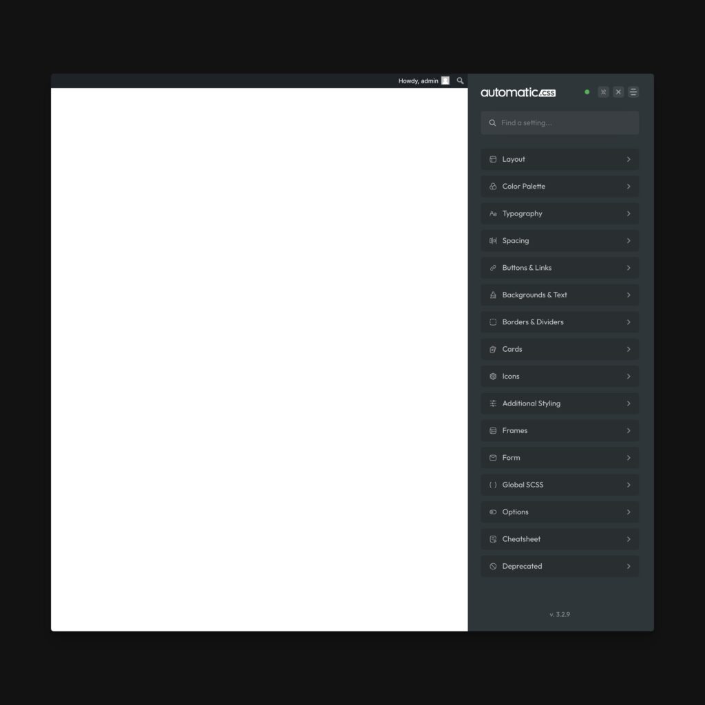
While ACSS is a very robust tool, the dashboard is designed so that almost every setting is less than three clicks away.
Instant Preview
As you change and adjust settings in the ACSS dashboard, you can see the effect of those changes on the canvas in real time. This works whether you’re in the builder or on the front-end.
It should be noted that Instant Preview is not compatible with every single input in the dashboard, though well over 97% of inputs are compatible. If you are changing an input and you don’t see the changes happening in real time, you’re advised to save the change, close the dashboard, and reload the page.
While live preview is very accurate in almost all cases, it’s accomplished with injected inline styles and is not a reflection of the actual enqueued stylesheet until you save and refresh.
Note: For greatest accuracy in seeing what the stylesheet is doing, you should reload the page with the dashboard closed. When the dashboard is open, live preview can influence what you’re seeing.
Warning: Custom SCSS is currently incompatible with Instant Preview when using SCSS mixins or functions. We’re working on making the SCSS processor compatible with Instant Preview.
Hot Reload
When you save changes in the ACSS dashboard, there’s usually no need to manually refresh the page. ACSS’ hot reload feature will instantly reload the stylesheet, showing you the newest version of the site.
In the small number of cases where there’s a discrepancy between what you’re seeing and what you think you should be seeing, close the dashboard and attempt to hard refresh the page manually.
Change Notice
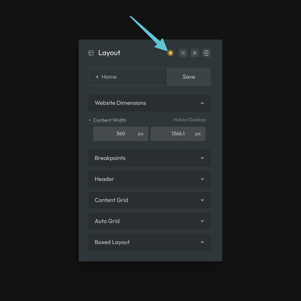
A colored icon in the header lets you know whether the dashboard is in sync with the stylesheet or if there are changes that need to be saved:
- Green circle: Stylesheet is in sync. No changes need to be saved (
SHIFT + CMD + Scan force a save here). - Yellow circle with an extra ring: Changes have been made and will be lost if you reload or leave the page without saving.
When the yellow dot is present, you’ll also receive a browser warning when trying to leave the page without saving.
Input Interactions
There are a number of things you should know about the ACSS dashboard when you’re interacting with it. Here are some tips:
- You can arrow up/down in number fields to increase or decrease the increment value. You can shift + arrow to increase whole numbers in cases where the input is increasing the decimal.
- You can arrow up/down through variable families. If the input has an ACSS variable as its value, you can arrow up/down through related variables. For example, if you have –text-m as a value, arrow up/down will cycle through the remaining t-shirt sizes.
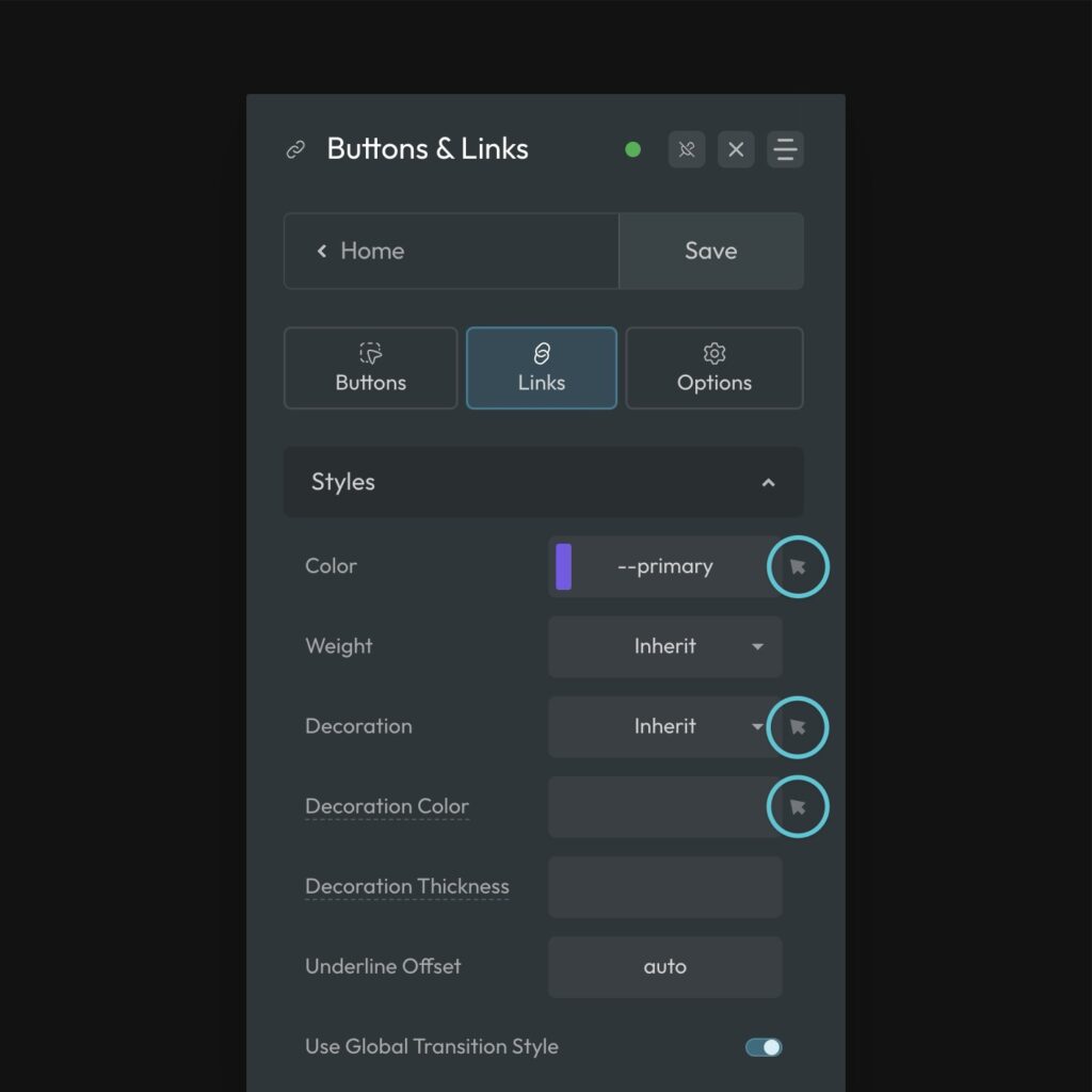
- Color values will produce a swatch preview. If you put a valid color value in an ACSS input, the input will produce a swatch representation of your color.
- ACSS auto-wraps
var()functions. Writingvar()over and over again is not required. Just type double dash and the name of your variable. ACSS will handle the var functions on the backend. If an input has more than onevar()in it, you’ll see thevar()just for clarity. If there’s only one var(), ACSS will strip it to keep the input as clean as possible. - Auto-calc. You don’t have to write
calc()when doing a formula. Just write the formula and ACSS will auto-wrap it incalc().
Hover Styles
Inputs that allow you to set a hover style will have a small cursor icon next to them. Clicking the cursor will swap to the hover style input for that property.
Clicking the icon again will swap back to the non-hover input. When the icon is illuminated, you’re looking at the hover value. When it’s grey, you’re looking at the non-hover value.
Palette Configuration
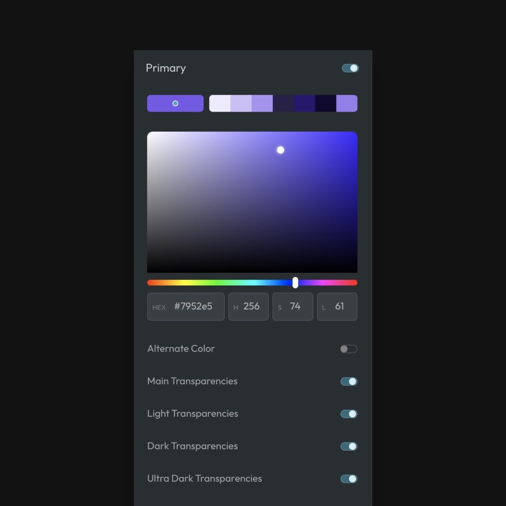
All colors are configured the same way. Start by pasting or typing your hex code into the hex input or selecting a color with the color picker. ACSS will calculate the HSL values and automatically configure all shades for that color.
You can customize each individual shade by clicking on its swatch in the top row next to the color’s main swatch and adjusting the HSL values. The shades are listed in order from lightest to darkest, with “hover” being the final swatch.
Remember, “hover” is a color shade in ACSS for each color. You’re not setting a specific hover style on anything here – it’s simply a shade you configure and use for hovers of that color when needed.
When adjusting shades, you’re mainly going to be changing the lightness value. Next important would be adjustments to saturation. Rarely will you change the hue and only by a few degrees max.
Below the color configuration area are your settings for controlling which transparencies are loaded and available and whether or not you’re going to include color scheme support for that color.
Alternate Color / Color Scheme Support
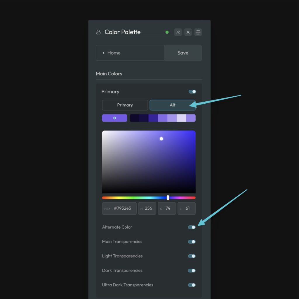
When you activate “Alternate Color” for any given color, a new “Alt” tab will appear above the swatches area. Clicking the tab will reveal all the settings for the Alt color and its shades. Configure this alternate color however you’d like.
Cheatsheet
A full cheatsheet of all ACSS class, variables, and recipes is available in the dashboard. From the home screen, select “Cheatsheet.” You can also copy to clipboard from here.