A unique feature of Automatic.css that you probably won’t see in other frameworks (unless they follow suit) is the ability to set text and heading line length caps.
The line length of content – the number of characters per line of text – is one of the most critical aspects of quality UX design on the web. Amateur web designers are notorious for creating content that is too wide visually.
Why line length is important

Text content that is too wide forces the user’s eyes to scan too far left and right. Numerous tests and studies have shown that this makes text content “intimidating” and overwhelming.
Additionally, line length influences reading comprehension and reading motivation. In copywriting, you’re taught that the job of the first sentence is to get the person to read the second sentence, and so on.
If you’re going to put effort into your copy to motivate the reader in that fashion, you shouldn’t then de-motivate them with a physical design error.
Reader motivation spikes every time the reader gets to a new line of text. Just think about reading a book. New lines spike motivation, just as turning the page spikes motivation.
Motivation drops as pages get longer and as lines get longer. So, too, does focus, which affects comprehension.
The result is that wide text content has far lower readability and worse comprehension. And since we presumably want the user to read and comprehend our content, we should prevent this.
The optimal line length of text
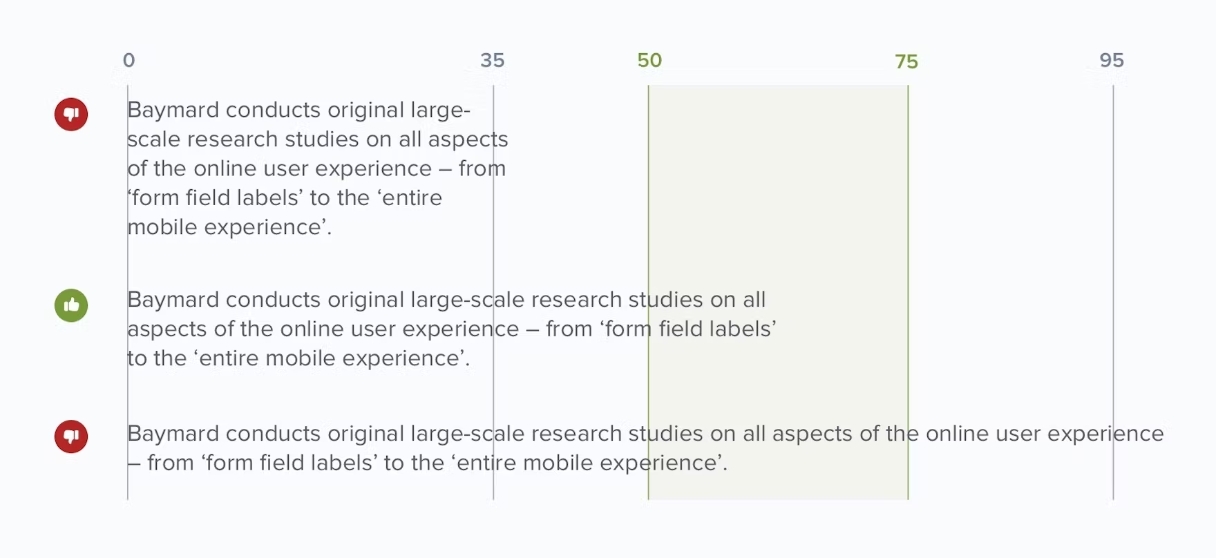
Proper line length is typically expressed with a specific character count. Research shows that the optimal line length of the body text on the web is between 50 and 60 characters.
That assumes your text is between 16px and 20px.
The tricky thing about text line length is that the optimal character count changes as text gets bigger. To complicate matters further, not all characters are the same width. So a good character count with one typeface may not be acceptable with a different typeface.
There’s really no need to overthink it, though. All you need to know is that text that’s too wide is hard to read, so you should put caps on line length that prevent text from getting too wide.
Layout-based line length caps
Have you noticed that certain types of layouts are very popular on the web?
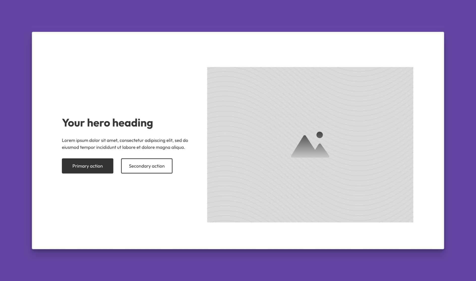
Take a common layout like this as an example:

This isn’t an accident. Websites are too wide for most text content, so good UX designers use visuals and other techniques to put natural line-length caps on text.
When the heading and lede paragraph are contained in that left column, they’re easier to read. A user can quickly digest that content without scanning all the way from left to right.
In this scenario, we don’t have to worry about the number of characters per line. The section layout naturally caps the length of each line.
CSS-based line length caps
Some layouts don’t naturally cap line length. When this is the case, we need to cap line length with CSS.
We do this by setting a max-width using “ch” units. The “ch” stands for “character” and it’s a way to control width based on the standard width of a “0” character at a given font size.
It’s not exact, but it’s more or less accurate.
We use max-width because we only want the cap to take effect if the line length happens to reach that cap. If the line length is shorter than the max, that’s fine too.
This is all handled for you by ACSS.
How to set a max line length in ACSS
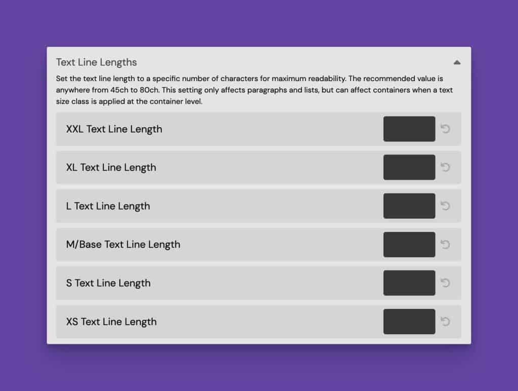
Line length is controlled via the Typography panel in ACSS. You can set a maximum line length for every text size and every heading size:

Line length is not set by default, so the inputs are blank out of the box.
Put a “ch” value into the input field for each text size to set a line length. The input accepts any unit, so you need to explicitly write the full ch value, e.g. 48ch.
This will automatically affect all paragraphs, list content, and anything that uses a text size class, such as .text--l.
You can repeat the same process for headings.
Setting your line lengths properly will ensure that all text content on your site is maximized for readability and comprehension.