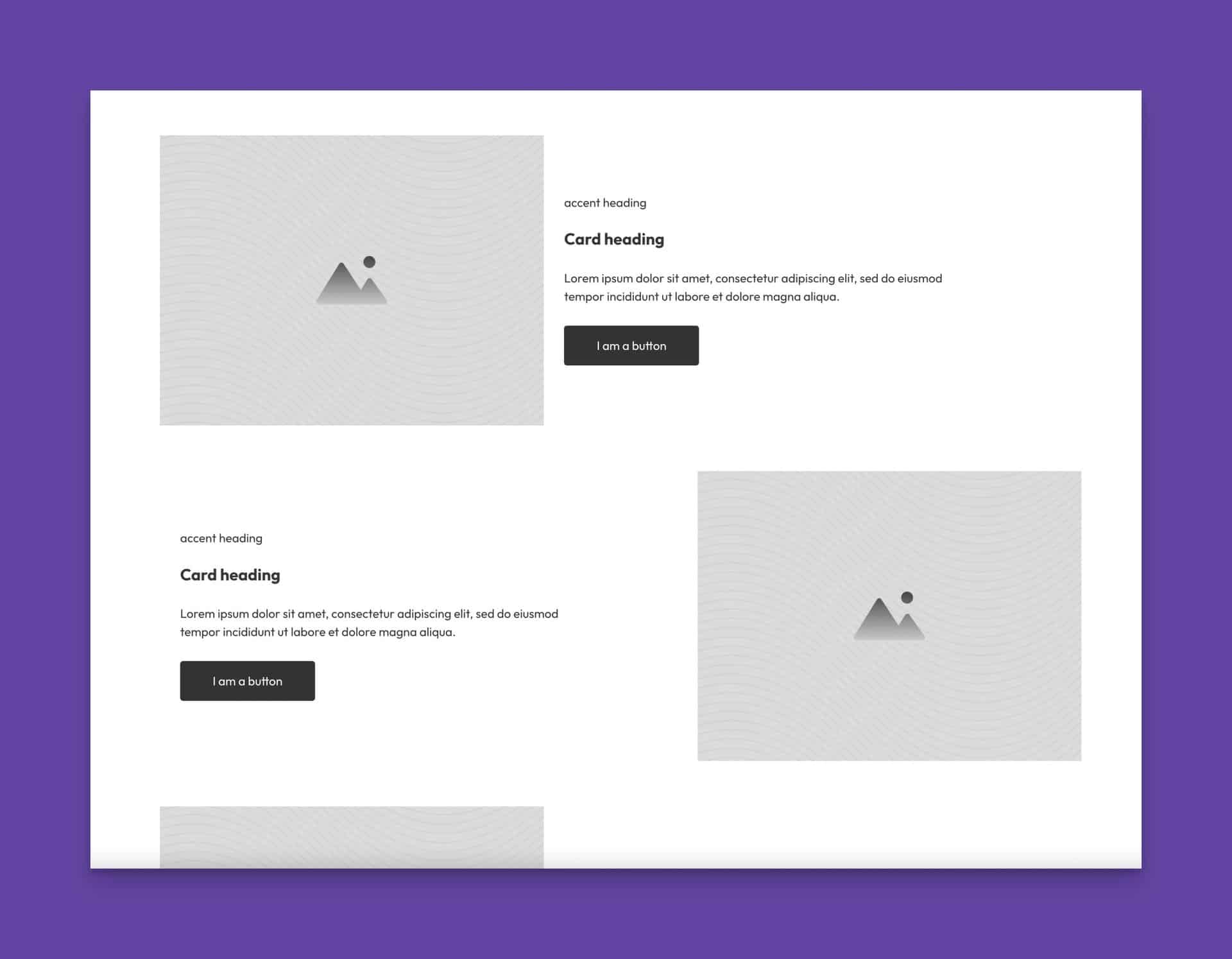
ACSS is one of the only frameworks to offer utilities for automatically alternating, two-column grids. This is a typical layout technique on the modern web where text is placed in a column next to an image or other media, and then in the next row, the two items switch positions. This pattern repeats back and forth.

How to create an auto-alternating grid
- Create a container for all your two-column grid “rows.”
- Create your two-column layout using
.grid--classes. You can use even grid like.grid--2or any of the uneven grid classes, such as.grid--2-3. - Duplicate the “row” as many times as needed.
- Decide which breakpoint (and up) you want the grids to start alternating at (you typically don’t want them alternating their content on mobile devices.
- Add a
.grid-alternate--class that matches the smallest breakpoint you want them to start alternating at. This is a “min-width” media query, so it will affect your grid at the chosen breakpoint and UP (not down). For example,.grid-alternate--lwill alternate your row content at the L breakpoint and up. - Don’t forget to use the other
.grid--media query classes to make your grid responsive.