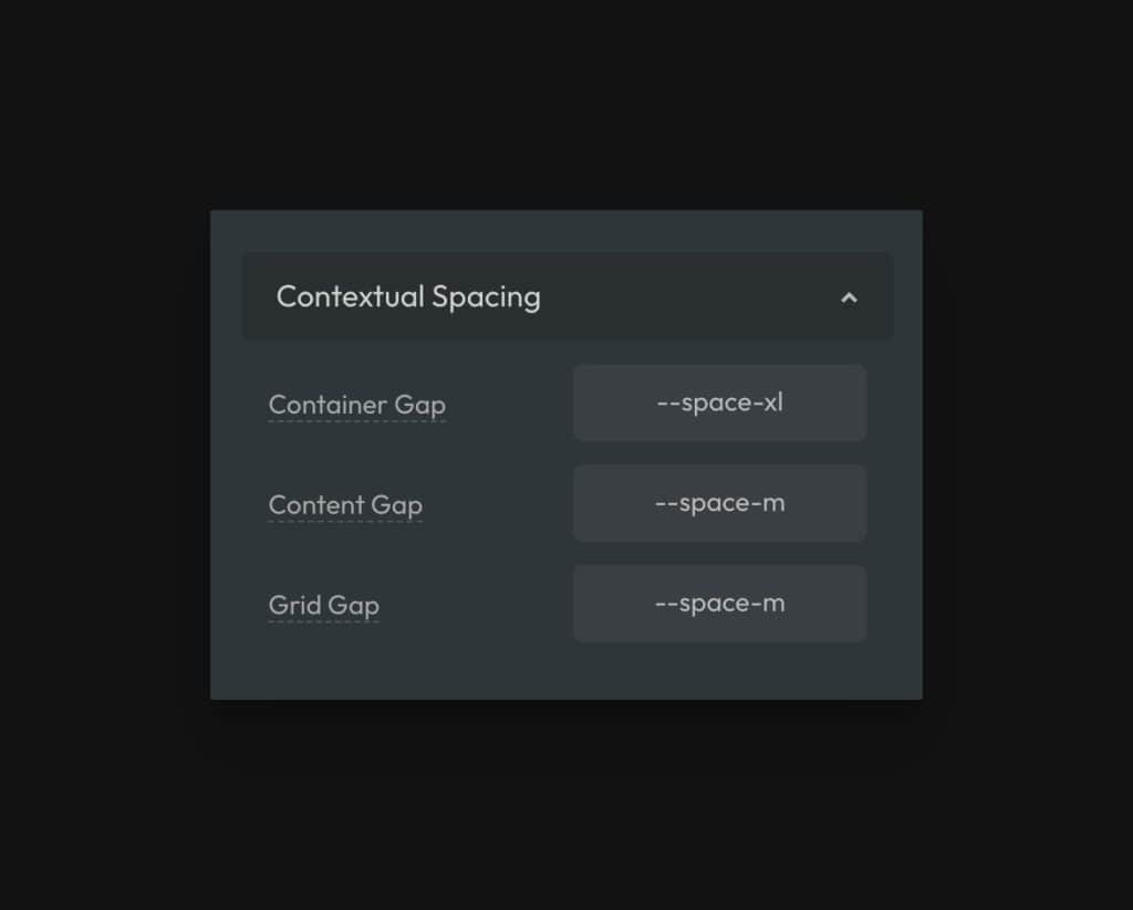
Contextual Spacing refers to spacing within a specific context. For example, the standard gap value you repeatedly use within grids or the space between content elements.
Imagine someone saying, “Use my gap value” on that element. Can you imagine what they’re referring to? Probably not. Gap is a spacing property but doesn’t refer to any meaningful context.
When someone says, “Use the grid-gap value,” they give you a reference point. You can look at all grids across the site and see they often use the same gap value.
Since consistency is desirable in web design, good designers will use consistent values within repeating contexts. In ACSS, we’ve identified three primary spacing contexts that call for consistency:
- Container gap
- Content gap
- Grid gap
We’ve created utilities for these gap values and they’re one of the most important and impactful features in ACSS.
Container Gap
The container gap is the spacing between containers in section elements. A container is the direct child div of a section element that establishes your website’s content width.
It’s often desirable to have multiple containers in a section as you work to group associated content.
Content Gap
Content gap is the equal space between all content elements on your website (headings, text, images, list containers, etc.).
Grid Gap
Grid gap is the gap between items in grids and columnized content.
Contextual Spacing Setup
You can set values for these contextual utilities via the ACSS Spacing tab.

Notice that we’re not using random values here. We’re using ACSS variables for automatic responsiveness and maximum consistency.
We’re really just taking existing variables and giving them a specific context. While this is a simple concept, it’s insanely impactful – so much so that I have no idea why other frameworks don’t encourage this.
Using Contextual Spacing
Once your utilities are setup, start using them in every situation that calls for them.
When you have multiple containers in a section, use .container-gap or var(--container-gap) on that section’s gap property.
When you have multiple content elements in a container of any kind, use .content-gap or var(--content-gap) to space your content evenly. It’s advisable to make sure you have Smart Spacing turned on in these situations.
When you’re using a grid or creating columnized content, use .grid-gap or var(--grid-gap).
Multiple values in one
What if you’re in a situation where you want a little extra or less spacing than these utilities offer? Should you abandon the utility and use a different utility or custom value instead?
No.
You should only abandon these utilities if you’re abandoning the context they were created for. That’s rarely the case, so stick with the utility even if it doesn’t give the desired result out of the box. Instead, calc it!
Let’s say I actually want double the typical grid gap for an individual grid.
.my-grid {
   display: grid;
   grid-template-columns: var(--grid-3);
   gap: calc(var(--grid-gap) * 2);
}
Code language: CSS (css)
This is a really fantastic approach for multiple reasons:
- I don’t have to think very hard (coming up with a new responsive clamp, for example).
- I’m not going to litter random values everywhere.
- I’m not using a spacing variable with no context.
- If I ever adjust my global grid gap value, this grid will still adjust itself accordingly.
- The value is relative to a value I use elsewhere, so consistency is maintained.
Try it, you’ll fall in love.
Automatic Contextual Spacing

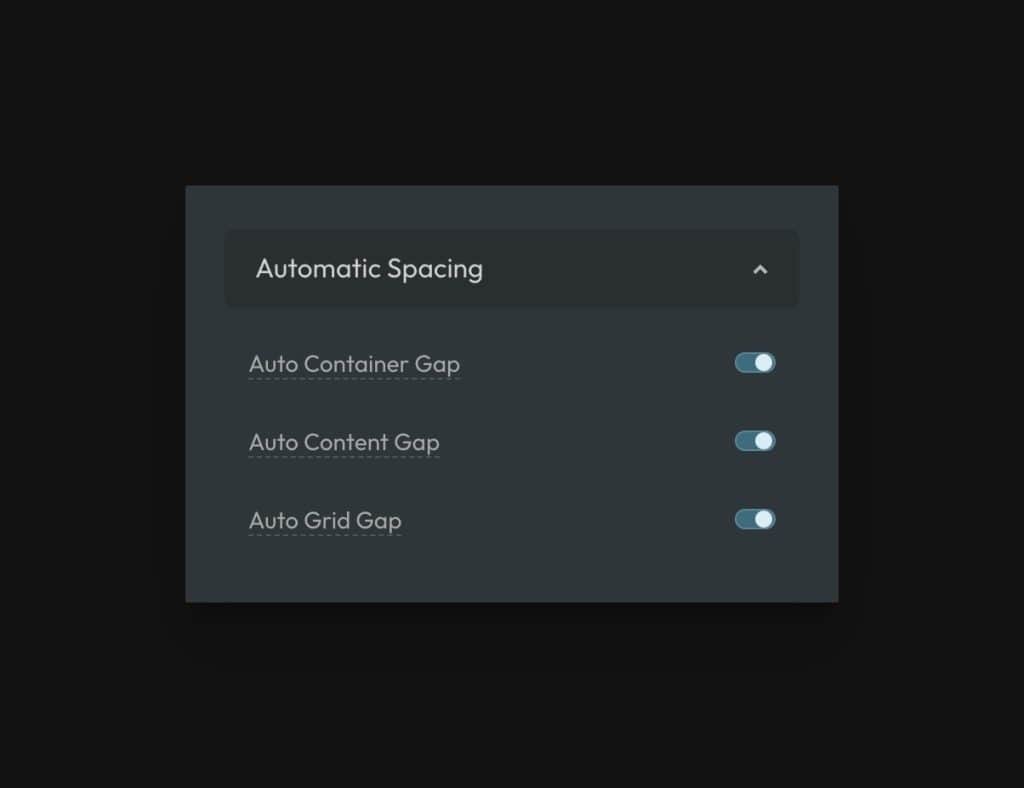
As of version 2.6, you no longer have to manually use contextual utilities within sections, containers, and grids. Simply activate Automatic Contextual Spacing and ACSS will apply the spacing for you automatically.
- ACSS will target all
sectionelements and apply container-gap spacing between divs that are direct children of thesectionelement. - ACSS will target all divs/containers that are direct children of
sectionelements and apply content-gap spacing. - ACSS will target all div/block elements in general and apply content-gap spacing.
- ACSS will target all grids that use grid utility classes and apply grid-gap.
To avoid conflicts and make it easy to override automatic spacing, ACSS applies these spacing values with zero specificity. The automatic spacing can be overridden at any point with other utility classes, custom classes, ID styling, inline styling, or global styling with any specificity value.