Sections, and the default spacing they provide, are a critical aspect of modern web design.
Automatic.css controls section spacing by default while giving you the ability to adjust it as needed per the design.
Anatomy of a Section
There’s a great article on section structure in web design that you should read if you really want to understand the importance of sections. ACSS follows this basic section structure by default.
Section Spacing Defaults
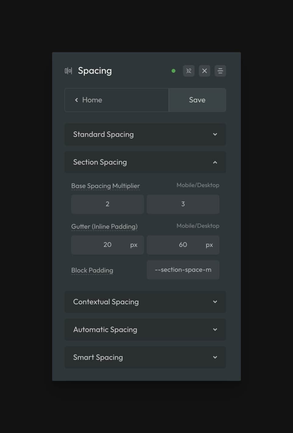
Block padding (top and bottom) and inline padding (left and right) are both controlled via the dashboard:

Section spacing uses the Base Spacing values from the regular spacing system and multiplies them to make them bigger and more appropriate for sections. The amount it’s multiplied by is set via the Base Spacing Multiplier input.
You can choose whatever values you want for the multiplier. The first number is how much it’s multiplied on mobile and the second number is how much it’s multiplied on desktop. The multiplication is actually fluid between those two numbers, so there are no breakpoints involved.
The “Gutter” inputs let you set the inline padding (left and right) via a responsive clamp function, and the “Block Padding” input is where you set the block padding (top and bottom) via a section spacing variable.
Note: The “Block Padding” input accepts two values. If only one value is given, it’ll be used for both the top and bottom value. If two values are given, the first value is used for the top and the second value is used for the bottom (it’s not recommended you touch this unless you know exactly what you’re doing and why you’re doing it).
All of the inputs in this section map directly to the “M” (medium) section spacing value. Other section spacing sizes are generated using the Spacing Scale from the regular spacing system.
What Section Spacing Affects
Section spacing in ACSS affects the following:
- Default section elements (spacing is set on top level section elements by default).
- Section Spacing Variables
- Section Classes