Where clickable parent extends the clickable area of a link to cover an entire content group, focus parent alters the focus behavior of that content group. In other words, the focus-parent technique also allows your entire clickable element to be focusable.
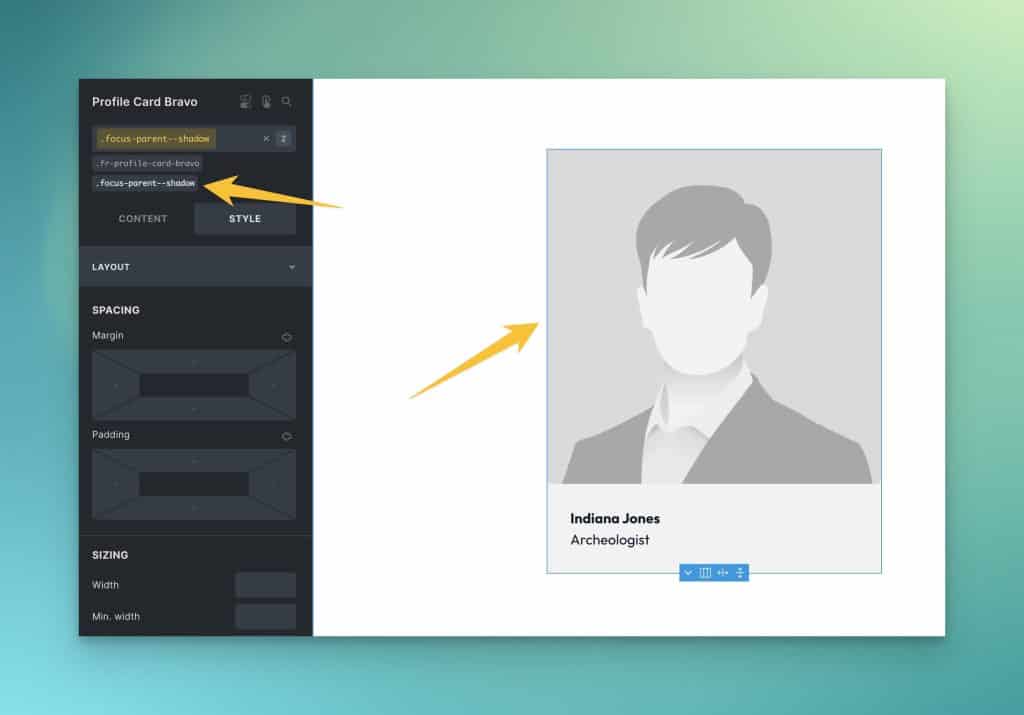
The Focus Parent Utility class
If you want the entire element to be focusable, you need to alter the focus behavior of the parent and child elements. You must remove focus from the clickable item and then apply focus to the parent element. This is done using :focus and :focus-within styling.
Again, you don’t need to know the technical details. You only need to know how to use the provided utilities.
.focus-parent--shadow and .focus-parent--outline are your options in this situation. Both will do what you want but with slightly different behavior.
.focus-parent--shadow applies focus to the parent using a box shadow style and .focus-parent--outline will apply focus to the parent using an offset outline style. Both classes will remove focus from the link within the content group.
There’s no right or wrong here. It’s user preference.
All you need to do is apply the class to the parent element (the same element you set to position relative).
The Focus Parent Mixin
Much like the Clickable Parent mixin, the Focus Parent mixin allows you to manipulate the focus styling of a BEM class so you don’t have to litter utility classes everywhere.
Using our example above, here’s what the execution looks like:
.clickable-card {
   position: relative;
   @include focus-parent(shadow);
}
.clickable-card__heading a {
   @include clickable-parent;
}
Code language: PHP (php)
As with the utility class, your options are “shadow” or “outline.”
Focus Parent in Bricks Builder With BEM Classes
If you need to assign focus-parent to a custom class in Bricks Builder without using SCSS, you can use this code snippet on the parent element class:
%root%:focus-within :focus {
  outline: none;
  box-shadow: none;
}

%root%:focus-within {
  box-shadow: 0 0 0 var(--focus-width) var(--focus-color);
}
Code language: CSS (css)
The first instruction removes the focus styles from focusable children, and the second instruction adds a box-shadow focus style to the parent element.
You could optionally use the outline style by replacing the second instruction with this:
%root%:focus-within {
  outline: var(--focus-width) solid var(--focus-color);
  outline-offset: var(--focus-offset);
}
Code language: CSS (css)
Whether you use the box-shadow or outline focus style depends on the situation and the effect you’re trying to achieve.
Also, if you want to use custom values for the tokens on a given element, you can redefine them on the parent element’s root selector:
%root% {
  --focus-width: [new-value];
  --focus-color: [new-value];
}
Code language: CSS (css)
Let us know if you have any questions!