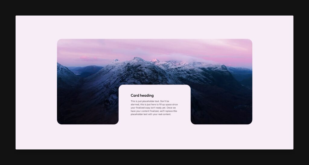
Inverted radii are not a native feature of CSS. Therefore, inverted radius implementation is typically quite technical and time consuming. But, with ACSS’ Inverted Radius Framework, you can implement inverted radius in your designs in seconds with no technical understanding of the technique.
Identifying Inverted Radius
Before you can implement inverted radius, you have to be able to identify it when you see it. The example above is created with a box that groups “Card heading” and the card text together. That box is positioned at the bottom of the parent box. Padding is added to the box to create space around the content.
The top two corners of that box are normal radius. You can achieve it by applying radius to the top left and top right while keeping the bottom left and bottom right radius at zero.
.box {
  border-radius: var(--radius) var(--radius) 0 0;
}
Code language: CSS (css)
The bottom two corners have an inverted radius that fold back into the parent. This is the part of the design that’s not natively achievable with the border-radius property in CSS.
Any time you see a border that curves away from the box that appears to create it, that’s an inverted radius.
Activating the Inverted Radius Framework
Since you won’t need inverted radius on every project, the Inverted Radius Framework is off by default. You can turn it on by going to Borders & Dividers > Additional Radius Options > Inverted Radius Support.
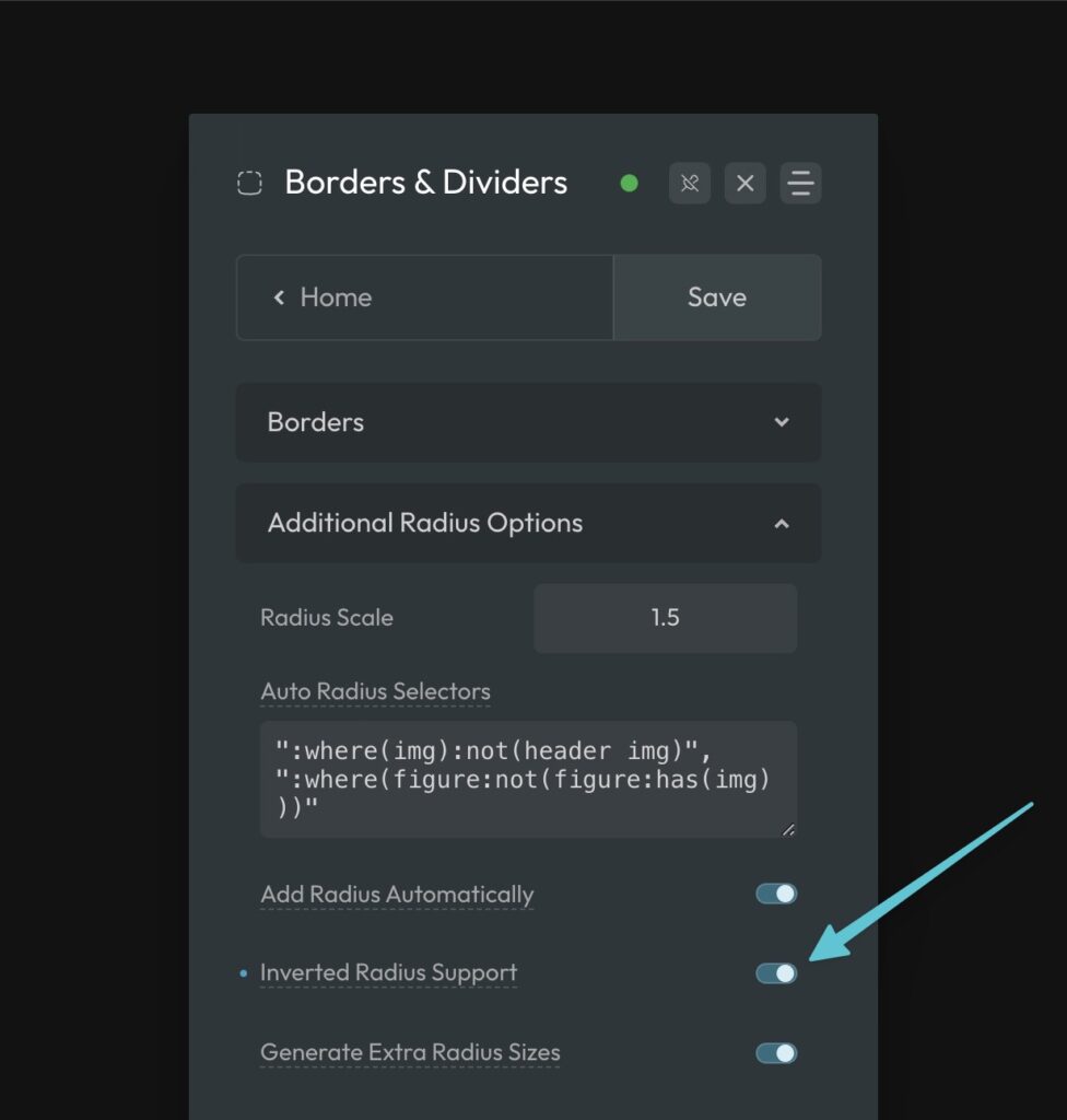
Once that’s activated, you’re ready to implement inverted radius wherever its needed.
The Inverted Radius Utilities
Inverted Radius is applied purely with data attributes.
There are two attributes per corner, one for positioning and one for slicing, and two total corners available for each box you need an inverted radius for.
data-inverted-radius-1-positiondata-inverted-radius-1-slicedata-inverted-radius-2-positiondata-inverted-radius-2-slice
Yes, these are long attribute names. We kept them like this because we’ve found that abbreviations do more harm than good. And since this technique is saving you hours of time in most cases, typing a long name a few times won’t kill you.
Here’s the rationale:
data is a required part of the name according to the spec. inverted-radius describes exactly what you’re doing, and we couldn’t think of any way to shorten this in a non-abbreviated way. 1 and 2 are the corner you’re targeting. Position and slice are the action you’re taking.
As you can see, it’s about as short as you can get without abbreviating it into an unrecognizable and unreadable convention. And if your attributes are unreadable and uninterpretable by others (or by yourself six months later when you return to update the project), that’s a bad thing.
Preparing to Apply Inverted Radius
It’s very important to know that inverted radii in ACSS all reference a token for background color. This token is var(--bg).
The inverted radius are expecting a value for this token, so you should start by defining the value at the parent level, wherever it makes the most sense.
In the example above and below, we want to use inverted radius to create a cutout effect. This means the content box and its inverted radius corners need to match the background of the section the entire element is in. Thus, we gave --bg a value at the section level and then set the background color of the section to var(--bg).
.this-section {
  --bg: var(--primary-light)
  background-color: var(--bg);
}
Code language: CSS (css)
The color of the radius edges and the color of the box that the radius edges are attached to automatically adopt the color once you define it, so there’s no need to set these colors anywhere else.
Adding an Inverted Radius
Inverted Radius is applied to the box that the radii are curving away from. This is the box you will apply the data attributes to.
In the example below, the data attributes are applied to the block that contains the card heading and card text. Before you can add the attributes, though, you need to be able to properly visualize the inverse radius effect.

When you apply the data attributes, you’re essentially positioning invisible boxes where you need the radius to be and then you’re slicing off the corner of the box where the radius needs to appear.
Since this technique uses pseudo elements, you have a max of two corners you can set. This is typically all that’s needed anyway.
There are two data attributes per corner: data-inverted-radius-[#]-position and data-inverted-radius-[#]-slice. This is because you have to control the position of the corner as well as how the corner is sliced.
Positioning an Inverted Radius
Let’s talk about positioning first. In the above example, corner 1 is placed on bottom-left-outside and corner 2 is placed on the bottom-right-outside.
When it comes to positioning inverted radii, there are 16 options:
top-lefttop-outside-lefttop-left-outsidetop-outside-left-outsidetop-righttop-outside-righttop-right-outsidetop-outside-right-outsidebottom-leftbottom-outside-leftbottom-left-outsidebottom-outside-left-outsidebottom-rightbottom-outside-rightbottom-right-outsidebottom-outside-right-outside
This is why visualization is important. Study the example above and notice that the box visualizations are clearly aligned to the bottom on both sides, but are still inside the box, vertically speaking. Next, they are positioned left and right to the outside of the box (on the inline axis).
The syntax is pretty simple. The word “outside” immediately follows the direction where you need outside placement. bottom-outside-right would place the box at the bottom, on the outside, to the right where bottom-right-outside would place the box at the bottom, on the inside, and then outside to the right.
Here’s bottom-outside-right:
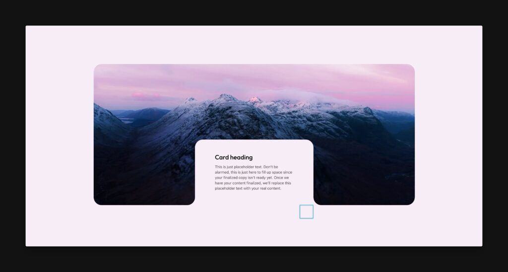
And here’s bottom-right-outside:

As you can see, proper placement is critical. One position will create an inverted radius and the other will do nothing. Use this box visualization model in your head as you’re preparing to create your inverted radius – it helps tremendously.
Here’s what it looks like in code to add the data attributes:
<div class="my-box" data-inverted-radius-1-position="bottom-left-outside" data-inverted-radius-1-slice="bottom-right" data-inverted-radius-2-position="bottom-right-outside" data-inverted-radius-2-slice="bottom-left" ></div>
Code language: HTML, XML (xml)
Note: You can easily apply data attributes in advanced page builders as well, but you’ll need to add them through the Data Attributes UI for the selected element.
The code example also shows the slice instructions, which we’ll discuss next.
Slicing the Corner
Once you position your box correctly, you need to “slice” the proper corner.
For slicing, you’re simply telling ACSS which corner of the box the radius needs to apply to. This part is the easiest as there are only four options:
top-lefttop-rightbottom-leftbottom-right
Use the box visualization method, it should be pretty obvious which corner of the box needs to be sliced to create the intended effect.
You slice the box using the attributes data-inverted-radius-[#]-slice with one of the above values.
Changing Positions at Breakpoints
In some cases, you may want to change the position of your box as well as the inverted radius corners at a different breakpoint. Not only is this possible, it’s made easier by the tokenization of the framework.
There are three variables that control each inverted radius corner:
--inverted-radius-[#]-position--inverted-radius-[#]-slice--inverted-radius-[#]-shadow
You’re already familiar with position and slice, but we haven’t discussed shadow yet. The inverted radius technique is mostly an optical illusion that’s accomplished with box shadow. When you use the data attributes, the box shadow is handled for you, but when you need to manually adjust a corner at a specific breakpoint, there’s no way to handle that automatically.
Thankfully, it’s super easy to manage this on your own. The slice and shadow properties share the same options for how they’re applied and they just need to match. There’s really no additional thinking required.
Here’s an example of moving a corner on devices 767px and under:
@media (max-width: 767px) {
  .my-box {
    <span style="background-color: initial; font-family: inherit;">--inverted-radius-1-position</span>: var(--position-top-right-outside);
    <span style="background-color: initial; font-family: inherit;">--inverted-radius-1-slice</span>: var(--slice-bottom-left);
    <span style="background-color: initial; font-family: inherit;">--inverted-radius-1-shadow</span>: var(--shadow-bottom-left);
  }
}
Code language: HTML, XML (xml)
Whichever side you slice is the same side you shadow. Easy!
The values are the same as when you were using the data attributes, the only difference is that when you’re calling tokens by name, they’re prefixed with either position, slice, or shadow.
Dealing With Visual Artifacts (Rare)
Depending on the specifics of your design, you may run into visual artifacts that look like this:
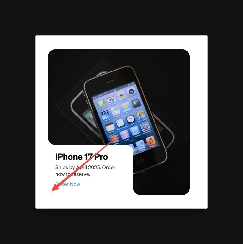
The artifact renders as a very faint half pixel “eyelash” which is actually part of the photo we’re using as the background.
You might think that this is due to some math discrepancy or overflow issue, but it’s actually just a browser rendering issue. It’s fixed by identifying the element in your design that is causing it (like the image in our case) and forcing the browser to use GPU Acceleration by adding a GPU-enabled property/value pair.
For example, adding the below line to the image in the above card solves the artifact:
.my-card__image {
  transform: translate3d(0,0,0);
}
Code language: CSS (css)
Support for Gradients/Patterns/Textures
There are two primary methodologies for creating inverted radius. One is the technique we’re using in ACSS (the “shadow” approach) and the other is a masking technique with SVGs. Both methods have pros and cons.
The benefits of the shadow approach are:
- No SVG files needed
- Radius is dynamically flexible and referenceable.
- It’s easy to implement with the framework.
The benefits of the masking approach are:
- Works with background gradients and patterns/textures.
Neither approach is right or wrong, you just need to know the limitations of each one so you can choose whatever is the most appropriate for the scenario you’re trying to solve for.
As long as you don’t need compatibility with gradient or texture backgrounds on your parent element, the shadow approach is by far the best approach.
If you do need compatibility with gradients and textures, you’ll need to use a masking approach which is not currently part of this framework.
Support for Clickable Parent
It’s possible to use clickable parent on a card that is also using inverted radius, but it requires a very specific structure and has definite limitations.
Since both clickable parent and inverted radius use pseudo elements and absolute positioning, there are three general rules of thumb:
- The clickable parent link cannot be the same element that has the inverted radius, nor can it be a child of the element that has inverted radius.
- The clickable parent link must wrap the box that creates the inverted radius and cannot be positioned relative or absolute.
- This is only viable if you plan on using a heading as the only content, otherwise you’re defeating the purpose of clickable parent.
Here’s an example of a working structure for clickable parent and inverted radius:
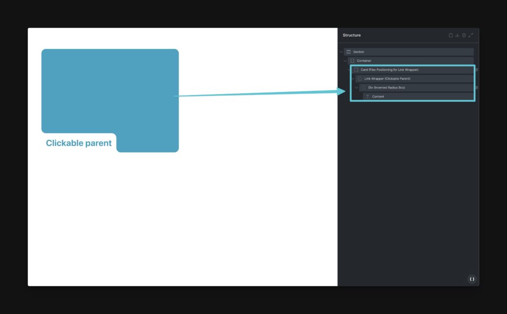
The “Link Wrapper” is positioned at the bottom by the card’s flex alignments since you can’t use absolute positioning for this. The heading wrapper is where the inverted radius are defined. This works because there’s nothing stopping the clickable parent’s clickable area from extending to the entire card.
If you want to put additional content in this card, it would need to be placed in a separate area from the heading, which you are free to position however you’d like and could support additional inverted radius on its own.