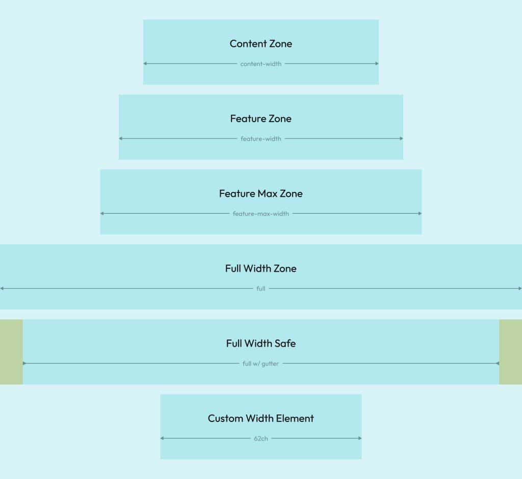
Content Grid presents a new paradigm for content layouts. Using advanced CSS Grid techniques, Automatic.css offers users a powerful way to vertically layout content using “zones.”

Establishing a Content Grid Manually
A Content Grid can be established in any box. You can even nest Content Grids inside other content grids. Simply add .content-grid to any box and you’ve established a Content Grid or use the Content Grid Mixin or Content Grid Recipe.
Note: When establishing a Content Grid in a section element, ACSS will remove the section’s inline padding (gutter) and set any column gaps to zero. This is because the content grid establishes a gutter by default using your site’s global gutter value.
Establishing a Content Grid Automatically (Sections)
As of v3.0, ACSS allows you to convert all your top-level sections to Content Grid by default.
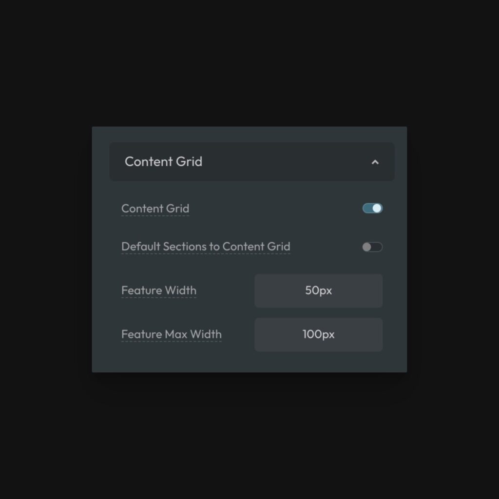
Navigate to Layout > Content Grid and activate the setting “Default Sections to Content Grid.”
If you need to turn off Content Grid on an individual section, you can use the class .content-grid--off.
Your Content Grid
By default, your Content Grid will establish four content zones:
- Content
- Feature
- Feature Max
- Full
Content Zone
The Content Zone is the main content channel, centered within your Content Grid just like a section centers content using an inner wrapper. The default width of the content zone is your website’s content width: var(--content-width).
All content or boxes placed inside the Content Grid will be placed in the Content Zone by default.
You can override this at any time by declaring a new content width on the box you’ve placed the .content-grid utility class on, like this:
#your-box {
  --content-width: 70ch;
}
Code language: CSS (css)
Doing this at the ID level is okay since you only want to affect this individual content grid.
“Feature” Zone
There are two ways to get content to grow to fill the first Feature Zone. You can use a utility class (for individual items) or a grid-column instruction (for programmatic control).
Method #1 (Single): Place the .content--feature class on any element or box inside your Content Grid to instruct it to fill the Feature zone.
Method #2 (Programmatic): You can tell specific types of items or groups of items to fill the Feature Zone automatically by setting their grid-column property to “feature.”
.blog-post-body > blockquote {
  grid-column: feature;
}
Code language: CSS (css)
The above example instructs all blockquotes that are direct children of .blog-post-body (the Content Grid in this case) to fill the Feature Zone.
Changing the width of the Feature Zone
You can change the value of the Feature Zone both globally and locally.
The global value is set in the ACSS dashboard under Layout > Content Grid:

You can also change the value of the Feature Zone locally on any individual Content Grid by setting --feature-width to a new value:
#your-content-grid {
  --feature-width: 75px;
}
Code language: CSS (css)
Note: The width value for the zone is added to whatever your current Content Zone is and it represents the value for each side of the zone. If your Content Zone is 1280px and you set the feature zone to “50px”, the zone will extend 50px on each side of the Content Zone for a total zone width of 1380px (1280px + (50px * 2)).
“Feature Max” Zone
The Feature Max Zone is a second, wider option. There are two ways to get content to grow to fill the Feature Max Zone. You can use a utility class (for individual items) or a grid-column instruction (for programmatic control).
Method #1 (Single): Place the .content--feature-max class on any element or box inside your Content Grid to instruct it to fill the Feature Max zone.
Method #2 (Programmatic): You can tell specific types of items or groups of items to fill the Feature Max Zone automatically by setting their grid-column property to “feature-max.”
.blog-post-body > figure {
  grid-column: feature-max;
}
Code language: CSS (css)
The above example instructs all figures that are direct children of .blog-post-body (the Content Grid in this case) to fill the Feature Max Zone.
Changing the width of the Feature Max Zone
You can change the value of the Feature Max Zone both globally and locally.
The global value is set in the ACSS dashboard under Layout > Content Grid:

You can also change the value of the Feature Max Zone locally on any individual Content Grid by setting --feature-max-width to a new value:
#your-content-grid {
  --feature-max-width: 75px;
}
Code language: CSS (css)
Note: The width value for the zone is added to whatever your current Content Zone is and it represents the value for each side of the zone. If your Content Zone is 1280px and you set the feature zone to “50px”, the zone will extend 50px on each side of your Content Zone, for a total feature zone width of 1380px (1280px + (50px * 2)).
“Full” Zone
The Full Zone is a literal full-width zone. Content assigned to the Full Zone will touch the edges of the screen.
There are two ways to get content to grow to fill the Full Zone. You can use a utility class (for individual items) or a grid-column instruction (for programmatic control).
Method #1 (Single): Place the .content--full class on any element or box inside your Content Grid to instruct it to fill the Feature Max zone.
Method #2 (Programmatic): You can tell specific types of items or groups of items to fill the Feature Max Zone automatically by setting their grid-column property to “full.”
.blog-post-body > figure {
  grid-column: full;
}
Code language: CSS (css)
The above example instructs all figures that are direct children of .blog-post-body (the Content Grid in this case) to span full width.
“Full Width Safe”
One final option exists: “Full Width Safe.”
Let’s say you want to span a box to touch the edges of the screen, but you want content inside that box to respect your website’s gutter. You can do this by using the .content--full-safe utility class.
Additionally, you can do this programmatically by targeting a custom class and setting the grid-column to full and padding-inline to var(--gutter).
.my-box {
  grid-column: full;
  padding-inline: var(--gutter);
}
Code language: CSS (css)
Content Grid Responsiveness
Content Grid layouts are automatically responsive. They will not cause overflow and they will respect your website’s gutter without any breakpoint management.
Perfect 50/50 Split Layout
You can achieve perfect 50/50 content splits with Content Grid, but it requires a little bit of math.
First, set the inner container/block to display grid. Then, set the grid-template-columns to this:
grid-template-columns: calc((min(50vw - var(--gutter), var(--content-width) / 2)) - (var(--grid-gap) / 2)) minmax(0, 1fr);
Code language: JavaScript (javascript)
Essentially, since the left-side content starts at the beginning of the content-width zone, we need the first grid cell to be exactly 50% of the content-width or 50% of the viewport minus the gutter, whichever is less.
The other side of the grid (media wrapper) is just allowed to be 1fr, which will take up all remaining space.
Next, we need to take away half of whatever the gap of the grid is. Thankfully, ACSS already uses a --grid-gap utility, so we can just reference that.
If you ever want your gap to be a different value, don’t switch away from --grid-gap. Instead, assign a new value to --grid-gap on the inner container and you’re good to go without having to fix your calc() statement.