The content width of a website is defined as the width from the left edge of the content to the right edge of the content on a screen that’s large enough not to compress the content.

The content width of your website is an important value. You’ll commonly want to set elements to the website’s content width, or to a value that’s somehow relative to the website’s content width.
You can easily do this in Automatic.css with two utilities: .content-width and var(--content-width).
Setting Your Website’s Content Width
Your website’s content width is set in the ACSS Viewport tab.
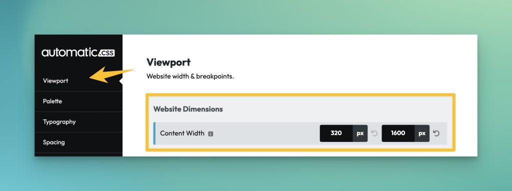
The second value is the most important value. It’s the width of your content on desktop devices. This is the value that is referenced by the utilities.
Once you’ve set your website’s content width, you need to inform your page builder of this value. The best way of doing this is with var(--content-width). You don’t want to tell the page builder the same static value because this creates a potential disconnect should your content width ever change.
If you set your content width in ACSS and then reference that value everywhere else with variables, you’re free to make changes to this value without anything breaking.
The Content Width Utility Class
Any time you need to set an element’s width to your website’s content width, you can use the .content-width class. This class actually sets the element’s max-width instead of its literal width to ensure it’s still responsive.
The Content Width Variable
I already mentioned that you can use var(--content-width) in your page builder’s global theme styles, but you can do a lot more with this variable.
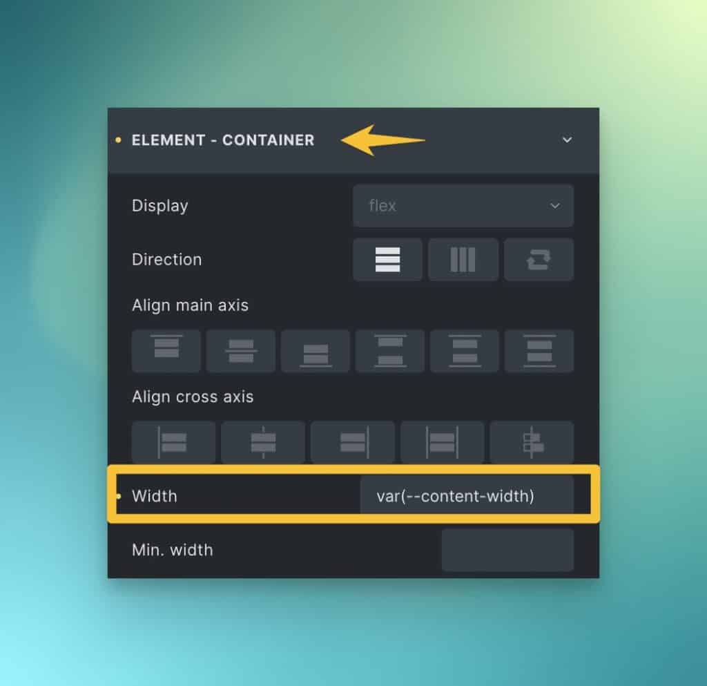
Any time you need a custom element (an element with a BEM class) to be content width, it’s best to use the variable instead of the utility class. Set the element’s width to 100% and then use the variable with the max-width property.
.custom-element {
   width: 100%;
   max-width: var(--content-width);
}
Code language: CSS (css)
Another everyday use is within calculations.
Let’s say I want an element to be 75% of the content width. I can easily do this:
.my-element {
   width: 100%;
   max-width: calc(var(--content-width) * .75)
}
Code language: CSS (css)
You might say, “why not just make the element 75% of the container?”
While that would work on desktop, it wouldn’t have the same effect on mobile. On mobile, it’ll always remain 75% wide, which is often undesirable. Using the content-width variable gets you 75% on desktop and 100% on mobile because the max-width variable is referencing a fixed value rather than a percentage.
In essence, the variable is automatically responsive while the percentage value causes complications on mobile devices.