CSS Grid is a powerful layout method that allows us to create complex and responsive website layouts quickly and easily.
Using standard grid classes in ACSS, we can use CSS Grid’s flexibility and efficiency without writing CSS manually, making it much easier to create intricate layouts quickly and easily.
Grid classes are applied to a parent container to arrange its children. This is typically a container or a div inside a section.
The video below shows how to get started with Responsive Grids with ACSS.
Note: Some classes, like alignment, have slightly changed, but you can find all current classes in the ACSS cheat sheet.
There are various ways we can apply standard grid classes to our design.
- BEM Classes with ACSS variables. By creating custom classes that leverage ACSS variables, we can create global grids that are responsive and controlled globally.
- Utility Classes with variables. We would apply utility classes to the container for one-off grids, but the best practice is adding a custom BEM class if the grid is used elsewhere on the site.
Getting Started With Basic Grid Structure
When using ACSS utility classes, we add our grid structure to our parent container. All grid classes start with .grid--
We have full 12-column grid support using both classes and variables. If we want a 3-column grid, we would add the .grid--3 class to the parent container or div.
We then add divs inside the parent container, which act as cells holding elements. These default to full width, but we can set widths on individual cells as needed.
Setting Up Grid Gaps
You can use .gap-- classes on the grid container to create spacing between rows and columns. However, the preferred way to add a gap to grids is with the contextual utility class, .grid-gap or the contextual variable, var(--grid-gap).
The grid-gap utilities create a separation of styles so you can control the grid spacing across your site independently from other types of spacing. The value for these utilities is set in the ACSS dashboard.
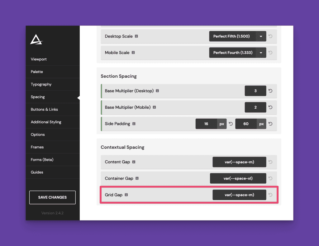
If you need grid gap variations, we recommend using simple calc() functions. For example, calc(var(--grid-gap) * 2) will create a gap that is double your standard grid-gap.
Equal Height Columns
We can add a class of .stretch to our parent wrapper to ensure all cells in our grid are equal height. This ensures all cells will grow to the height of the tallest cell.
Grids On Sections
It’s possible to turn a <section> into a grid, though this creates significant and unnecessary limitations.
For 99% of use cases, you should always use the container in your section as the grid or add a new container or div to create your grid layout. This allows you to put content above and below your grid, within the same section, without breaking the layout.
Responsive Grids
We have full control of our grid across responsive breakpoints. This is done by adding classes that change the structure across the various breakpoints.
For example, let’s say we need a grid to be four columns on desktop, two columns at the “L” breakpoint and one column at the “M” breakpoint. Here are the classes you would apply to your grid container:
.grid--4 .grid--l-2 .grid--m-1
Combining grid and grid breakpoint classes helps you achieve fully responsive grids in seconds.
Uneven Grids
To create uneven grids, we can use classes that set fractional units, such as .grid--1-2. This would create a two-column grid that is 1 part to 2 parts, or small first column and larger second column. The following uneven grids are available:
- grid–1-2
- grid–2-1
- grid–1-3
- grid–3-1
- grid–3-2
- grid–2-3
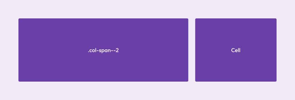
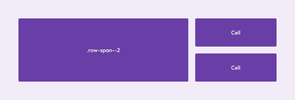
Row and Column Spans
We can control the span of each grid cell, specifying what column and row it starts on.
Column span classes allow us to take a cell out of its grid structure and span a specific number of columns using classes like .col-span--2.
Similarly, a row span class will force the cell to span the number of rows we specify.
We also have full control over all breakpoints :
.col-span--l-1, for example, would make it span back to one column at the L breakpoint.
Note: Whenever you use spans, it’s important to override the spans at the appropriate breakpoints. Cells hold onto the instruction until you tell them otherwise.
Grid Cell Order
We have full control of the order of grid cells and can easily set them to display first or last at any breakpoint.
Examples:
.order--firstand.order--lastwill affect all breakpoints..order--first-lforces the cell to appear first at the l breakpoint and below. All breakpoints are available..order--last-sforces the cell to appear last at the mobile breakpoint.
Starts & Ends
Another way to control grid item position is to tell each item where to start and end within the grid. This is done using the .col-start--, .col-end--, .row-start--, and .row-end-- classes.
Let’s say you have a 12-column grid and want the first item to start on column 1 and end on column 9. You would use the following classes: .col-start--1 .col-end--9.
The same is true for row positioning.
If you want the item to end on the last column, you can use .col-end--last which will span all columns regardless of the number of columns in the grid. .col-row--last will do the same for rows.
If you want grid items to overlap, you can force them to share columns and/or rows.
Grid Content Alignment
Grid controls allow for the alignment of “Grid Content” (Different from Grid Items.).
“Content” refers to the grid items as a whole unit.
Content can be justified or aligned only when extra space exists in the Grid container (not just within its cells).
Note: Content alignment and justification have no effect when the flexbox has only a single line and/or no available space within the Flexbox.
Prefix
.justify-content--.align-content--
Conventions
.justify-content--[position].justify-content--[position]-[breakpoint].align-content--[position].align-content--[position]-[breakpoint]
Common Flex Positions
start | end | center | stretch | space-between | space-around | space-evenly
Grid Items Alignment
Grid Items are direct children of the cells of the Grid container. Unlike Flexbox, you can align and justify items in a grid.
Justifying items in a Grid positions them along the column axis of the grid.
Aligning items in a Grid positions them along the row axis of the grid.
In Automatic, you have full control over item alignment at each breakpoint.
Prefix
.align-items--.justify-items--
Conventions
.align-items--[position]
.align-items--[position]-[breakpoint].justify-items--[position].justify-items--[position]-[breakpoint]
Common Flex Positions
start | end | center | baseline | stretch
If we want to center content in a grid cell horizontally, we would add .align-items--center to the grid container.
Wrap-Up
It’s important to learn and understand the basics of CSS Grid to get the most out of the grid utilities in ACSS. We’ll continue to release education and training around CSS Grid and Automatic.css, so make sure you’re subscribed to the ACSS YouTube Channel and the Geary.co YouTube channel.
Make sure you also read up on auto-alternating grid classes and grid variables.