Variable Grid is a unique, powerful, lightweight, automatically responsive grid system that’s not currently found in any other framework. In this article, we’ll discuss how Variable Grids work and when you should and shouldn’t use them.
How Variable Grids work
In a traditional grid system, grid cells stack at specific breakpoints (based on your choices at each breakpoint). This means that the grid is responding to the size of the device or window and not the size of the elements in the grid.
In our Variable Grid system, grid cells stack automatically when items in the grid are squeezed to their minimum allowed width. Instead of the grid responding to a specific device size, it responds only to the current width of its children.
One of the problems with the traditional grid system, other than needing a ton of utility classes to pull it off, is that you can’t always protect child elements from getting too narrow. If the “too narrow” point happens between breakpoints, there’s not much you can do about it.
With Variable Grids, this is never a problem. You decide what the minimum allowed width for items in the grid is, and the Variable Grid will fill itself at each breakpoint accordingly.
Benefits of Variable Grids
There are some benefits to Variable Grids over traditional grids:
- Automatically responsive. You don’t have to make decisions at different breakpoints.
- Works very similar to container queries, but without container queries & easier than container queries. The grid responds to the child’s size rather than to device breakpoints.
- Low-input. It’s two utilities, max.
- Lightweight. The entire Variable Grid system is five lines of code (vs. 430 lines for utility classes for a traditional grid system).
- There are no column count limitations. Unlike other grid systems, there are no column-count utilities. You can have anywhere from 1 to 1000 (assuming 1000 items are small enough to fit in a row).
- Variable Grids are simpler to manipulate dynamically. You can use Javascript to quickly set or change the grid structure on the fly.
Limitations of Variable Grids
Variable Grids aren’t perfect for every situation. If you want tight control over the number of columns in the grid or the number of columns at each breakpoint, or you want uneven columns, you might want to opt for traditional grids.
The first two things are controllable with Variable Grids, but you might find that achieving this level of control with Variable Grids is a little more cumbersome. Uneven columns are not achievable without spans, and once you get into this level of manipulation, you should question your decision to use a Variable Grid in the first place.
How to create a Variable Grid
There are three ways to create a variable grid: utility class, variable-grid-columns recipe, and variable-grid recipe.
To create a variable grid with the utility class, simply assign the .variable-grid class to any box. Unlike our other grid systems, there are no additional classes to use.
If the box is the content width of your website, like a traditional section container, you’ll immediately get two equal columns that are automatically responsive. In some cases (like a 50/50 content layout), this may fit your needs perfectly. You can move on without giving the grid any additional input.
In cases where you need more than two columns or you have elements that are sensitive to specific widths (like cards), the next step is to tell the Variable Grid what the minimum width is. This is done with the var(--min) utility.
%root% {
  --min: 380px;
}
Code language: CSS (css)
Typically you’ll want to set this --min value at the ID level so it only applies to that specific instance of variable grid.
In a page builder like Bricks, you can set the value of the variable two ways.
The first method is to add the --min via the custom CSS tab. This is probably the fastest, most obvious, and most maintainable method.
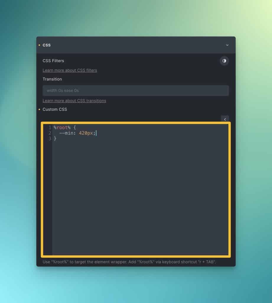
Note: Do not attach this custom CSS to the .variable-grid class itself. That would apply the same width to every instance of variable grids across your website. Since the grids you’ll be building are all different, you want to assign the --min to each unique instance. This is best done at the ID level.
The second method is to add the –min via the data attributes feature:
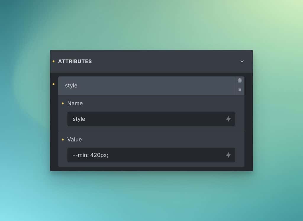
This adds the --min as an inline CSS style which, by default, only applies to that unique instance of your grid.
We named this “Variable Grid” because of the variable nature of how they behave and the fact that it’ll help remind you that they’re based on a --min variable.
The recipe methods allow you to attach variable grids to custom classes.
@variable-grid-columns gives you the literal grid-template-columns value for Variable Grid. Type the name of the recipe and hit enter in the grid-template-columns input and it’ll expand to the full grid-template-columns value.
You can then use the --min variable as shown above, but this time you can attach the --min to the custom class you made for the grid.
The second recipe method is the full recipe for Variable Grid. On your custom grid class, navigate to the CSS input and then type @variable-grid; –– as soon as you type “;” on the end, the recipe will expand.
The full recipe gives you all the Variable Grid code, including a --min that you can customize.
Understanding var(--min)
There are two ways to use var(--min). The first is to set a minimum allowed width for grid children (literal use). The second is to use var(--min) as more of an “optimal” width.
Variable grids work by filling the grid with as many children as will fit in a row, according to the minimum width. As long as the minimum width hasn’t been achieved, the grid will keep filling the row with more items.
Let’s say you’re creating a grid of team member cards. In your mind, you want a three-column grid. But when you set var(--min) according to the bare minimum you want those cards to ever be, the grid might turn out to be a four-column grid.
Instead of choosing a bare minimum value, you can choose a slightly bigger minimum value. With this new minimum, the grid may now only fit three cards in a row. All good!
Changing var(–min) at breakpoints
Variable Grids are automatically responsive. A downside of this is that you might find an uneven grid at a specific breakpoint, or even an orphaned item.
In CSS Grid land, this is seen as perfectly acceptable, though it offends some people’s OCD. Thankfully, if your OCD is triggered by this, it’s a fixable solution.
You can re-assign the value of var(--min) at any breakpoint. All you have to do is choose a new value that restructures the grid to your desired configuration.
Being OCD about this will limit the “automatic” nature of Variable Grids, but that’s the tradeoff.
Setting or changing var(–min) dynamically with Javascript
If you’re in a situation where you need to set or change the behavior a grid (like the number of items per row) dynamically with Javascript, Variable Grids might be a good option. Instead of having to dynamically add or remove classes, or create additional variables, you can simply change the value of var(--min) dynamically with inline CSS.
<div class="my-variable-grid" style="--min: 320px;"></div>
Code language: HTML, XML (xml)
Have fun!
Variable Grids are not the be-all, end-all of CSS Grid, but they’re extremely helpful in a variety of situations that require even grids. The fact that they’re so lightweight is a huge benefit as well.