Automatic.css introduced support for color-scheme (dark mode) in v2.7.
It should be noted that this feature is more than just “dark mode.” In fact, the term “dark mode” isn’t a technical term and doesn’t accurately describe what this feature does.
Dark Mode?
Accessibility is an essential aspect of modern web design. One aspect of accessibility is serving a color scheme that matches the user’s preference.
Users can prefer a generally light scheme or a generally dark scheme. Users can also prefer other color changes, such as low-contrast.
The term “dark mode” suggests that all websites are light, and can be changed to dark with the flip of a switch (or based on the user’s preference).
We all know that’s not the case, though. A website can be dark by default, in which case the switch becomes a “light mode” switch.
This is why “dark mode” is not a technical term in CSS. The technical term for serving different color modes to the user is color-scheme.
For this reason, ACSS refers to this feature as Color Scheme.
Consequently, you can use ACSS’s color scheme functionality for more than just inverting colors.
How to Activate Color Scheme
In the dashboard, navigate to the Palette tab and find the area titled Color Scheme.
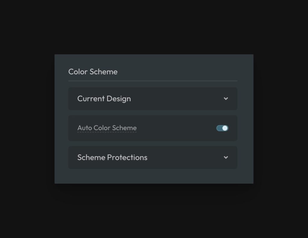
Activating Color Scheme
There are two ways color scheme is applied to websites: a manual color scheme switch and prefers-color-scheme which is an automatic transition based on a media query.
The first thing that you’ll notice in ACSS is that there’s no actual switch for activating color scheme across the website. There’s a switch for “Auto Color Scheme,” but this switch only determines whether or not ACSS will automatically serve alternate colors to the user based on their operating system preference (via prefers-color-scheme).
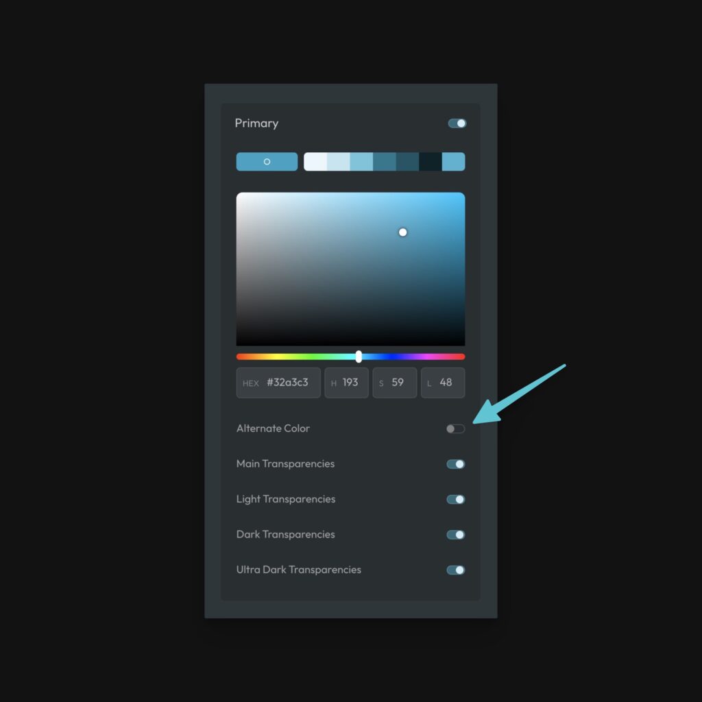
The way you “activate” color scheme is by defining an alternate color for any of the colors in your palette:
Any time you activate an alternate color, your website is ready to use color scheme. Now you just have to determine whether you want ACSS to automatically serve the alternate color to users or use a manual color scheme switch – or both.
Auto Color Scheme
Users can set their preference for light or dark settings in their operating system. This is true for desktops, laptops, tablets, and phones.
The operating system communicates this preference to the browser, and the site can scheme for this preference using CSS media queries.
If you toggle this switch on (it’s off by default), we will serve the color scheme the user prefers (assuming you’ve activated alternate colors).
If you leave this toggle off, we will not serve any other scheme by default. In this scenario, you’ll need to add a toggle switch on the front end so users can manually switch back and forth.
Note: ACSS detects the user’s preference on page load rather than loading extra CSS in a media query, so browser color scheme simulators will not work for previewing color schemes. Use the in-builder color scheme toggle, a front-end toggle, or your actual OS’ color scheme preference settings.
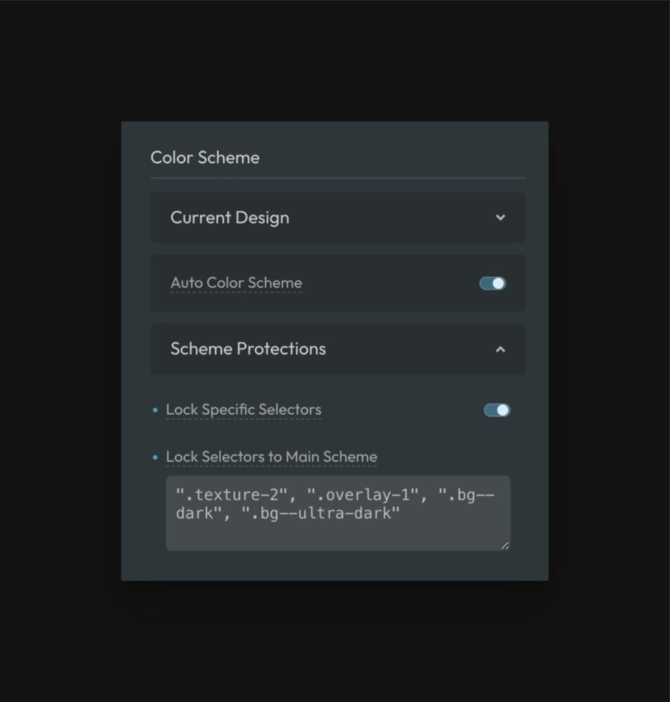
Current Design
If ACSS is going to serve an alternate color to users based on their preference, we need to know the main, non-alt scheme, for your website.
This is set in the “Current Design” area, where you tell ACSS if your main design is primarily light or primarily dark.
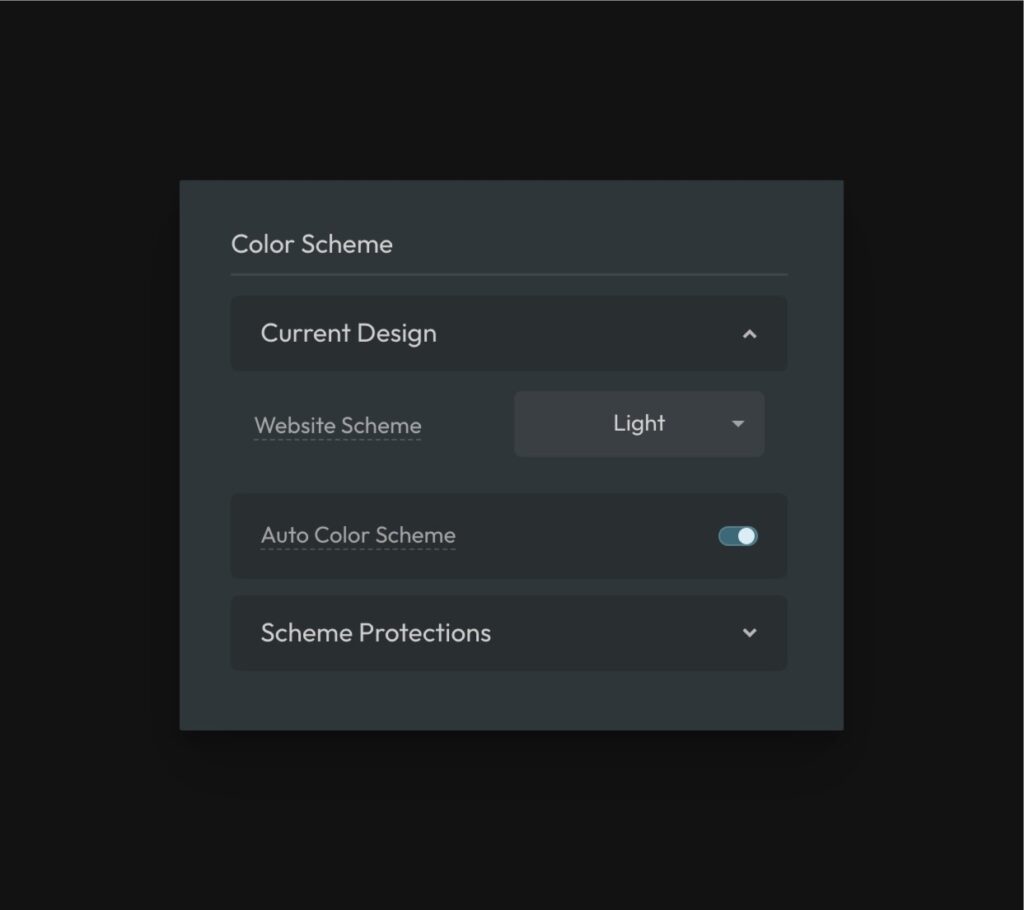
If your website is primary light and the user prefers light, we’ll serve the main scheme. If your website is opposite of what the user prefers, we’ll serve the alt scheme.
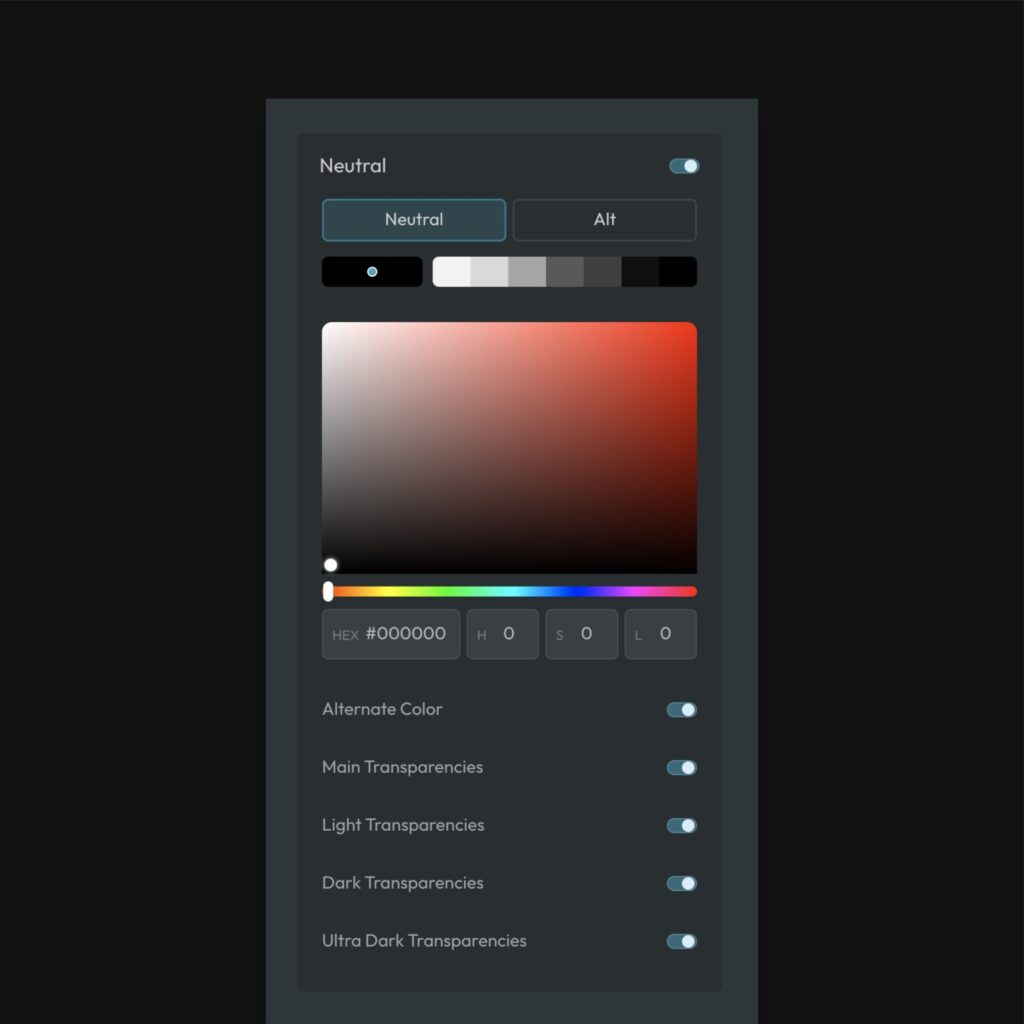
Color Inversion & Adjustment
Depending on the alternate scheme you’re trying to achieve, some colors and shades may need to be inverted, changed completely, or left alone. For this reason, ACSS doesn’t attempt to do anything by default (with the exception of the neutral palette).
When you activate an alternate color, you’re essentially duplicating the default version of that color. You’re free to use the color picker to select a brand new color. Or, if you’re only wanting to invert the shades, you can simply starting inverting the lightness value for each shade.
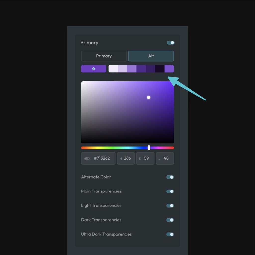
In the above example, we’re using a completely different color for the altnerate color and can easily adjust the saturation and lightness for all the shades using the “S” and “L” inputs.
If you did want to invert the shades completely using the same color, just replace the lightness values with the inverse value. For example, “95” is five steps away from 100. So, the inverse value is five steps away from 0, or “5.” The inverse of “85” is “15.” And so on.
In about six seconds, you can completely invert the shades.
The Neutral/Shade Palette
Another important aspect of color scheme is the handling of whites and blacks.
Again, since “color scheme” can be used for more than dark/light, Automatic.css doesn’t manipulate black and white values without user input.
The only time ACSS manipulates black and white values is if you turn on the alternate color for the Neutral palette.
Since this is a palette of blacks and whites, we assume you’re using a true light/dark mode now and we invert black and white values automatically.
If you want blacks and whites to be left alone, leave this toggle off.
Note: Some people try to use raw values when they need black or white, such as #fff, #000, or white or black keywords. These will never invert via color scheme. The only time white and black will invert is if you use the color variables var(--white) and var(--black).
Seeing Your Alternate Color Scheme in the Builder
It’s tough to design an alternate scheme for a website if you can’t see what you’re doing. For this reason, Automatic.css adds a color scheme switch in the builder panel of every officially supported builder.
This switch allows you to toggle back and forth between your main scheme and your alternate scheme inside the builder canvas.
Seeing Your Alternate Color Scheme on the Front End
If you activate “Prefers Color Scheme” in ACSS, users will automatically see the correct scheme when they visit the site (based on their preference).
If you want to test this, you’ll need to change your operating system color scheme preference and then reload your site. Remember, you can’t use emulators because the CSS only checks the preference on page load.
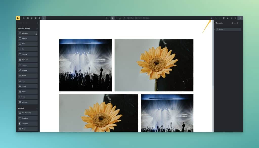
If you’re not using “Prefers Color Scheme,” you must provide the user with a front-end color scheme toggle. If you’re a Frames user, there’s a color scheme toggle component in the Frames dashboard under Components:
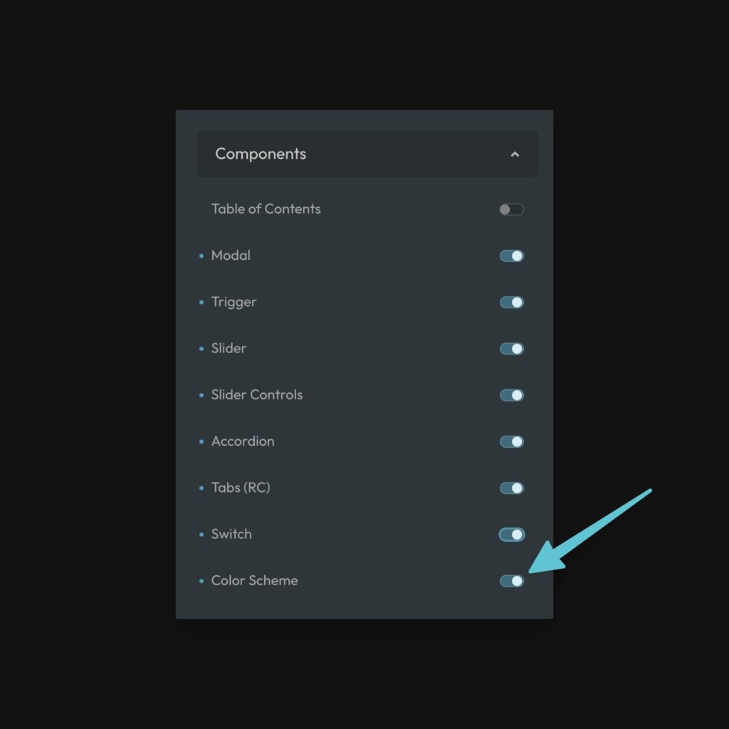
Turn this component on and then add the switch element anywhere on your site using the builder interface.
The switch can be used simultaneously with “Prefers Color Scheme.” We store the user’s preference in local storage and then serve them the scheme they last chose with the toggle (or serve the site based on their preference if they haven’t used the switch).
If you’re not a Frames user, you have three options:
- Use our manual scheme switch for Bricks Builder
- Create your own switch however you’d like.
- Use this switch from our CodePen library.
Manual & Programmatic Color Scheme Protection (Lock Selectors)
When building a color-scheme-based website, it’s common to need to “protect” certain areas or elements from switching schemes. For example, if your site is primarily light, but there’s a dark section on the page, you want to protect that dark section from switching to light.
For this reason, some frameworks have classes you can add to control what gets switched and what doesn’t. The problem with this method is that it’s manual and often lacks maintainability because you have to litter the color scheme protection classes everywhere.
Automatic.css is the only framework we know of that offers programmatic & global color scheme protection. Rather than using utility classes on areas or elements you want to protect, you can protect them via their selector.
In the Palette area, find the toggle that says “Lock Specific Selectors” and turn it on.
An input will appear titled “Lock Selectors to Main Scheme.”
This input accepts any valid selector including complex selectors, compound selectors, and combinators. Just make sure you wrap each selector in quotes and separate them by commas.
Example:
"header", ".service-card", ".hero .featured-image", ".team-grid"
Code language: JavaScript (javascript)
This example would protect the header, service cards, hero features images, and team grids from displaying the alt scheme.
Tip: It’s typically best to use the block-level (parent) selector. This will automatically protect all children of the block and account for locally scoped variables that might be defined at the block level for children.
This is, by far, the fastest and easiest way to control which areas of your site should switch between schemes or stay locked.
Manual control still exists using .color-scheme--main and .color-scheme--alt on any element respectively, but you’re usually better off doing this kind of thing programmatically from the dashboard.