Ribbon classes, variables, and data attributes are helpful utilities for quickly adding corner ribbons (and potentially other types of ribbons in the future) to elements on your site.
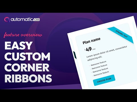
Ribbons are commonly used to visually mark specific types of elements, like cards, with additional information. For example, an “On sale” ribbon can mark e-commerce items as currently on sale.
Adding Your First Ribbon
It’s easy to add a ribbon to any container.
- Set
position: relative;andoverflow: hidden;on the container you want to add the ribbon to (this won’t be necessary once Firefox supports:has(). - Add a text element to the container. This will be the text of your ribbon.
- Add the class
.ribbonto your text element to activate the ribbon functionality. - Add a ribbon position class (e.g.
.ribbon--top-rightor.ribbon--top-left) to your text element to position the ribbon.
That’s it! You’ve added your first ribbon.
Customizing Your Ribbon
You can customize ribbon styles three ways:
- Globally
- Contextually
- Individually
Customization is done via the following locally scoped variables:
--ribbon-offset--ribbon-width--ribbon-padding--ribbon-background-color--ribbon-text-color--ribbon-text-size--ribbon-shadow
For reference, the default values for these are as follows:
- Offset: -2rem
- Width: 30rem
- Padding: .5em 1em
- Background Color: var(–action)
- Text Color: var(–white)
- Text Size: var(–text-s)
- Shadow: 0 5px 10px var(–shade-trans-10);
To style a ribbon contextually, create a custom modifier class to identify it and then set its styling via locally scoped variables. You only need to add the variables you want to change. So if you like all the default ribbon styling but want to change the background color, text color, and shadow, you only need to alter those three variables:
.ribbon--sale {
--ribbon-background-color: var(--primary);
--ribbon-text-color: var(--primary-ultra-light);
--ribbon-shadow: 0 0 30px -3px var(--primary-ultra-dark-trans-20);
}
Code language: CSS (css)When adding your new “sale” ribbon, you’ll want to add the standard .ribbon class and your new .ribbon--sale class. This is the standard for how modifier classes work. One class adds base styling, and the modifier modifies the style.
Dynamic Ribbons
Sometimes you need Ribbons that are added, styled, and positioned based on dynamic data. This is easily doable with ACSS ribbons.
To get started, add your text element along with the base .ribbon class. Instead of using static text, insert dynamic data from a custom field.
To position the ribbon, use our preconfigured data attribute. Add data-ribbon-position to your element and then use one of the positioning values:
- top-right
- top-left
You can use your own custom data attribute to dynamically style the ribbon based on custom field values or some other parameter. Follow the same process that you would follow when creating a custom ribbon class.
Here’s an example of our “on sale” ribbon styled using data attributes:
[data-ribbon-style="sale"] {
   --ribbon-background-color: var(--primary);
   --ribbon-text-color: var(--primary-ultra-light);
   --ribbon-shadow: 0 0 30px -3px var(--primary-ultra-dark-trans-20);
}
Code language: CSS (css)
You can create as many ribbon styles as you want and then trigger which one gets used by dynamically passing the style name to the data attribute value.