It’s common for clickable and hoverable elements to have transition styling. It’s also common for clickable and hoverable elements to share transition styling for consistency purposes.
Given this fact, ACSS offers a global transition style which maps to two main utilities: var(--transition) and .transition.
For buttons and links, these utilities aren’t necessary because ACSS applies your global transition settings to by default (override available).
For other elements, though, you’ll need to apply the transition yourself. Here’s how you can use the transition variable for a hoverable/clickable card:
.my-card {
  background-color: var(--bg-light);
  color: var(--text-dark);
  padding: var(--space-l);
  transition: var(--transition);
}
Code language: CSS (css)
You could also just add .transition to the card, but that’s less efficient than using the variable on your custom class.
How the Transition Utilities Work
The global transition style is set with multiple inputs in the dashboard. Three of the inputs are for your main transition properties:
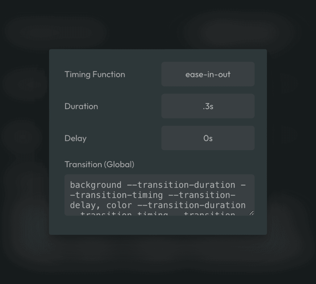
- Duration
- Timing Function
- Delay
These three inputs map to corresponding variables:
var(--transition-duration)var(--transition-timing)var(--transition-delay)
The fourth input is for assembling the actual transition. You do this by listing the properties you want to transition (e.g. color, background, border, etc.), followed by the references to each of the above properties. Each segment should be comma-separated.
Remember: The ACSS dashboard doesn’t require the use of var() and will strip all instances of var(). Therefore, just use the variable stems.
If you only want to transition the background property, it would look like this:
background --transition-duration --transition-timing --transition-delay
If you need to transition more than one property, use comma-separated values:
background --transition-duration --transition-timing --transition-delay,
color --transition-duration --transition-timing --transition-delay,
border --transition-duration --transition-timing --transition-delay
Warning: The use of “all” is not recommended. While this is easier to write and manage, it can create performance issues.
Custom Transitions That Leverage Global Transition Properties
You’re not limited to using .transition and var(--transition). If you want to set a custom transition style on an element, but reference specific global transition properties, you can easily do this.
.my-card {
  background-color: var(--bg-light);
  color: var(--text-dark);
  padding: var(--space-l);
  transition: background .7s ease .2s, color var(--transition-duration) var(--transition-timing), border .1s ease-in .3s;
}
Code language: CSS (css)
In the above example, we’re creating a custom transition with custom values, but referencing global transition values where desired.
You can also redefine the var(--transition) variable on any element. This allows you to override programmatic transition styling for a specific element.
Let’s say you have a loop of clickable cards that are all using var(--transition) and you want to set a completely different transition style on all even cards. Here’s how you can do this.
.my-card:nth-child(2) {
  --transition: all .8s ease 0s;
}
Code language: CSS (css)
And, don’t forget, you can calc stuff, too:
.my-card:nth-child(2) {
  --transition: all calc(var(--transition-duration) * 2) ease calc(var(--transition-delay) * 2);
}
Code language: CSS (css)
It’s pretty flexible!
Removing Global Transition
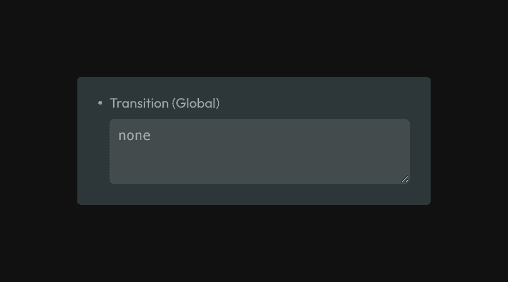
If, for some reason, you don’t want any transition on elements, you can set the “Transition (Global)” input value to none.