Color setup happens in the Palette tab of ACSS:
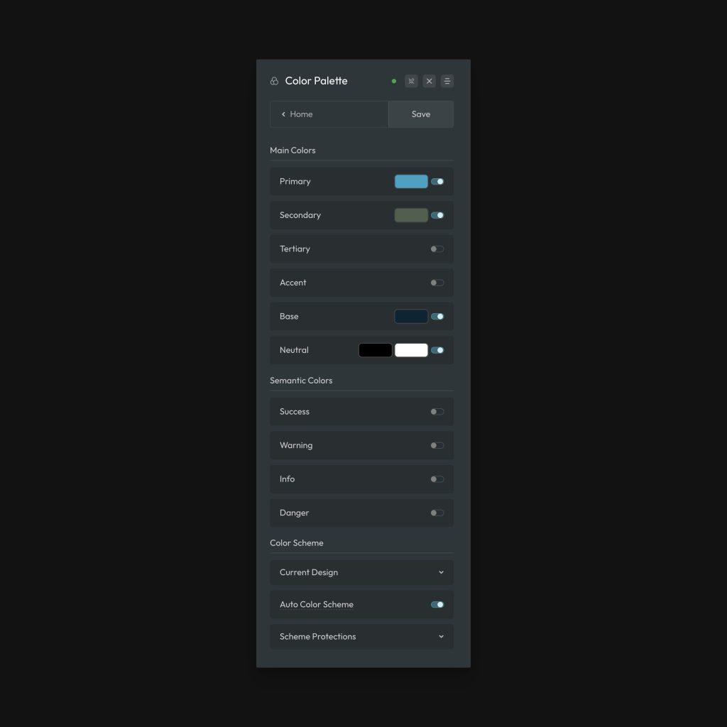
Automatic.css provides the following customizable colors:
- Primary: The brand’s primary color (The main identifying brand color – also often the action color).
- Secondary: The brand’s second most used color.
- Tertiary: The brand’s third most used color.
- Accent: The brand’s least used color.
- Base: The brand’s base color (typically best if a dark version of the base is chosen) – most commonly used for backgrounds and text.
- Neutral: Black and white, plus shades of grey.
This should cover the needs of 99% of websites, especially when you consider that these 6 colors are expanded into a palette of up to 36 options when you include the generated shades and over 200 options when you include transparencies.
Shades
When you enter your website’s color HEX codes, Automatic.css generates 1 contextual shade and 6 additional shades of each color ranging from ultra light to ultra dark:
- ultra-light
- light
- semi-light
- semi-dark
- dark
- ultra dark
- hover (reserved for hover use)
Each shade is customizable via the Shades swatches next to the main swatch:
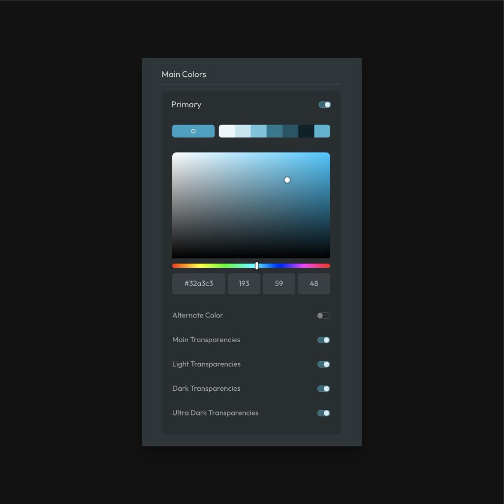
Shades are generated using HSL values. This is how most color systems generate shades. The Hue and Saturation values remain roughly the same, but the lightness value changes to create the desired shade.
If you are trying to match shades to Hex values you were given by a designer, Google the HEX code and Google will tell you the HSL values for that color in their default color analyzer. You can then put those exact HSL values into ACSS for each shade.
Opacities / Transparencies
Transparent colors are very important in web design. They’re commonly used for backgrounds, overlays, borders, and more.
ACSS optionally generates 10 transparencies of each main color, 10 transparencies of the light shade of each color, 10 transparencies of the dark shade of each color, and 10 transparencies of the ultra-dark shade of each color.
These transparencies can be accessed via various classes and variables. For example, .overlay--primary-trans-60 will create a primary colored overlay at 60% opacity. You can use a variable, such as var(--base-ultra-dark-trans-10) to reference a transparency anywhere a color value is accepted.
Transparencies always map to the exact shade values you enter, so they’re automatically up to date with the latest Palette settings.
If you don’t need certain groups of transparencies for any color, you can deactivate them in the dashboard.
Creating Additional Colors, Shades, and Transparencies
The default ACSS Palette with all shades and transparencies will cover 99% of use cases. However, if you do find yourself in a situation where you need more colors, shades, or transparencies, you can easily create them yourself.
Creating a new color variable (and partials for maximum flexibility):
To create a new color, we recommend defining all the following at the root level for your new color:
:root {
    --my-color: {hex value};
    --my-color-hex: {hex value};
    --my-color-hsl: {hsl string};
    --my-color-h: {h-value};
    --my-color-s: {s-value};
    --my-color-l: {l-value};
    --my-color-rgb: {rgb-string};
    --my-color-r: {r-value};
    --my-color-g: {g-value};
    --my-color-b: {b-value};
}
Here’s an example:
:root {
    --my-color: #344f6f;
    --my-color-hex: #344f6f;
    --my-color-hsl: 213 36% 32%;
    --my-color-h: 213;
    --my-color-s: 36%;
    --my-color-l: 32%;
    --my-color-rgb: 52 79 111;
    --my-color-r: 52;
    --my-color-g: 79;
    --my-color-b: 111;
}
Using your new color
Since your new color is based on variables, you can make your own utility classes with it, reference it within custom classes, or even reference it at the ID level.
If you want to create a utility class that uses your new color, you can do that easily. You just have to decide what you want the utility class to do. Here’s an example where we create a new background color utility class:
.bg--my-color {
   background-color: var(--my-color);
}
If you were creating a card and wanted to use that new color as the background color for the card, it would look like this:
.my-card {
   background-color: var(--my-color);
}
Once you’ve created a new color variable you can reference it anywhere. And since you created the color partials along with it, you can even do extra custom stuff like this:
.my-card {
   background-color: hsl(var(--my-color-h) calc(var(--my-color-s) * .5) calc(var(--my-color-l) * 1.5));
}
That would set the background color of your card to your new color at 50% saturation and 150% lightness. We’re just using a calc function to cut the S value in half and multiply the L value. When you have the right variables at your disposal, there are zero limitations in what you can accomplish.
Note: These same color partials are available for all colors in the ACSS system, so you can use this exact technique with the existing colors.
Creating a new shade variable
To create a new shade, you’ll want to reference the HSL values for your new color (or an existing color), but change the shades to the new desired values:
:root {
   --my-color-light: hsl(var(--my-color-h) var(--my-color-s) 82%);
}
In the above example, we’re referencing the H and S value from our new custom color, but then replacing the L value with a new static value (higher L values are lighter and lower are darker).
You can do this as many times as you’d like to create as many shades as you’d like. Then you’re free to assign these shades to utility classes or reference them in custom classes.
Creating a new transparency variable
To create a new transparency, you’ll want to reference the HSL values for your new color (or an existing color), but add the alpha value for the transparency to the HSL string.
In this case, you usually don’t need to reference the HSL values individually. That’s where our HSL variable comes in handy:
:root {
   --my-color-light: hsl(var(--my-color-hsl) / 72%);
}
In the above example, we’re referencing the full HSL string for our new custom color, but then adding a “/” and the alpha value (opacity). This is one way to write an HSL string. Any validly structured HSL string will work.
You can do this as many times as you’d like to create as many transparencies as you’d like and then you’re free to use them with utility classes or custom classes.
Contextual Colors
Aside from these main brand colors, ACSS also allows you to configure contextual colors and contextual color utilities.