Focus styling is when an element’s style is changed on focus (when the user interacts with the element via keyboard, click, etc.). It’s a vital accessibility feature so users know which particular clickable element they’re interacting with.
Websites don’t have focus styling by default – the developer must add it. Or, in this case, a tool like Automatic.css adds it for you (yet another thing you don’t have to remember!).
Customizing Focus Styling
You can customize your site’s focus styling in the ACSS Additional Styling panel under Accessibility.
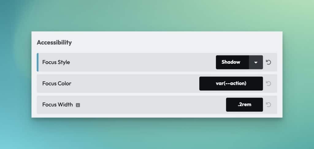
Focus Style
Choose between Outline or Shadow. Outline uses the CSS outline property. Shadow uses the Box Shadow property.
The advantage of outline is the ability to offset the focus ring from the element in focus. The advantage of the box-shadow method is that the box shadow will follow curves of elements being focused (where outline will put a square around rounded elements in many browsers).
Focus Color
You can choose any color for your focus color. The default is your website’s action color.
Remember that you can change the focus color of individual elements using focus classes.
Focus Width
This setting allows you to control the thickness of the focus indicator. Rem units are a good choice here.
Focus Offset
This setting is only available when the outline focus style is chosen. It allows you to control the amount of offset – the gap between the focus indicator and the element being focused.