Automatic.css’s typography system controls the font size of text across your site.
All text sizes are automatically responsive, and unlike with other frameworks, text sizes in Automatic.css follow a perfect mathematical scale.
Root Font Size
The first setting in the Typography tab is for Root Font Size. It’s essential to set the root font size as a percentage for maximum accessibility.

The most common root font sizes are 62.5% and 100%.
In Automatic.css, the default is 62.5%. Why? Because 62.5% makes 1rem = 10px. So, when setting rem units in your styling, you can easily make them equal to pixel counts.
(Using rem units over pixels is highly recommended, as pixels do not conform to accessibility standards).
When would I want to switch it to 100%? If you’re installing Automatic.css on an existing website that uses rem units based on 100% root font size or a default 16px font size, you’d want to change it to 100% in Automatic. If you leave it at 62.5%, your existing rem-defined elements will be 1.6x larger than you intended.
If this confuses you, know that most utility frameworks don’t give you a choice. Automatic.css gives you a choice for maximum flexibility and conformability.
Fluid Text Setup
Next, you’re asked to set your base font size for fluid text.

The “base” font size serves two purposes:
- It sets the default size of paragraph text on desktop.
- It sets the starting point for the mathematical typography scale (for other sizes)
While these values are stated in pixel units, they’re converted to rem on the back end. Automatic.css uses rem, em, and dynamic units exclusively.
The “S” and “XS” sizes are scaled *down* from the “M” size while all the other sizes are scaled up.
Fluid Text Scale
The second most crucial thing to customize within Automatic.css is the typography scale. This scale controls the degree of variance between text sizes.
You can choose from popular typography scales or set your own scale manually.

It’s common to want to use a tighter scale on mobile devices than on desktop since mobile devices don’t have enough room to fit more extreme scales, so Automatic.css lets you set the desktop and mobile scales independently.
If you don’t want the scale to change between devices, make the Typography Scale and Mobile Typography Scale equal (double-check that the scale you’ve chosen works well on all devices).
Note: To generate a hierarchy, the scale values must be greater than 1.
Text Size Overrides
You can manually override text sizes in Automatic.css. When you override a size, you’re effectively removing it from the mathematical scale. No sizes above or below the size you’ve overridden will be affected.

To override a size, input a value into the min or max field. The min field controls the bottom end of the fluid range. The max field controls the top (desktop) end of the range. These values are plugged into the clamp() and calc() functions to ensure these custom sizes are automatically responsive.
Note: You can override the max without overriding the min. The clamp function will pair your new max value with the default min value.
Text Minimums
Because you have complete control over the type scale, creating a hierarchy where “S” and “XS” text sizes are too small and inaccessible for most users is possible.
As a protection, you can use the “min” fields in the text overrides for these sizes to set fixed minimums that “S” and “XS” will never go below.
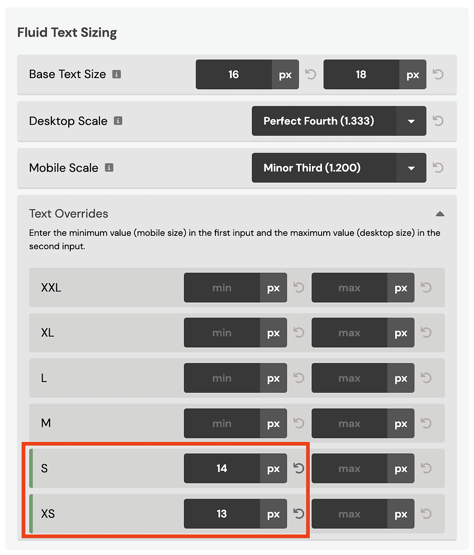
Many users prefer to set manual max and min values for the “S” and “XS” sizes because they don’t want the scale to affect those sizes. That’s perfectly fine, too.
How do I dial in the proper font sizes?
The primary values controlling font sizes in Automatic are the base values and the scale values.
The Base sizes allow you to adjust ALL SIZES EVENLY.
The Scales allow you to adjust the VARIANCE between sizes (larger scales create a larger variance, and smaller scales create more minor variance).