The Automatic.css Card Framework is an innovative new framework for managing card styling . It reduces the amount of work you have to do when building cards, ensures that card styling is extremely consistent, and improves the scalability and maintainability of your sites.
Note: This feature is currently in experimental mode while we do extensive testing and adjustments. Settings, variables, conventions, and workflows are subject to change.
Enabling the Card Framework
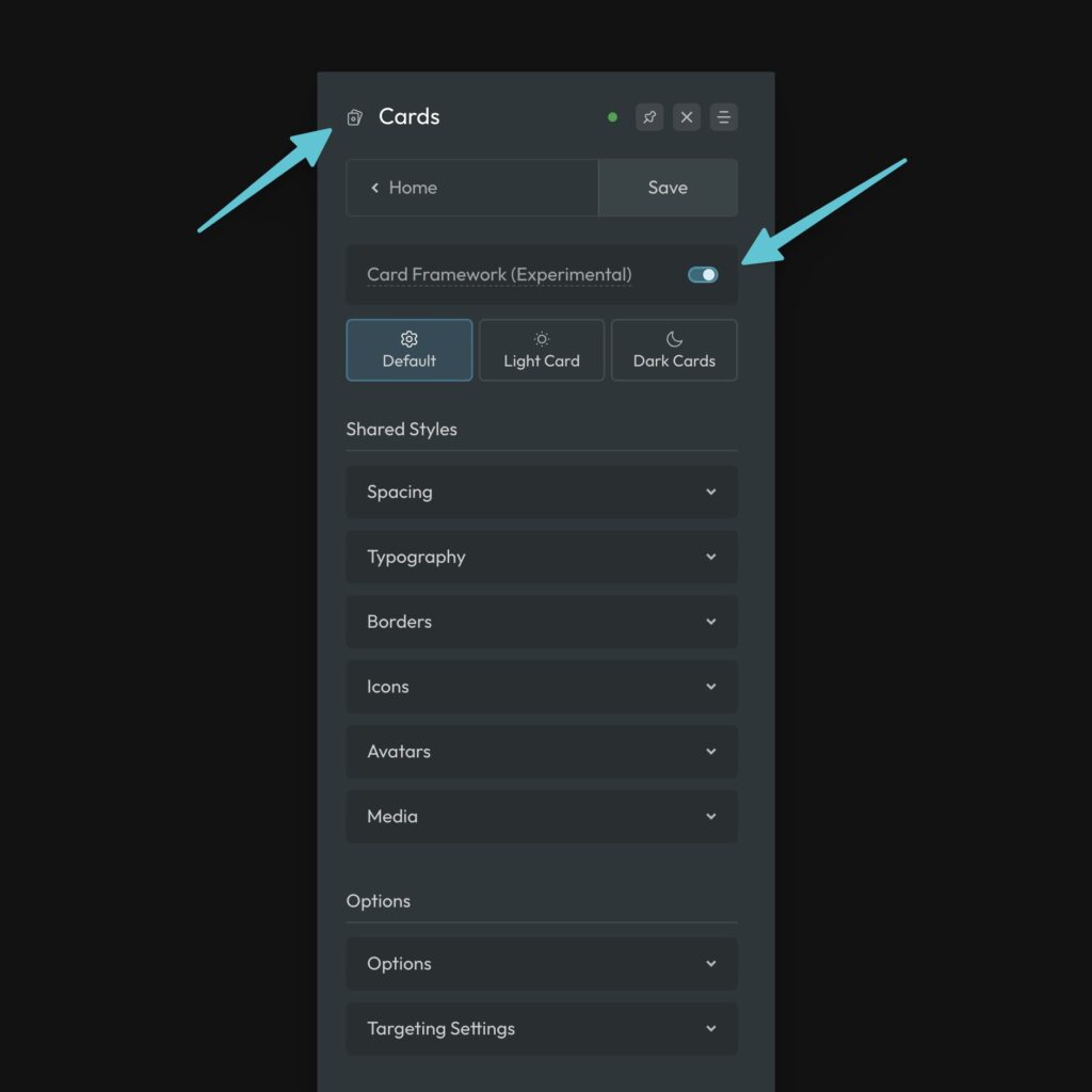
The Card Framework is turned off by default, though we highly recommend you turn it on. To enable the framework, navigate to Cards from the main dashboard and then toggle the framework on.

Automatic Card Styling
Turning the framework on won’t change anything out of the gate. The first decision you’ll want to make is whether or not you want ACSS to style your cards automatically.
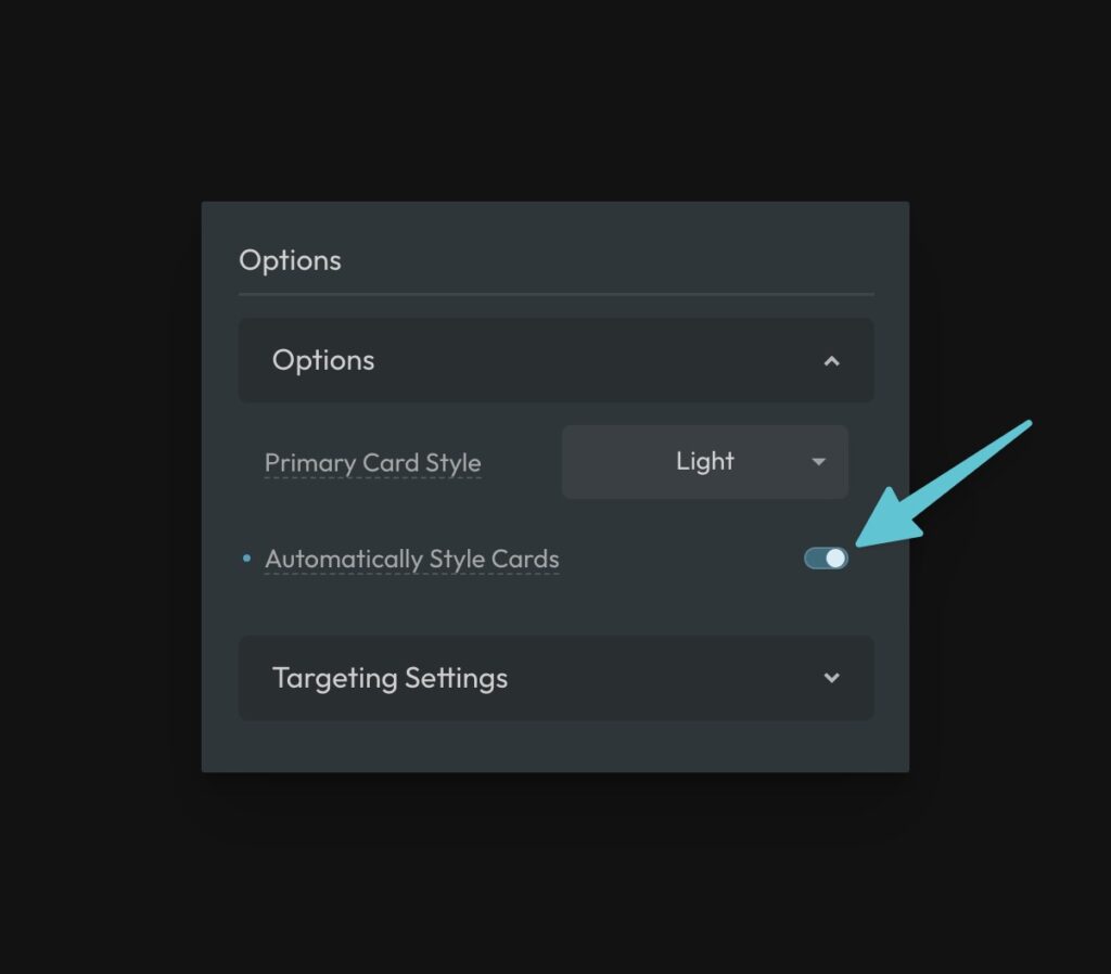
Navigate to Cards > Options and find the toggle for “Style Cards Automatically.”

This setting works by Automatically styling all cards that have the word “card” in their class name. For example: .article-card, .team-card, .product-card, .review-card, etc.
Using specific class names isn’t necessary, you just have to use the word card somewhere in the name, which is already a well-accepted standard.
If you are working on a new project, we recommend turning this setting on. If you’re working on an existing project with existing cards, we recommend leaving this setting off.
Excluding Cards From Auto Styling
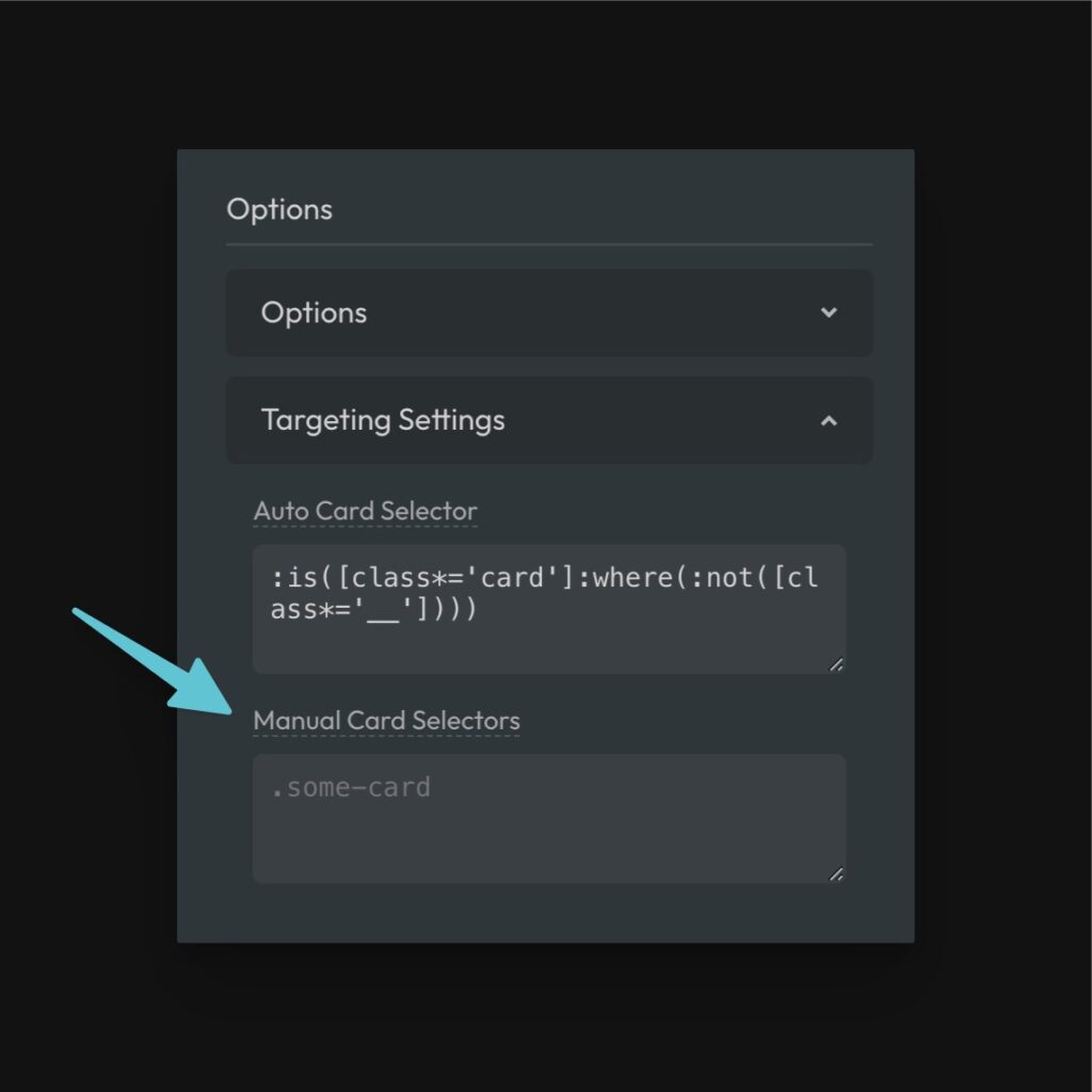
If the auto card styling is picking up a class that has the word card in it, which should not get card styling, you can exclude that element from automatic card styling by adjusting the Auto Card Selector under “Targeting Settings.”
Here’s the default targeting:
:is([class*='card']:where(:not([class*='__'], [class*='wrapper'])))
Code language: JavaScript (javascript)
Just add any selectors you want to exclude to the :not() list using comma-separation.
:is([class*='card']:where(:not([class*='__'], [class*='wrapper'], .excluded-card)))
Code language: CSS (css)
Any selectors added here will be excluded from automatic card styling.
Manual Card Targeting
If you’re not going to use Automatic Card Styling, you need to use the Targeting Settings to identify which cards should be controlled by the ACSS Card Framework. This is done via the Manual Card Selectors input.

There are three approaches you might want to take here.
- A main card utility class like
.card. If you take this approach, any box with the class of.cardwill have the framework enabled and will be styled automatically. - A card data attribute like
[data-card]. If you take this approach, any box with the attribute of[data-card]will have the framework enabled and will be styled automatically. - List specific card selectors like
.article-card. Using this approach, any class listed in a comma-separate list will be styled automatically.
How the Framework Works
Once the framework is applied to a card (either manual or automatic), you’ll see default card styling and can start to manipulate that styling from the ACSS dashboard.
For example, you’ll see that the card has padding, border radius, a relative position, clipped overflow, and other similar default styles. These are all very helpful and consistent with the rest of the ACSS framework and are all controllable from the dashboard inputs.
ACSS uses tokens for all styling, which are all prefixed with the word “card.” You set your default styles from the dashboard and then are free to make any adjustments you need to make on a per-class basis.
For example, padding is applied with var(--card-padding), gap is applied with var(--card-gap), and radius is applied with var(--card-radius). Remember, this is all done for you! You never have to do this manually.
Styling Cards with BEM (Important)
BEM is the best all-around syntax for organizing CSS classes and flattening your CSS. The Card Framework is based on BEM principles and you’ll want to follow BEM practices when using the Card Framework to avoid complications and to unlock additional superpowers within the framework.
This is especially true when using Automatic Card Styling. The Card Framework looks for classes that contain “card,” but that don’t have a “__” modifier. If the class structure for an Article Card looks like this, you’ll break the Auto Styling framework:
.article-card
  .article-card-heading
  .article-card-text
  .article-card-link
Code language: CSS (css)
All of those classes contain the word “card” without any identification of which element is a child element. Therefore, ACSS will attempt to style every single one of those elements as a card.
The appropriate structure looks like this:
.article-card
  .article-card__heading
  .article-card__text
  .article-card__link
Code language: CSS (css)
This is classic BEM and best practices. Following this syntax will improve the quality of your site and ensure the card framework operates flawlessly.
Tip: ACSS won’t style card classes that contain the word “wrapper” or “group” either. This makes it possible to add card wrapper classes without adopting the default card styling.
Default Styling, Light Cards, and Dark Cards
Once you start building your first card, you’ll need to start adjusting the styling to suit the design you’re trying to achieve.
For most sites, your cards will either be primarily light or primarily dark. The Card Framework supports both and you can set the most prominent one as the default via Options > Primary Card Style.
Default Styling
Default styling is styling that applies to all cards, whether they’re light or dark. This is things like spacing, typography, border styling (other than color), etc.
You can configure all your default styling in the Default panel. The following options are available (make sure you read the details – some elements require specific class names to take effect):
- Spacing
- Card Padding – Main padding value for card content. It’s applied automatically to the main card wrapper, but can be removed from there and used in any part of the card.
- Card Content Gap – The gap between all content inside cards. Is applied automatically to the main card wrapper, but can be applied manually to internal wrappers as well.
- Typography
- Heading Size – The size of the main heading of the card, which is identified by
__heading. - Text Size – The default size of text inside your card.
- Heading Size – The size of the main heading of the card, which is identified by
- Borders
- Concentric Radius – Optionally sets card radius using concentric math to improve the radius UI of cards with boxed icons, media, avatars, etc.
- Border Width – The thickness of the card border (set to your global border width by default).
- Border Style – The style of the card border (solid, dotted, etc.)
- Border Radius – The radius of the card (set to your global radius by default).
- Icons
Targeted with__icon- Icon Size – Size of the main icon in an icon card, as signified by.
- Icon Radius – Radius of the main icon in an icon card.
- Avatars (Photo/Headshot, etc.)
Targeted with__avatar- Avatar Size – Size of the main avatar in an avatar card.
- Border Width – Border width for the main avatar.
- Border Style – Style of the border on the main avatar.
- Radius – Radius of the main avatar (use
50vwfor a perfect circle). - Aspect Ratio – Aspect ratio of the main avatar. Use
1for circles.
- Media (Featured Image, Featured Video, etc.)
Targeted with__media- Radius – Radius of the main media in a card
- Aspect Ratio – Aspect ratio of the
- Object Fit
Light Styling & Dark Styling
Styles that are specific to light and dark variants are set in the Light and Dark panels respectively.
Each option has the following settings:
- Background – The background of your card, which supports any valid background value including images, linear gradients, etc.
- Heading Color – The color of your main card heading, set with
__heading. - Text Color – The color of your text.
- Link Color & Link Color Hover – The color of your links.
- Button Style – The style of any button in a card, triggered by the existence of any
.btn--class. - Border Color – The color of the card’s border.
- Icon Style – The style of the main icon, chosen from the Icon Framework. Again, make sure the class name uses
__icon. - Avatar Border Color – The color of the border on avatars. Make sure the class name uses
__avatar. - Card Shadow – The color and style of the shadow for your cards.
By default, if Primary Card Style is set to “Light,” your cards will be light by default and without any additional input. If it’s set to “Dark,” your cards will be dark by default.
You can call the opposite style manually on any card using one of two modifiers:
--alt– The alt class will flip a card to the opposite style and continue to flip the card accordingly if the default ever changes.--darkor--light– These are specific classes that will call that specific style and persist indefinitely, completely independent of the “Primary Card Style” setting.
If you’re designing a card that’s always supposed to be the opposite from the others around it, use --alt modifier. If you’re designing a card that should be light or dark and never change, use the specific --light and --dark modifiers.
Remember, this follows proper BEM conventions. If you want to use the dark modifier, your structure should look like this:
<div class="article-card article-card--dark">
Code language: JavaScript (javascript)
Notice that both classes are used. You shouldn’t use the modifier class alone by itself.
Creating Cards
The card workflow is simple – create cards as you normally do and simply follow the proper BEM conventions. Let the card framework apply its defaults and then override them where necessary.
If there’s a situation where you want to reference a card style in a place its not being applied automatically, use the Card Framework tokens.
For example, let’s say you want to remove the main padding and gap on your article cards and apply the card padding to the inner content wrapper instead. It would look like this:
.article-card {
  padding: 0;
  gap: 0;
}
.article-card__content-wrapper {
  padding: var(--card-padding);
  gap: var(--card-gap);
}
Code language: CSS (css)
This might seem like we’re undoing things the framework is doing, only to do them elsewhere. However, you’ll quickly realize that the styling decisions you have to make and properties you have to set are reduced by 80% to 90% when using the Card Framework. Not only that, but all your card styling is completely standardized and globally controllable.
Container Query Support
The Card Framework has unique and simple support for container queries. This allows you to change the card’s design or layout based on the size of the container it’s in.
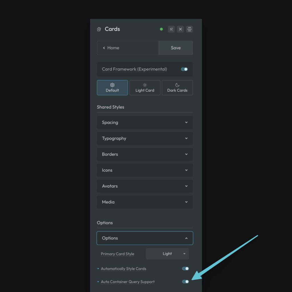
First, enable Auto Container Query Support in Card Options:

This automatically gives any wrapping element of your cards a container-type of inline-size, opening the door for styling your card with container queries.
The easiest way to add a container query is to select the card class you want to style, go to custom CSS, and use the card container recipe. There’s also a card container mixin if you prefer using the SCSS editor.