Spacing variables allow you to hook into the ACSS spacing system for establishing consistent, responsive spacing for things like margins, padding, and gaps.
The most important thing to wrap your head around is that spacing is spacing. Unlike with classes, which have to declare what they’re applying spacing to (e.g. margin-top), spacing variables are just pure spacing values. They can be used anywhere, so they don’t require specific names.
For example, let’s say you want to apply padding to a testimonial card you’re creating. Since this is a re-usable element, you’re creating a BEM class for it called .testimonial-card and assigning all styles to the custom class instead of using utility classes.
Here’s what that would look like:
.testimonial-card {
   padding: var(--space-m);
}
Code language: CSS (css)
Notice there is no var(--pad-m) variable. Once again, spacing is just spacing and variables are just values. You could use the same value to gap the card’s content out:
.testimonial-card {
   display: flex;
   flex-direction: column;
   padding: var(--space-m);
   gap: var(--space-m);
}
Code language: CSS (css)
The only exception here would be contextual variables.
This makes life super easy when styling custom classes. There are very few variables to know and they’re super easy to use without a lot of decision-making.
Section Spacing & Footer Spacing
Sections and footers typically demand much more spacing than other boxes. If you’re creating a custom class for section padding or using a variable at the ID level on a particular section or within your footer, we recommend using ACSS’s section spacing variables instead of regular spacing variables. This also keeps things contextually accurate.
Fine Tuning Spacing with Calc()
When using variables, you’re not limited to the available t-shirt sizes by default. You can achieve any value in between each size by using a spacing variable within a calc() function.
Let’s say that --space-l was *almost* perfect, but you want just a little less spacing. It’s easy!
.testimonial-card {
   padding: calc(var(--space-l) / 1.1);
}
Code language: CSS (css)
This calculation reduces the padding value by 10%.
Dividing will reduce the value and multiplying will amplify it. Using decimals will give you fine-tuning control.
The only thing to potentially keep in mind here is your website’s spacing scale:
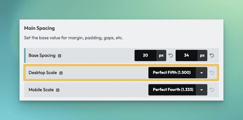
The value for your scale will help you decide whether you should multiply or divide.
If my scale is 1.5, then the halfway point between sizes is 1.25. This means that my logical adjustment range for each size is up to 1.25 down or up from the size I chose. Anything adjustment beyond that means I should probably base my sizing off the next size up or down (from “m,” that would mean switching to “s” or “l.”).
While this isn’t a requirement (nothing will break if you ignore this suggestion), it keeps things logically consistent. The below styling makes objectively zero sense:
.testimonial-card {
   padding: calc(var(--space-m) * 1.5);
}
Code language: CSS (css)
The value of this calc exactly matches the value of var(--space-l), so var(--space-l) should be used instead. Even 1.4 wouldn’t make much sense because you’re getting too far away from the initial value. It would be more logical to do calc(var(--space-l) / 1.1) than to do calc(var(--space-m) * 1.4).
The principle is to keep the adjustments as small as possible.
Using spacing variables to move elements a known amount
Spacing variables also come in handy when you need to shift an elements position, either with absolute positioning, relative positioning, fixed positioning, or negative margin.
Let’s say I want to make an image overlap with the section above it. For that to happen, it needs to travel a distance equal to the top padding of the section it’s in, plus the amount of whatever overlap you want. Not only that, but we probably want to add some bottom padding to the section being overlapped to ensure the white space stays consistent.
Using variables for all of this makes this super easy, consistent, and maintainable.
Creating the overlap
To make the image overlap the section above it, we need to use negative margin. The value is the sum of the section padding plus overlap:
.overlapping-image {
   margin-block-start: calc((var(--section-space-m) + var(--space-l)) * -1);
}
Code language: CSS (css)
--section-space-m is the known value for the section’s block padding, so we take that and then add --space-l to it (that’s the amount of overlap we want). Lastly, we multiply that by “-1” to make these values negative.
With the overlap achieved, we then want to adjust the bottom padding of the section being overlapped. How much do we adjust it by? The exact opposite of the overlap we just created:
.overlapped-section {
   padding-block-end: calc(var(--section-space-m) + var(--space-l));
}
Code language: CSS (css)
See, there are no random “magic numbers” to manage. It’s all done with variables, removing a lot of thinking and keeping things super clean.
Variables Are King
Variables are much more powerful than utility classes because they can be fine-tuned and they can be attached to custom classes for maximum scalability and maintainability. This is why we advocate for a Pro Mode approach to development where utility classes are used sparingly and most of the work is done with custom classes and variables.