Automatic.css conforms to your website’s actual dimensions (website width and viewport dimensions) for maximum accuracy in responsiveness. It also allows you to set custom breakpoints that match the specific WordPress page builder you’re using.
Setting Website Width
To set your website’s width, open the Viewport tab in the ACSS dashboard and change the Website Width input to your desired value:
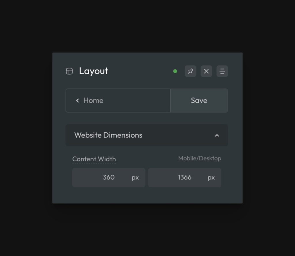
It’s essential that the website width in ACSS settings matches the website width or container width that you’ve set in your page builder. The framework has to know your website’s dimensions in order for things like responsive typography, responsive spacing, and auto grids to function accurately.
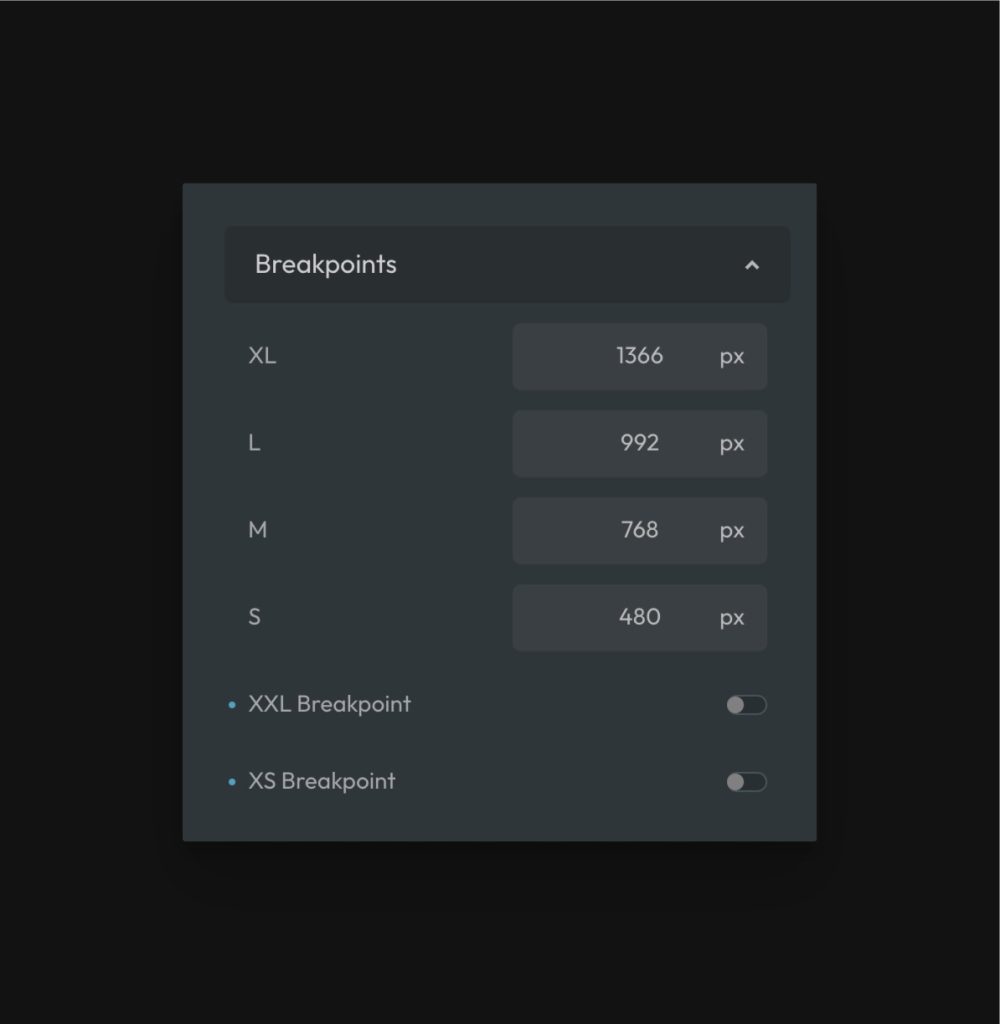
Setting Basic Breakpoints
ACSS has the following breakpoint options by default:
- XL (Laptop)
- L (Vertical Tablet)
- M (Horizontal Phone)
- S (Vertical Phone)
It’s best practice to make sure your largest breakpoint is equal to the website width you set in the Website Dimensions area (unless you’re using the extra breakpoints as detailed below).
Breakpoints are customizable via the Viewport tab:
The most important thing to understand when setting up breakpoints is that they must align with the values you’ve set in your page builder. If the page builder and ACSS use two different sets of breakpoints, your responsiveness will be inconsistent.
Whatever changes you make to breakpoint values here must also be set in your page builder.
Note: Because of the way some page builders show breakpoints in the builder (Oxygen Builder, for example), it may be necessary to set up your builder breakpoints at 1px less than your ACSS breakpoint values for maximum accuracy in the builder. Follow the latest setup documentation for your specific builder – do not blindly follow old video tutorials.
Additional Breakpoints
Aside from the standard breakpoints, ACSS offers two additional breakpoints that are optional. These breakpoints are off by default, but can easily be turned on in the Viewport tab:

The XXL breakpoint is helpful if you design a site above the average width. Most websites are between 1140 and 1280px. If you design a site at 1366px, 1440px, or higher, you’ll likely find value in enabling the XXL breakpoint and shifting the other breakpoint values to minimize the gap between your largest breakpoint and the next breakpoint down.
If you find too much of a gap between one breakpoint and another, activating the XS breakpoint as an additional option can help.
Mapping Breakpoints in Bricks Builder
Whether you’re sticking to the standard breakpoints or adding additional breakpoints, we recommend mapping all your ACSS breakpoints over to Bricks. This will keep the names and values consistent and ensure your site works fluidly.
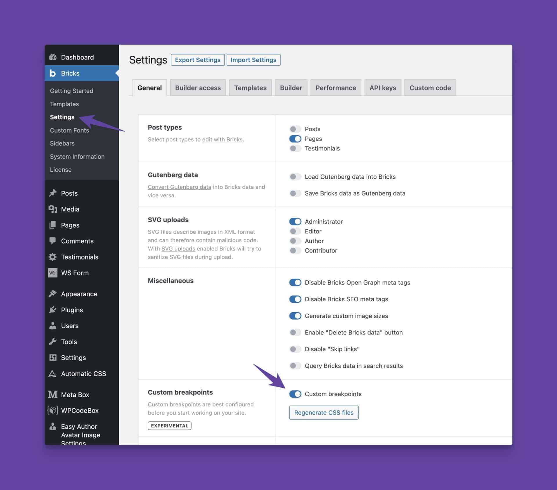
First, ensure you’ve turned on Custom Breakpoints in Bricks’ settings:
Once that’s enabled, you can edit breakpoints in Bricks from any page as long as you have the builder open.
In the builder, click the three dots next to the breakpoints to open the editor panel.
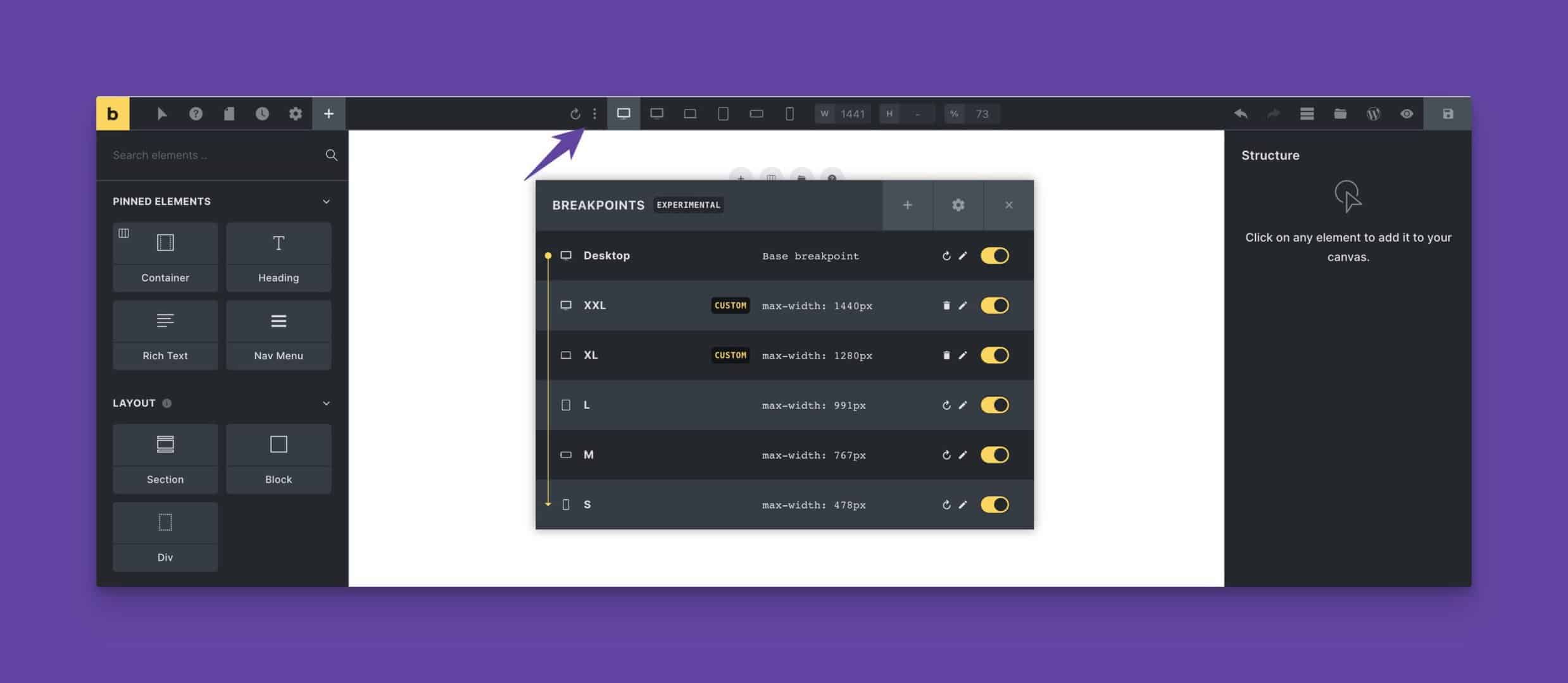
Bricks sets the top breakpoint as the “base” breakpoint by default. You can change the value of the base breakpoint, but you should never set any other breakpoint as the base breakpoint. This will break your site.
If you’re using standard breakpoints:
- Click the pencil next to the base breakpoint and change the name to “XL.” Make sure the value matches the XL breakpoint value set in ACSS.
- Click the pencil next to the “tablet portrait” breakpoint and change the name to “L.” Make sure the value matches the L breakpoint value set in ACSS.
- Click the pencil next to the “mobile landscape” breakpoint and change the name to “M.” Make sure the value matches the M breakpoint value set in ACSS.
- Click the pencil next to the “mobile portrait” breakpoint and change the name to “S.” Make sure the value matches the S breakpoint value set in ACSS.
Now your breakpoint names in Bricks map perfectly to your breakpoint names in ACSS.
If you’re using additional breakpoints:
- Click the pencil next to the base breakpoint and change the value to your website width.
- Click the pencil next to the “tablet portrait” breakpoint and change the name to “L.” Make sure the value matches the L breakpoint value set in ACSS.
- Click the pencil next to the “mobile landscape” breakpoint and change the name to “M.” Make sure the value matches the M breakpoint value set in ACSS.
- Click the pencil next to the “mobile portrait” breakpoint and change the name to “S.” Make sure the value matches the S breakpoint value set in ACSS.
- Click the “+” sign to add a new breakpoint. Set the name to “XXL” and set the value to match the XXL breakpoint value you set in ACSS.
- Click the “+” sign to add a new breakpoint. Set the name to “XL” and set the value to match the XL breakpoint value you set in ACSS.
- If you added an XS breakpoint, click the “+” sign to add a new breakpoint. Set the name to “XS” and set the value to match the XS breakpoint value you set in ACSS.
Your custom/additional breakpoints now map perfectly to your breakpoint names and values in ACSS.