Default spacing in ACSS works pretty well for a wide range of sites, but there may be times where you’ll want to make adjustments. While ACSS is quite complex under the hood, you only really need to understand what’s going on at a surface level to be able to customize the framework to fit your needs.
Regular Spacing (Padding, Margins, Gaps, Owl)
As with typography in ACSS, spacing starts with base sizing and then generates the additional sizes via a mathematical scale. You have full control over both the base spacing and scale values.
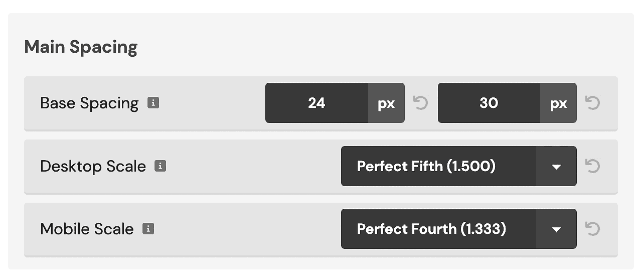
Base Spacing uses a min (mobile) and max (desktop) value. In the example above, the “M” spacing value will be 30px on desktop and 24px at the smallest device size. Changing the base spacing value will change all spacing sizes equally.
The Desktop Scale value sets the degree of variance between spacing sizes on desktop devices. In the example above, .gap–l (one size up from .gap–m) will create a 45px gap on desktop devices instead of a 30px gap (30px * 1.5). L, XL, and XXL all get scaled UP from “M” and S and XS get scaled DOWN from “M.”
The Mobile Scale value works the same way as the Desktop Scale value, except it affects how the spacing sizes behave on mobile devices instead of desktop. It’s common to use a smaller scale on mobile devices because things need to be tighter in general. In the example above, .gap–l would produce a gap of 39.9px on the smallest device size instead of 45px.
Remember This: Increasing the scale increases/decreases the degree of variation between the sizes while the base spacing values increase/decrease all sizes equally across the board.
Using consistent values calculated with math scales ensures that all spacing across your site is consistent and perfect regardless of whether you’re adding padding, margin, gaps in grids, owl spacing, etc.
Section Spacing
What’s unique to ACSS is the addition of section spacing. In web design best practices, it’s recognized that sections require more top/bottom spacing while maintaining consistent left/right spacing.
IMPORTANT: ACSS applies “M” section spacing to sections by default. This is because sections in web design need internal padding by default 90%+ of the time. If default spacing was’t applied, you’d be required to put a .pad-section– class on every single section which is inefficient, annoying, and fails scalability/maintainability best practices.
You can quickly change the padding for any section using section padding classes or section spacing variables.
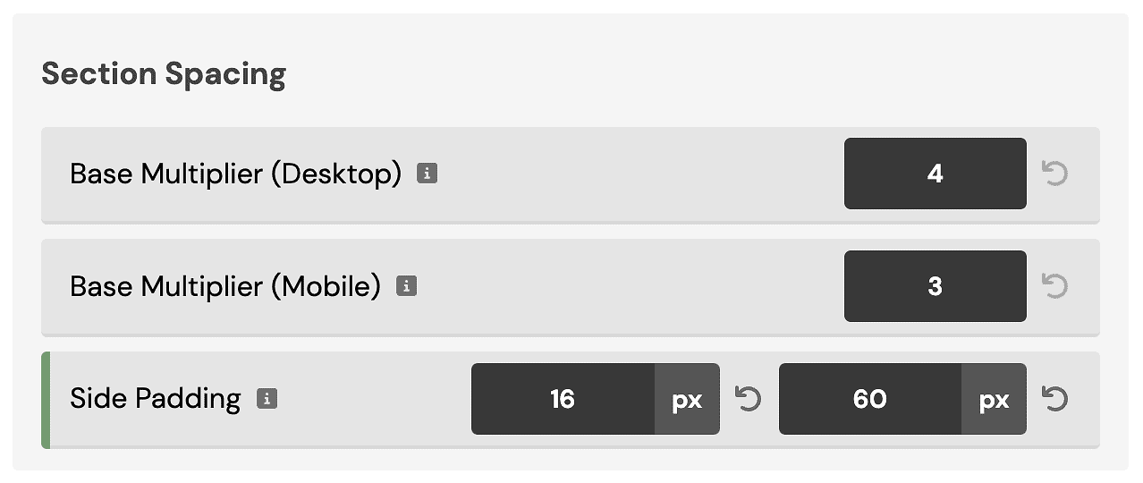
Section Spacing in ACSS takes the “Base Spacing” value from above (since that’s your website’s base) and then multiplies it to make it bigger and more appropriate for sections.
When setting up your website, you want to set a multiplier that’s appropriate for your default sections on desktop and mobile:
The other section spacing sizes will be generated based on the scale you chose in the Main Spacing section.
Additionally, you’ll want to set a minimum and maximum Side Padding (“gutter”) value. This is the amount of padding on the sides of your website on laptop and mobile devices (so your content doesn’t touch the edge of the screen).
Your website’s side padding will fluidly scale between the min (minimum device size) and max (laptop/desktop). You typically won’t see side padding on desktop devices unless you’ve set a very large website width. It’s typically only seen on laptop and mobile devices.
You can remove side padding on a case-by-case basis using various techniques: .pad–none, custom classes with “0” as the left/right padding values, or using “0” as the left/right padding values at the ID level.
Header Spacing (Oxygen)
ACSS does not apply default padding to the header builder in Oxygen by default. When you add the header builder, it will have no spacing. This is so you can easily use a .pad-header– class to get the header spacing you desire.
.pad-header– classes uniquely target the HTML structure of the Oxygen header builder to ensure proper top/bottom spacing without causing left/right alignment issues.
Note: Apply the pad-header– class to the header builder row and not the header builder itself. Also, it’s not recommended to use other padding or section padding classes on the header builder.