Aside from programmable brand colors, ACSS provides you with the following status colors:
- Warning (alert, caution)
- Info (general information)
- Success (safe, correct)
- Danger (error, wrong)
These follow the status color standard set by Bootstrap many years ago, providing colors that indicate a specific “notice” for the user and that [typically] have nothing to do with a website’s brand palette.
Note: Prior to v2.8.2, Status Colors were referred to as “contextual colors.” This name was updated to “Status Colors” to eliminate confusion with the new Contextual Color System.
Configuring Status Colors
Status colors are preconfigured, but you can easily adjust them via the Palette tab of the ACSS dashboard:
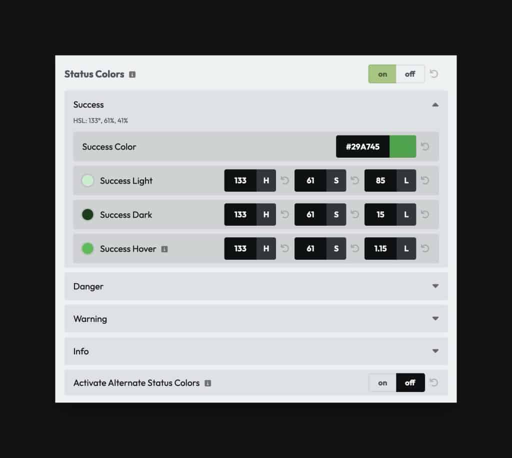
Status Color Shades
Along with the main color value for each status color, ACSS also gives you access to the following shade variations:
- Light
- Dark
- Hover
These options give you tremendous flexibility over how you use status colors in your design:
- Light background with dark text
- Dark background with light text
- Main color background with light or dark text
- Any color background with light or dark border
- Link with status hover
Status Color Classes
The following groups of classes have access to the status colors by default:
.text--.bg--.link--
The class naming convention is the same as with all other colors in ACSS. Append {color} or {color-shade} to the above classes on the desired element (e.g. .text--warning-light)
Status Color Variables
You can access status color variables and color partials along with classes. These variables allow you to reference status colors or parts of status colors when creating custom classes or within custom CSS.
The naming conventions for status colors are the same as all the other colors in the ACSS system: var(--{name}) and var(--{name}-{shade}.
The following partials are available for each status color:
{color}-hex{color}-hsl{color}-h{color}-s{color}-l{color}-rgb{color}-r{color}-g{color}-b
These partials remove all limitations from the status color system, allowing you to make custom shades, transparencies, hovers, and more.