Automatic.css uses advanced CSS techniques to make the system automatic. While these techniques are supported across all modern and up-to-date mainstream browsers, they’re not backward compatible with every older version of these browsers or many older devices.
To ensure that your site still functions properly and looks okay on older systems, we’ve installed two separate fallback layers inside Automatic.css.
The first fallback layer is for browsers that don’t support clamp() functions. Clamp() is used for all responsive spacing and typography across the site.
If a browser doesn’t support clamp(), we created a unique fallback that uses calc() instead, and produces surprisingly accurate results. You will likely not notice any difference when viewing your website on a browser that supports clamp() versus a browser that only supports calc().
The second fallback layer is for browsers that don’t support clamp() or calc(). This would be much older browsers that are still in circulation on older devices. As a percent of market share, it’s a very small user base.
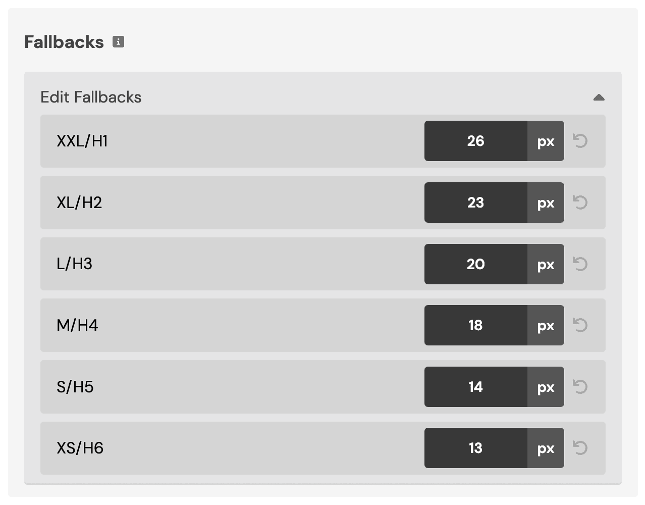
If a browser doesn’t support clamp() or calc(), we use pure rem units. This is a completely manual fallback layer. We have the default values set to follow a mathematical hierarchy with the largest XXL unit still being small enough to display fine on mobile devices.
The main goal of this 2nd fallback layer is NOT to try and replicate the look and feel of your primary design – it’s simply to ensure that the typography and spacing across your site doesn’t look broken on older devices. It’s a “Plan C” emergency fallback, not a desired outcome.
Editing the rem fallbacks
You don’t really need to do anything here unless you really really really want to. You’ll likely never see these changes unless you love browsing on old tech.

Open the Typography panel and scroll down to “Fallbacks.” You can change these values to whatever you’d like. There are no overrides for the calc() fallback layer because those already map perfectly to your current fluid responsive values.