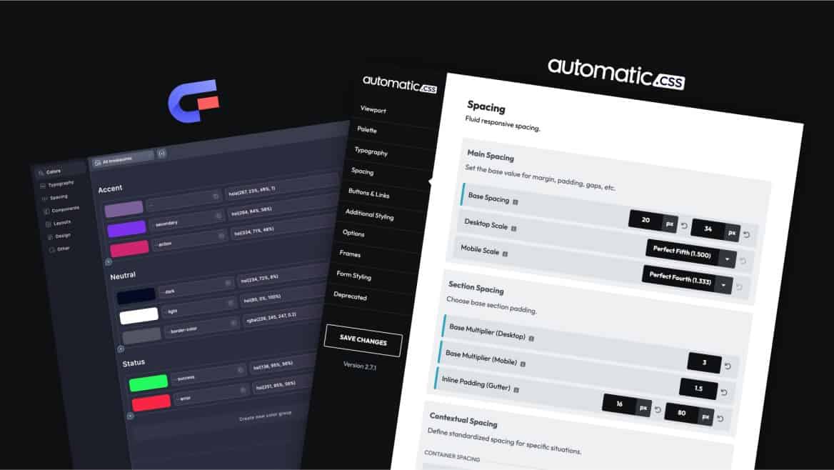
Automatic.css (ACSS) is consistently voted the #1 framework for WordPress page builders by various page builder communities. Core Framework (CF) is a younger framework product offering a similar but very different approach. This article will take an objective-as-possible look at the differences between ACSS and Core to help you decide which framework might best fit you.
NOTE: We won’t claim that this is a completely “unbiased” comparison. However, we made a strong effort to stay objective and stand by the facts presented throughout. This is also not an attack on Core Framework in any way. We respect their team and their product. Anyone is welcome to contact us to challenge the content in this comparison. We are committed to correcting any inaccuracies.
Table of Contents
- Why use a framework in the first place?
- Both products are more than a framework
- The fundamental differences between ACSS and Core
- Additional features in ACSS that don’t exist in Core
- True Builder Integration (TBI)
- Education, support, and documentation
- Page builder enhancements
- ACSS Ecosystem vs Core Framework Ecosystem
- ACSS Pricing vs Core Pricing
- Which Framework is leading in innovation?
- How to choose between ACSS and Core Framework
Why use a framework in the first place?
A CSS framework offers tremendous benefits to web design and page-building workflow. Here are the top five reasons someone might use a framework for all their projects instead of managing styling from scratch:
- Less decision-making. Starting projects from scratch requires a lot of setup and decision-making, which is repetitive from project to project. Having a flexible framework can shave hours off project timelines because so much is already done for you from the start and things that require customization are straightforward to manage.
- Faster workflow. Having a library of utilities – whether classes or variables – speeds up workflow tremendously. You can move at light speed because everything you need is at your fingertips, common challenges are already solved for you, and you’re using the same naming conventions, values, and processes across every website you build (hopefully).
- Less breakpoint management. A good framework builds in a lot of automatic responsiveness, which cuts down on the number of adjustments you need to make at various breakpoints. This saves hours of time on every project.
- Greater consistency. Consistency is essential across many areas: workflow efficiency, design balance, spacing rhythm, scalability, and maintainability. A good framework encourages consistency through features like naming conventions, value decisions, math scales, value equality, and workflow processes.
- Better maintainability. Sites that aren’t built with a framework typically use a lot of random values, unassociated values, raw values (no tokenization), manual responsiveness, random naming conventions, etc. This all makes maintainability much more difficult. A framework resolves all these issues and makes life easier for everyone, especially when returning to a site months later or working with multiple team members.
Both products are more than a framework
The great thing about Automatic.css and Core Framework is that both “frameworks” are actually much more than a CSS framework.
Most CSS frameworks are just a library of utilities. While ACSS and Core both fit within that definition, they also have features that conventional frameworks don’t have. These features are designed to enhance your workflow, solve common challenges, and make your life easier.
We’ll take a look at these features in more detail later in this write-up, but it’s important to understand that these products aren’t directly comparable to the typical definition of a “CSS framework.”
The fundamental differences between ACSS and Core
There are three major philosophical differences between ACSS and Core. It’s important to understand these differences and their implications before deciding.
- Complete framework (ACSS) vs. starter framework (CF).
- Structural consistency (ACSS) vs. unlimited flexibility (CF).
- Builder components (ACSS) vs. framework components (CF).
Let’s look at these differences in more detail:
Big difference #1: ACSS is a complete framework, while Core is a starter framework.
ACSS was released as a complete “done for you” framework, while Core was released as more of a starter framework (This isn’t us talking down about Core. It’s what they provide by design).
What does that mean for you? Let’s take a look.
When using any framework, you’ll find that utilities fit into one of three buckets:
- Essential
- Important
- Nice to have
Both Core and ACSS offer the most common utilities that fall into the “essential” bucket. These are utilities within the categories of colors, spacing, typography, basic grid layout, buttons, etc. Even here, though, there are some things that Core is missing.
The following essential utilities are offered in ACSS but missing in Core:
- Contextual Spacing (Container Gap, Content Gap, Grid Gap, & Gutter) – This is spacing assigned to an essential context, which allows the user to granularly tighten or loosen spacing across a website without risking breakage or getting unpredictable results.
- Section & Header Spacing – These are spacing utilities independently designed for sections and headers, which have unique requirements over other types of wrappers.
- “Smart Spacing” – The automatic removal of default spacing in regular layouts to allow for perfectly even spacing, plus tremendously helpful rhythm-based spacing within rich-text use cases.
- Content Width & Content Width Safe – Variables for referencing the website’s content width and dynamically creating gutters on content-width containers where there’s no physical gutter.
- Color & Shade Partials – Referenceable variables for the hue, saturation, lightness, full HSL stem, red, green, blue, and full RGB stem values, essential for dynamically adjusting colors and creating transparencies on the fly or globally.
- Button Variables – Locally scoped variables for every default button style, essential for theming buttons on a page/section basis, easily creating custom buttons, easily changing the style of a specific button, etc. all without losing control of the rest of the button’s styling from the dashboard.
- Flex Grid – Flex Grid allows users to create grid layouts where unbalanced items can be centered or stretched. They’re a popular layout feature unique to Automatic.css.
- Magic Grid – Magic Grid is an ACSS-specific technique for creating automatically responsive grids with a single class and local variable. This tremendously speeds up workflow, requires no breakpoint adjustments, and is automatically responsive.
Utilities that fall into the “important” category cover things like accessibility, flex, advanced grid, width, height, columns, shadows, text, etc. Automatic.css offers powerful utilities across all these categories. Core offers utilities within Grid (starts and spans), width, and flex alignments, but that’s it.
Here are some important utilities in ACSS that are missing in Core:
- Clickable Parent – Utility for making an entire card or container clickable without a link wrapper for improved accessibility.
- Focus Parent – Utility for making an entire card or container focusable. Typically used in combination with clickable-parent.
- Hidden Accessible – Hides descriptive text visually but retains it for screen readers. Adds an icon in the builder so users know when hidden accessible text is present. Essential for accessibility.
- Header Height – Having a variable that references the height of your header is essential for various offset and positioning scenarios.
- Columns – Creates automatically responsive columnized content that flows dynamically from one column to another. Includes utilities for gaps and ruled columns.
- Forms – Light and dark form classes that style WS Forms, Fluent Forms and Bricks Form element in seconds. Fully customizable from the dashboard. More forms integrations are being added as we speak.
- Breakouts – Allow you to break any content out from its parent container to varying degrees, including full-bleed. Very useful in a variety of layout situations.
- Height – Classes that allow you to control an element’s minimum height on the fly.
Utilities that fall into the “nice to have” category include things like ribbons, overlays, content flips, position, overflow, blur, filters, etc.
Here are some nice-to-have utilities from ACSS that are missing in Core:
- Overlays – Instantly add background and image overlays with any available color, shade, and transparency combination.
- Object Fit & Position – Utilities for quickly setting the object-fit property on images. Core has some fit classes, but these aren’t very useful without positioning.
- Aspect Ratio – Useful for quickly setting the aspect-ratio property on images.
- Marker Color – Useful for setting the marker color on list items.
- Ribbons – Powerful utilities for creating corner ribbons in seconds.
Core gives you the tools to add some of these utilities (but certainly not all of them). However, adding utilities yourself assumes you:
- Know how they’re done or have time to figure them out.
- Have the time needed to go through and add them.
- Have the time and patience to decide on naming conventions and value relationships
And what about the ones that can’t be added in Core? For example, you can’t use Core to add overlays, Flex Grids, etc. This means you must maintain these utilities in a separate stylesheet after figuring out how they’re accomplished (and accomplished within the specific page builder you happen to use).
If you choose Core, you must be comfortable adding, managing, and maintaining the utilities not offered out of the box. With ACSS, you can focus on working with the confidence that this has all been figured out for you already.
And regarding users needing to know how utilities are accomplished if they want to add their own, there’s something to be said about general attention to detail and sensical naming conventions. This is what you’ll see in Core for the CSS Grid utilities:

The fact that grids are referred to as columns is pretty jarring, especially considering the fact that CSS has something called “columns” which are definitely not grids. Additionally, using 1fr as a unit is known to cause overflow in various situations. ACSS uses minmax(0, 1fr) for this very reason.
These kinds of little details make a big difference to the end user in a real-world workflow. You don’t want to be second-guessing your framework and constantly running into little issues while also dealing with naming convention confusion.
One last point regarding features and utilities: anything that you don’t want or need in ACSS can be turned off, so the framework can be as light/minimalist as you’d like or as complete as you’d like. Most users feel that turning off things they don’t need is far easier and better than adding things that aren’t there manually.
Big difference #2: Core believes in unlimited flexibility while ACSS believes in structural consistency.
Core allows you unprecedented flexibility when it comes to manipulating the framework. Users can:
- Add an endless number of colors, shades, and transparencies.
- Add an endless number of text sizes.
- Rename colors (but not shades, from what we can tell).
- Add custom utilities
- Rename utilities
- Prefix all utilities automatically
- Set styling defaults with custom selectors
While this level of flexibility and customization may seem nice to have at first, Automatic.css has explicitly rejected the concept of unlimited flexibility.
In other words, these aren’t features that are missing from ACSS. Rather, they’re features that were considered and purposefully excluded because we believe that structural consistency is far more important than unlimited flexibility.
Look at the main goals of a framework – things like efficiency, consistency, etc. – and it becomes clear that unlimited flexibility is antithetical to these goals. This is especially true when you consider your workflow from project to project.
A consistent, efficient workflow is impossible if utility names aren’t always the same.
A consistent, efficient workflow is impossible if some projects have utilities that others don’t.
A consistent, efficient workflow is impossible if the relationships and logic between certain utilities change from project to project.
These customization features also present critical ecosystem challenges. Frames is efficient, powerful, and nearly flawless to work with across thousands of projects because it’s based on a structurally consistent Framework.
If users could change the names of utilities, Frames would constantly break on import from one site to another.
In fact, Core has a “class prefix” and “variable prefix” feature that allows users to put a custom prefix in front of every single class. Doing this instantly makes the website incompatible with design sets that use Core’s standard classes (when/if design sets are offered). That’s a large-scale issue.
The issue exists on a smaller scale as well, given the fact that users can change one-off utility names or the names of individual utility groups. For example, what if users don’t like .columns- for the grid naming convention and change it to .grid- instead?
Everything breaks.
I reached out to Eduware Izekor of BricksMaven about this because he has experience with designing Core Framework. Here’s what he had to say:
Yes, if the user switches up the variable conventions, the layout will break. With the template system I created I am using the default settings of Core to ensure that everything works for everyone. I also added some custom styles like section padding etc. The users has to import my core styles to ensure that everything works properly during the import process. You need some kind of standard to make sure adoptation is possible on a broad scale.
Eduware Izekor – BricksMaven
“Some kind of standard” is exactly correct! ACSS exists as the standard, and we’ve long been wary of infinite flexibility in conventions because of the challenges it causes at the freelance level all the way to the framework ecosystem level.
The most important aspect of all this is that ACSS, even when prioritizing structural consistency, doesn’t create any limitations. You can still add anything you feel might be missing on a specific project while remaining hooked into the framework. The difference is that the integrity of the base framework is never jeopardized and everyone is operating according to the same standard.
Big difference #3: ACSS leaves components to the builder environment while Core brings component styling to its dashboard.

Core offers an innovative approach to styling reusable components by offering a “Components” area in its dashboard.
This area can be used to manage simple components, like buttons, while also offering users a way to style more complex components like cards.
It’s an impressive aspect of Core, and they’ve done a great job with it, but it’s another feature that ACSS purposefully excludes. Let’s take a look at the workflow, and you’ll see why:
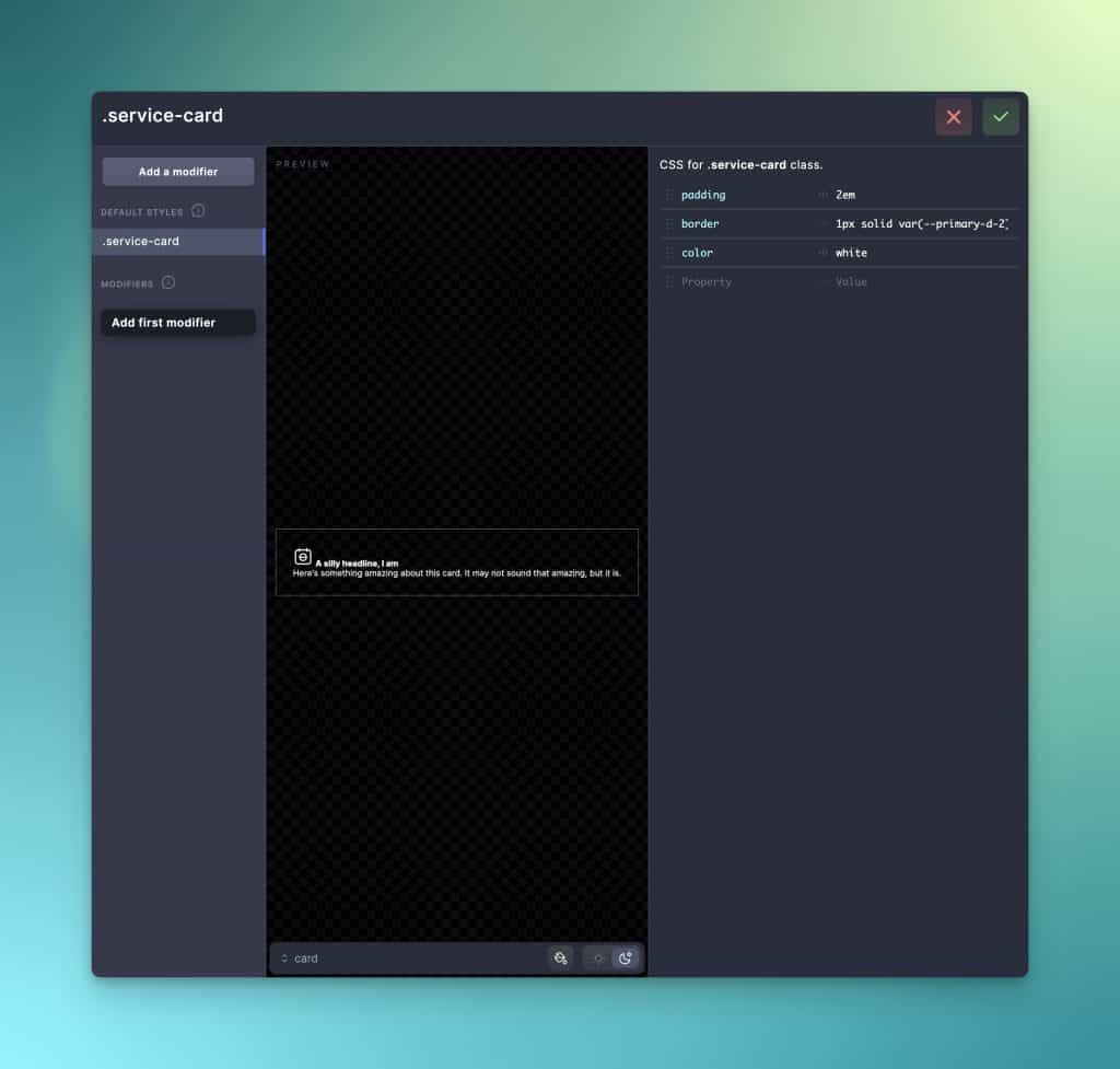
Components in web design are a mix of HTML, PHP, JS, and CSS. Core is only a CSS framework tool, so it only allows you to define the CSS side of components.
The fact that this is done in a separate dashboard creates a major workflow disconnect in our opinion.
I started creating a card with the component builder in the above example. I gave it the class .service-card and then gave it some basic properties (padding, border, color).
Since you can’t declare any HTML, Core has to show you a preview of a very generic card with an icon, heading, and text. I’m sure you can already imagine the issues with this workflow.
- Components have parent-child relationships. Not everything can be done from the parent level.
- Children typically have their own classes, but this can’t be managed very easily in Core.
- I can’t style a component properly unless I can see the component I’m styling. A generic preview does me no good.
And the most important question of all still hasn’t been asked. Why am I doing this in a CSS framework dashboard when I can do it in the page builder I’m already building the website with?
One of the most essential principles in workflow is: Don’t bounce from environment to environment. Every time you have to leave one environment and enter another, you’re killing workflow efficiency.
Core’s “components” dashboard forces you to leave your page-building workflow any time you need to adjust the styling of a component on the site or build a new component. It effectively introduces a new environment that doesn’t need to exist and has no real advantages. Styling of components is best handled in the page builder where you’re actually building and managing the component.
Additional features in ACSS that don’t exist in Core
Aside from the differences in the utility libraries that were detailed earlier, Automatic.css offers the following powerful features that don’t currently exist in Core:
- Automatic Section Padding – Section padding is already set up for you out of the box by ACSS (fully adjustable). No need to figure out what your defaults are supposed to be or where to set them in the builder.
- Automatic Contextual Spacing – Sections can have automatic container spacing, containers can have automatic content spacing, and grids can have automatic grid gaps with the flip of a switch. It saves a ton of time and doesn’t create any limitations or issues.
- Automatic Header Height Offset – If your website uses an overlay header, it means that your header takes up some of the room in the hero section of your pages. This makes your hero spacing look off-balance. Automatic.css will fix every page on your website automatically, restoring perfectly balanced spacing to the first section on every page.
- Automatic Heading Balancing – Automatically balance headings to prevent orphans and unbalanced line lengths. Includes an
.unbalanceutility for unbalancing specific headings. - Automatic Sticky Offset – Sticky headers overlap sticky elements by default. ACSS fixes this overlap automatically.
- Automatic Scroll Offset – Sticky headers interfere with scroll-to-hash links. ACSS fixes this overlap automatically.
- Default Focus Styling – ACSS ensures that you have proper focus styling (your choice of outline or shadow) across your website out of the box, using your site’s action color.
- Rich Text Link Utilities – Utilities for setting smart spacing, changing link color, focus color, and more, specifically designed for rich text elements that lack builder controls for these properties.
- Boxed Layout – Want a boxed layout for your website instead of the traditional full bleed? You can customize every aspect of your boxed layout in seconds with ACSS.
- Default selection colors – Want to style the text on your website when the user selects it? Simple to do with ACSS (try on this site).
- Auto Alternating Grids – Do you love how some grids alternate content back and forth? You can make any ACSS grid do that with a single utility class. It’ll be automatically responsive, too.
- SCSS Functions & Mixins – Power user? You might love our SCSS Functions and Mixins.
Remember, this list is in addition to the previous lists of utilities and features not found in Core that were detailed earlier.
True Builder Integration (TBI)
Every page builder is different and takes a different approach to workflow, code output, etc. Knowing this, there are two questions you must ask when using a framework in a page builder:
- Can I install and use the framework in this specific page builder?
- Does the framework work flawlessly in this specific page builder?
Most frameworks will claim compatibility with certain page builders, but this only satisfies question #1.
Users often find – typically when they’re too far into a project to turn back – that a framework struggles in many situations because the page builder and the framework aren’t on the same page.
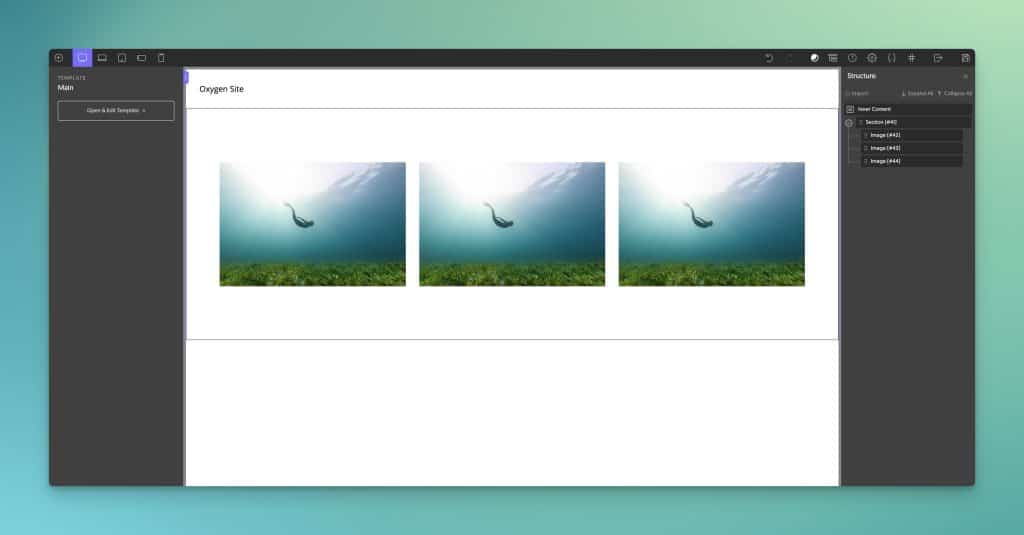
For example, when users try to turn a section into a Grid in Oxygen Builder with Automatic.css, it works perfectly. When you try to do the same thing with Core, the section breaks:

This is because Oxygen, like many builders, has an improper section element with an inner wrapper that isn’t selectable by the user. Automatic.css accounts for this and applies the grid instruction to that inner wrapper in Oxygen while Core does not account for this.
Where Core users see a broken section, Automatic.css users see the grid they asked for:
There are way more of these types of issues than you might think! And these points of failure create big headaches for the user. You must diagnose why something isn’t working and then work around it. Or, there might be something you need when working in a specific builder, but it’s not there because the framework wasn’t designed with that builder in mind.
Depending on your skill level, these issues and oversights can add costly hours to project timelines.
Automatic.css saves you from all that hassle because it’s the only framework that offers “True Builder Integration.” When we say that we integrate with a builder, it means we’ve tested every aspect of the framework in that particular builder, analyzed the code output of that builder, and designed the framework to load an overrides/adjustments file that ensures maximum efficiency and compatibility with that builder.
Other frameworks might be okay with 90% compatibility, but we’re not. We want users to have a buttery-smooth workflow that’s free from failures, breakages, and roadblocks.
Education, support, and documentation
No framework, be it ACSS, Tailwind, Core, OpenProps, etc. is of any value to a user who has no idea how to implement it, use it correctly, or use it efficiently.
As much as we’d love for users to snap their fingers and instantly have the utilities, techniques, and principles Matrix-downloaded into their brains, that’s not going to happen any time soon.
There is a learning curve to using any of these tools and the only way we can shorten the learning curve and make it more enjoyable is to give users all the documentation, education, and support they need.
Core Framework has a Facebook Group for support and an official documentation area on their site. While they’ve done great with the documentation, there’s no education component. There’s no official YouTube channel, workflow videos, how-to, or best practices videos.
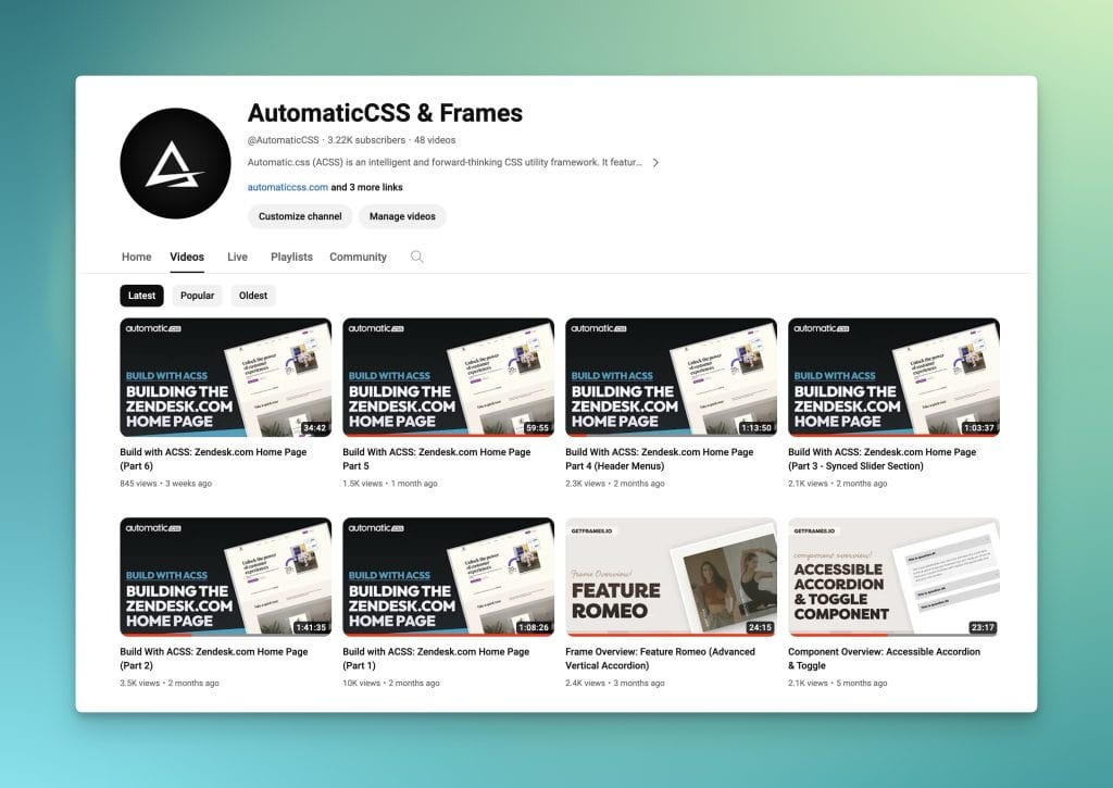
ACSS, on the other hand, invests tens of thousands of dollars and countless hours into all three areas. You can find endless tutorials on YouTube via our official ACSS channel as well as from our Creator on the Geary.co channel. We also have a growing list of talented creators who use and teach ACSS.
Our website has extensive documentation so you can look up exactly how to use specific features.
Lastly, we have perhaps the best support experience of all – a dedicated private support community with thousands of users, hundreds of power users, and a small team of official support staff. We’ve created a culture of helping and guidance, with almost every question/thread getting multiple detailed responses in just minutes.
If you want official support and don’t want to post in the community, we also have dedicated email support, with same-day response time.
ACSS users love the fact that there’s really no guesswork and nothing for them to figure out on their own. Everything they need to learn is available at no extra charge, almost everything is documented in detail, and any issue that does come up is quickly resolved by the community or support team.
Having this level of education, documentation, and support is worth its weight in gold.
ACSS and Core offer different dashboard workflows
Automatic.css was the first of any framework to offer users a UI dashboard for quick and easy framework customization.
Note: Automatic.css is currently on the cusp of releasing v3.0, featuring a brand new dashboard and dashboard workflow. We’ll update this article when v3.0 is public.
ACSS Dashboard
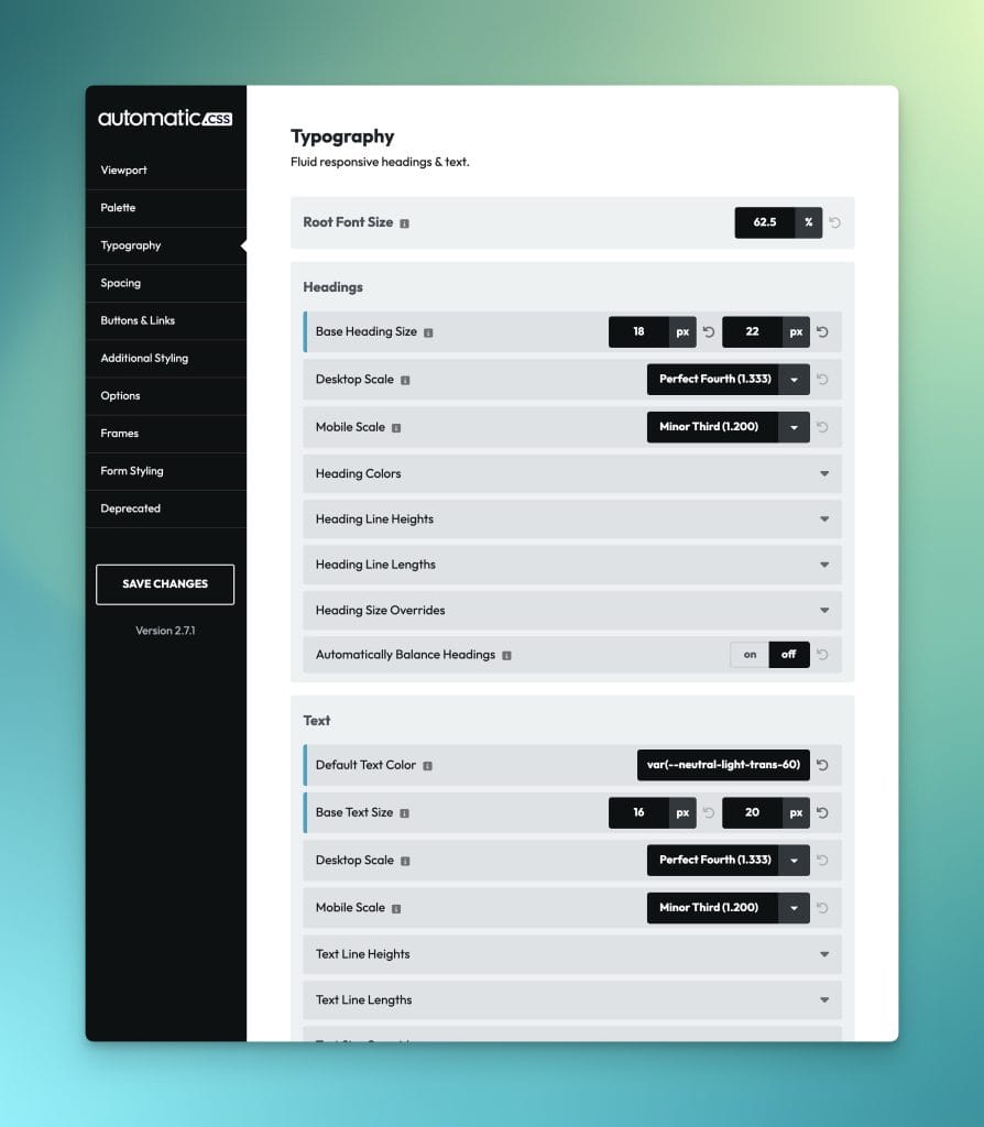
The ACSS dashboard is clean and relatively easy to navigate, allowing users to customize every key part of the framework. Features with functionality that aren’t obvious feature a tooltip explanation and/or a link to the official documentation.
Inputs can be reset to default values with a single click and error handling ensures that users can’t break anything when saving and regenerating stylesheets.
Core Dashboard

Core’s dashboard is much newer than ACSS’ and feels more modern and stylized. It features the same left-side navigation but offers a 3-column layout vs ACSS’ 2-column layout.
The Save button is nested in the right-side column along with a “Preview CSS” button. This button gives you an overview of the full stylesheet output. It’s not an important feature, but it might be nice to have for some users.
The bottom right sidebar also has a nice feature showing users how many utilities are active.
We found some issues with error handling and dashboard/framework logic during testing. For example, I completely removed the name of an active color and was still allowed to save successfully. This resulted in all the color variables losing their name and having four dashes as a prefix instead of two. This broke that color everywhere it existed across the website.
Core also seems to have a critical issue with shade and tint generation, making these utilities dangerous to use site-wide, but detailing such things isn’t the purpose of this article. Overall, the Core dashboard is well-designed and thought out, and I’m sure they can address and fix breakages in future releases.
Page Builder Enhancements
Automatic.css and Core both have features designed to enhance workflow in page builders. Other than a UI dashboard and Core’s “components” feature, this is a key area that sets these tools apart from pure “frameworks.”
Core Builder Enhancements
Core Framework offers the following builder enhancements:
- Variable UI – Right-click opens a context menu that auto-suggests, inserts, and live previews framework variables.
- Dark Mode Toggle – Adds a toggle in the builder for designing across color schemes.
- Preview Class Styling on Hover – This will live preview class styling on hover.
ACSS Builder Enhancements
ACSS offers the same enhancements, plus more:
- Variable UI – Right-click opens a context menu that auto-suggests, inserts, and live previews framework variables.
- Dark Mode Toggle – Adds a toggle in the builder for designing across color schemes.
- Class UI with Live Preview – A searchable context menu for all utility classes with live preview and multi-insert.
- Dynamic Convert to Rem (CTR) – Convert any value from pixels to rem instantly, according to your website’s root font size, simply by adding “ctr” as the unit and hitting enter. Works in input fields and custom CSS.
- Auto-BEM – Automatically add customizable BEM classes to a parent and all its child elements in two clicks. Has additional options for element exclusion, bulk renaming, create new and delete old, create new and keep old, and create new and remove old. Very powerful!
- Variable Expansion & Validation – Automatically wrap variables in the var() function by typing the variable name and hitting enter (or semi-colon in CSS). Automatically wrap calc strings in the calc() function by typing a math function and hitting enter (or semi-colon in CSS). Will automatically wrap variables and calc strings simultaneously and automatically validates
var()andcalc()strings for proper opening and closing brackets to prevent errors.
ACSS Ecosystem vs Core Framework Ecosystem
Building both a native and third-party ecosystem around a framework or page builder-type product is very important. It extends more options to users and helps solidify the product in the market.
Core Framework’s Ecosystem
The Core Framework native ecosystem is just Core Framework. There’s an area on their website that says UI Kits and templates are coming soon:
Given the issues we discussed earlier with the framework’s unlimited flexibility, we want to wait and see how this ecosystem plays out. It’s going to be a challenge designing UI kits and templates for installations that potentially use different utility names, various breakpoint options, and so on.
As for third-party players in the Core ecosystem, the only two we know of right now are BricksMaven (also for ACSS) and CalummaUI (we recommend avoiding this one as it’s mobile-first, which has no benefits but requires a completely different workflow than you’re probably used to).
The Automatic.css Ecosystem
ACSS’ ecosystem is much more robust. As far as the native ecosystem goes, there are three primary offerings:
- Frames – Build beautiful custom websites 65% faster with zero limits on your creativity using Frames’ unstyled layouts and accessible component library.
- ACSS Tokens – The power of Automatic.css directly inside of Figma for a truly professional UX/UI workflow.
- Frames for Figma – Get the entire Frames layout library directly in Figma, fully componentized with impressive enhancements such as our proprietary “site builder” feature, forms builder, and more.
- Etch – Coming in 2024.
The third-party ecosystem is growing rapidly as well. It currently includes:
Additionally, ACSS has support for the following builders that are not officially supported by Core:
And don’t forget our growing creator network.
ACSS Pricing vs Core Framework Pricing
Both products have a very different pricing model. Let’s take a look.
Core Framework Pricing

Core Framework uses a freemium pricing model. You can create an account, install Core on your website, and use it 100% free. Kind of.
If you want to integrate Core with your page builder of choice, that’s when you’ll need to purchase an add-on for each specific builder. As of this writing, Core is listed at 119€ or around $130 per add-on.
Right now, the only available add-ons are for Oxygen, Bricks, and Gutenberg (the Gutenberg add-on is free also). The add-ons install the classes into the builder’s auto-suggest menu and add the builder enhancement functionality, which are both necessary for most users to have an efficient workflow, in our opinion.
Automatic.css Pricing

Automatic.css pricing isn’t based on specific builders, add-ons, or integrations. ACSS operates as a single tool that adapts dynamically to its environment. When you buy ACSS, you’re buying a tool that will work seamlessly in all officially supported builders, free of add-ons or upsells.
ACSS integrates with Bricks Builder, Oxygen, Gutenberg, and Cwicly as of right now. Users can install ACSS across all these builders for the same price. ACSS auto-detects the builder and adapts accordingly.
When new builder integrations are added in the future, ACSS users can use the tool on those builders at no additional charge.
- Freelancer: $79/year (3 Sites)
- Agency: $149/yr (100 Sites)
- LTD: $399/lifetime (100 Sites)
Pricing Considerations
While Core Framework may look cheaper at first glance, there’s much to consider.
- If you were to use Core Framework across three separate builders (e.g. Bricks, Oxygen, Cwicly – assuming they add Cwicly support at some point), the LTD price would be $390. And the price will keep going up for any builders beyond that.
- It’s also important to remember that ACSS has more features, more builder enhancements, and is a complete framework.
- Make sure you factor in the time it takes to add missing utilities and features (and learn how to add them in the first place if you’re not advanced with CSS). Time is money.
- Make sure you factor in access to education and support.
- Make sure you factor in ecosystem value.
- Account for the fact that you can style WS Forms and Fluent Forms (more to come!) in seconds with ACSS while Core lacks form integrations.
- Consider the trends in innovation and the fact that ACSS is always on the cutting edge of CSS and workflow efficiency.
Which Framework is leading in innovation?
ACSS was designed from the ground up as a next-generation framework for WordPress web designers who care about speed, consistency, customization, efficiency, scalability, and maintainability.
Because of this, ACSS introduced many “firsts” to the market:
- A UI dashboard for effortless framework customization
- Fluid responsive typography
- Fluid responsive spacing
- Section block padding presets
- Math scales
- Owl spacing (in a framework prior to Flex Gap)
- Auto grids
- Auto alternating grids
- Accessibility features
- Variable partials
- Header height offsets
- Smart spacing
- Auto-BEM
- Automatic Variable Expansion
- And more…
Our commitment to innovation and workflow enhancement is second to none, as is our commitment to support, education, and industry leadership.
Core has attempted to innovate, with its component functionality being the most prominent entry into the innovation category. But, as explained earlier, we feel that particular feature creates a massive disconnect within a page-building workflow.
And guess what? ACSS is poised yet again to claim the innovation crown with v3.0, which introduces a completely new workflow paradigm. This is on top of other innovative features like Magic Grid.
If innovative features and workflow enhancements are important to you, ACSS has been and will continue to be the leader in innovation.
How to choose between Automatic.css & Core Framework
Core is the better choice for users who feel they need more of a “framework builder” with unlimited UI flexibility than a complete, done-for-you framework that’s built to a consistent standard.
Given the challenges presented by Core’s open-ended design, it’s a better fit for advanced users who have the time, knowledge, and expertise required to add missing utilities and who have little to no intention of using third-party design sets or other ecosystem products. It’s also a much better fit for users who aren’t building WordPress websites since ACSS is strictly for WordPress at the moment.
If you’d much rather use a complete, done-for-you framework that integrates seamlessly with design sets and other ecosystem tools, is still flexible and expandable but organized to a consistent standard, offers many more workflow and builder enhancements, and offers top-tier education and support, then Automatic.css is the better choice.
Power users will find equal joy in Automatic.css since we have all the necessary utilities under the hood for expanding and granularly controlling the framework (partials, functions, mixins, pro mode, and more).
Again, we have a great deal of respect for Core’s team and product. At the same time, it’s essential for us to speak to fundamental differences, advantages and disadvantages, and product-market fit because real users and potential users inquire about this daily.
If you feel that anything in this analysis is inaccurate, please contact us, and we’ll update the article with any necessary corrections.
