
Using utility classes to change an element’s behavior at certain breakpoints is a fast and easy way to achieve responsive design.
If you want to quickly whip up a four column grid that degrades to 2 columns and then to 1 column, it’s as simple as: .grid--4 .grid--m-2 .grid--s-1.
That syntax, though, has always felt problematic.
Reducing Cognitive Load With a More Efficient Syntax
Our goal is always to reduce cognitive load during development. The technical nature of what we do is already very demanding, so any opportunities to make it feel easier and smoother are welcomed.
The main problem with .utility--{breakpoint}-{size} syntax is that doesn’t optimize for cognitive load.
When you create a four column grid, you know that it needs to be two columns at some point. And you know that without any cognitive load. There’s no cost to knowing that — it’s obvious.
So, you can type .grid--4 .grid--2- without any thought whatsoever. There’s no blocker.
The question of what breakpoint that change will happen at requires far more cognitive load.
Placing this decision at the end feels far smoother and easier than forcing this thinking to happen in the middle of the syntax, because that decision making becomes a blocker to typing the utility.
Additionally, this “thinking in the middle” forces two context switches. Instead of seamlessly making one decision –– the number of columns –– you’re forced to context switch to figure out what breakpoint this will happen at. And once that’s solved for, you then have to context switch back to thinking about how many columns it’s supposed to be.
This is obviously far less efficient.
Additionally, when reading a series of classes, the breakpoint syntax breaks up the flow of understanding what’s happening to an element.
The most relevant information is that the grid goes from 4 to 2 to 1. Where those changes happen is far less relevant from a scanning perspective.
This is easier to read:
.grid--4 .grid--2-m .grid--1-s
Than this:
.grid--4 .grid--m-2 .grid--s-1
It’s subtle, but subtle improvements compound dramatically over time in this game because of the sheer number of interactions developers have with utilities.
Improving Breakpoint Extensions
Another improvement we’re making in ACSS 4.0 involves the migration of breakpoint extensions from one or two letters to strictly two letters.
This change solves two problems. The obvious problem it solves has to do with consistency. Some breakpoints like xl are two characters and some, like s, are only one.
This is fine for size values, but not as much for breakpoints.
This is especially true since we use the same t-shirt sizes for values.
Pop quiz! Tell us what this utility is doing:
.padding-s-s
There’s a discrepancy between the value and the breakpoint. Which is which?
If you refer to syntax, you know that the breakpoint comes last, but this type of pattern still isn’t super favorable.
What about this:
.padding-s-sm
Now you have two rules that confirm what’s happening instead of one:
- Breakpoints come last
- Breakpoints explicitly have two characters
Again, subtle subtle improvements to clarity, but they compound over time.
While this doesn’t fix every single scenario of mixing up values and breakpoints (.space--xl-xl), it does help in certain cases where the previous model was less favorable in all cases.
This change, of course, also trickles down to using mixins, media queries (when they accept tokens), etc. and will add clarity into other situations as well.
Syntax Consistency
Most utilities in ACSS follow the exact same syntax. That was always the goal. Unfortunately, a few utilities somehow found themselves with the opposite syntax.
ACSS 4.0 is an opportunity for us to fix these utilities and ensure that every single utility in the framework follows the same, consistent, logical syntax.
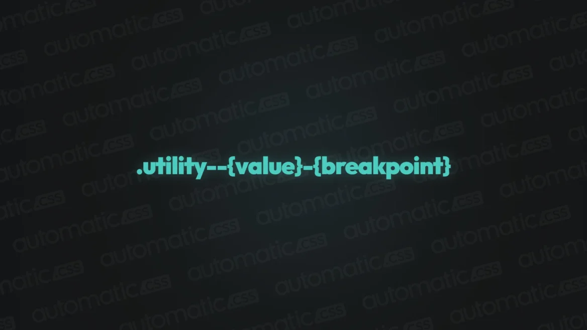
So the new, official syntax for breakpoint utilities is:
.utility--{value}-{breakpoint}
If you have comments or additional thoughts on this, please sound off in the community on this official post.